
For many, "experimental" is the kindly euphemism for "unrealized crap." In conceptual fields like architecture, it's easy to call up dozens of flashy-looking, ultimately failed experiments disguised as ideas. This is why Jimenez Lai is arguably one of the most remarkable people currently working in architecture. His ideas are experimental, but they're also realized; in other words, he's pioneering farsighted concepts that have a direct application to reality, but don't bore you to tears with footnotes and clichéd allusions to Italo Calvino.
Consider his super furnitures, or his graphic novel, "Citizens of No Place". Or perhaps the Taiwanese Pavilion at this year's Venice Biennale, which Lai's studio Bureau Spectacular conceived of and installed. Each of these projects possesses not only vivid originality, but actual intellectual heft. Most importantly, every project Lai undertakes tells a story.
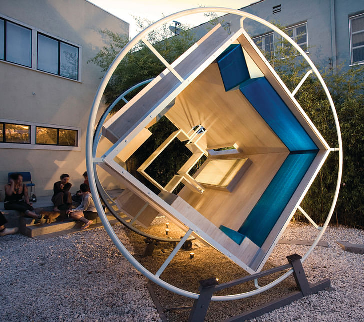
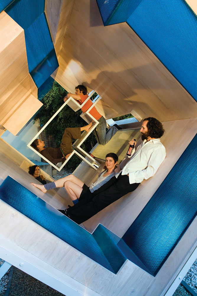
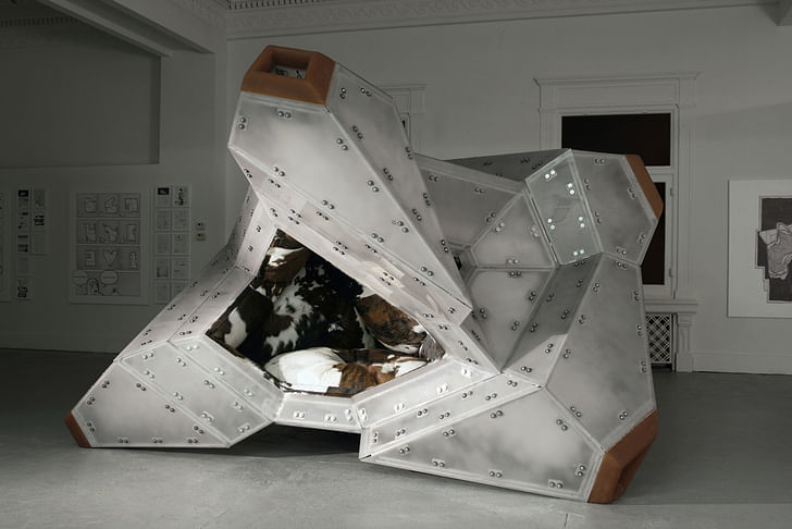
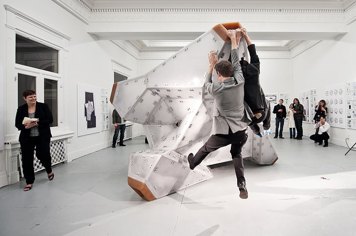
The super furnitures, so called because they are too large to be furniture yet too small to be architecture, are designed to be experienced on a variety of axial planes. To understand what this means in real life, first imagine a pentagon. For most people the pentagon always has a basic alignment, such as the form of a single-family home with a standard inverted V-shaped imagine living in a world where notions of conventional alignment have been turned on their head – as in, the exact world we live in nowroof. Now imagine living in a world where notions of conventional alignment have been turned on their head – as in, the exact world we live in now. This formerly stable, predictably aligned house could suddenly be positioned on its side, or suspended on a corner, its 'roof' now serving as its 'foundation.' The super-furnitures are designed to be experienced on a variety of different axial planes within different interpretations of standard shapes, so that there isn't a "right way" to inhabit the space any more than there is a "right way" to exist in the world; you do so in the manner that suits you best. The furniture is therefore not only dazzling aesthetically ("White Elephant," Lai’s piece that has been added to MoMA's permanent collection, has a kind of cowhide, disco-spaceship vibe), but also serves as a tangible demonstration of what it feels like to be alive in the perpetually shifting 21st century. In 2008, Lai staged an opening of "Phalanstery Module" at Materials and Applications, which could be termed as one of the first super-furnitures. Essentially an open-ended elongated box with furniture-like implements inside, Phalanstery Module was suspended at an angle within a rotating apparatus, tilting the structure so that every fifteen minutes one of the box's faces was parallel to the ground. This wasn't simply an exercise in technical goofery; the installation was patterned after a story Lai wrote about a spaceship-version of Noah's Ark en route to a distant planet, and therefore became a literal demonstration of how it would feel to leave the old world behind and travel with a group of enthused, farsighted companions. Fittingly, the opening attracted Silverlake denizens who sipped beer as their suspended, conical environment slowly shifted around them. About every seven and a half minutes, a pair of visitors would have to move mid-flirt as they were displaced by a rotating rectangular surface or window opening. It worked.
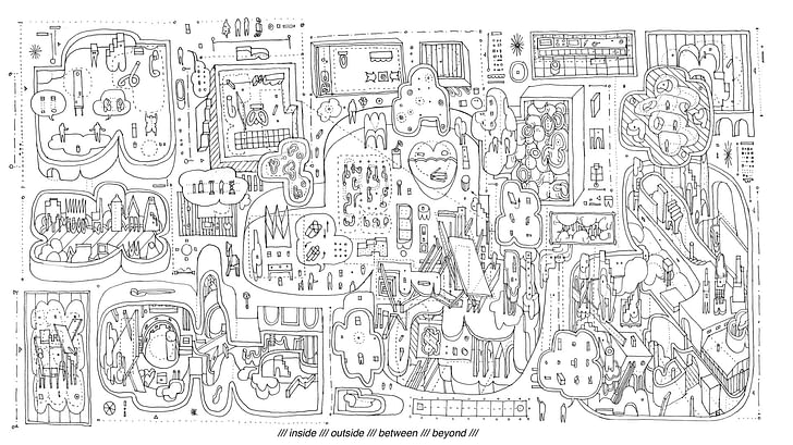
There is no slack in Lai's execution, regardless of the medium. Illustrated with the purposeful precision and line weights of an architectural plan, his "Citizens of No Place" graphic novel traces the development of imagination, humanity, and the need to create forms to house these qualities. In terms of linear time, the book spans from our primal, animal-hide-wearing roots to a hyper-displaced future. In one sequence, a hunter-gatherer kills and skins an animal. He knits the hide into a kind of cladding, then describes his day to the woman he loves, who is fairly underwhelmed. He then begins to dance for her, creating a series of entirely new forms with the hide. In the comic, we pull back and see his dance moves illustrated side by side. The moves form a kind of skyline made from the attire of the hide. The woman is noticeably intrigued. Unusual, vibrant, and funny, Lai's storytelling is flush with energy and embedded within an underlying conceptual framework. He expresses his vision with an articulation and artistry that would be impressive for someone in his 50s, but is extraordinary for a man who was in his late 20s at the time of its publication.
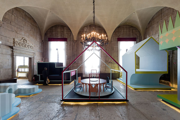
Understanding the role of storytelling within design is fundamental to all of Lai's work. Instead of conceiving of a remote structure that hangs its narrative hat on abstraction, Lai is interested in exploring how very real, emotional concerns shape our built environment, and more very real, emotional concerns shape our built environment, and more importantly, our perception of our built environment.importantly, our perception of our built environment. It is with the Taiwanese pavilion that Lai and Bureau Spectacular began to address fundamental questions of architecture's functionalism. The Pavilion features nine distinct "houses" with themes such as House of Sleep, House of Social Dining, and House of Shit. Each house takes a basic program and expands it into a publicly-sized venue, and in doing so amplifies the assumed purpose of the space. This allows visitors to examine aspects they wouldn't ordinarily have considered. Lai introduces part of the inspiration for the project by quoting architectural critic Jeffrey Kipnis: "Did the cavemen set out to find a two-bedroom cave?" This quotation underscores the notion that architecture is shaped by our needs as much as our cultural histories. The Pavilion tangibly explores our preconceived and evolving notions of what spaces a house should have, and how we choose to inhabit these spaces.
As an example, while the House of Shit's purpose may seem obvious, Lai brings up a very good point: increasingly, the bathroom is the only place where 21st century types are allowed to escape from connection, whether that connection is with technology, our peers, or even our family. I asked him if he thought that the profession of architecture in the next few decades will be motivated to create specific spaces, aside from the accidental bathroom, for this increasingly rare, almost outmoded concept of "private time."
"It is possible," he said. "In my own case, I used to live in a house I built inside of my office called the Briefcase House. It was a space that I used for personal time. I called it 'Spaceship Hour' where I would retire and enjoy my private time. It is strangely enjoyable, and I can see it developing into a luxury item. That said, I believe the bathroom will continue to serve the specific private function. Going to the bathroom is a very valid excuse to hide away during moments of high stress, unlike the unjustifiable 'spaceship hour'."
Going to the bathroom is a very valid excuse to hide away during moments of high stress, unlike the unjustifiable 'spaceship hour'."Although Lai has yet to design any permanent architectural structures, his ideas are vital in a field that swings between the poles of rigid formality and wild, unchecked Rhino-ing. Lai allows for experimentation and intellectual growth while simultaneously keeping his feet on terra firma, or, as is the case when I meet up with him, on the outdoor patio of the Neutra VDL House in Los Angeles. In September of 2014, he moved here from Chicago to become a lecturer at UCLA. I asked him why he chose to move to Los Angeles.
"I wanted an adventure," he explained. "I miss Chicago, but the invitation to Los Angeles felt like a challenge I wanted to engage. There will be hard times, but I think such discomforts will allow me to learn, meet more people, and experience more things."
Julia Ingalls is primarily an essayist. Her work has appeared or is forthcoming in Slate, Salon, Dwell, Guernica, The LA Weekly, The Nervous Breakdown, Forth, Trop, and 89.9 KCRW. She's into it.
34 Comments
The hipsters climbing on White Elephant really says it all.
&
"I believe the bathroom will continue to serve the specific private function."
The fact that you posted this comment literally seconds after this feature was published also says something. At least you spent the time to scroll to the bottom.
I'm sure it took longer to read this article than a few seconds. I'm not responsible to know exactly when Archinect posts things.
The question is, why is Archinect pimping Lai's terrible design ideas? Who wrote this puff piece? It sounds like it's straight from some PR person.
This is what people make fun of architects for--these in jokes.
Who goes to the john without their phone? It's where I make my best comments.
I'm angry and bitter too!
Darkman, can you explain exactly how Jimenez Lai's pondering and production around architectural thought are "terrible design ideas"? What exactly are your criteria for what makes something speculative "terrible"?
I see three exceptionally well-crafted installations that make users consider architectural space, I see drawings of a caliber fans of the best draftsmanship would praise, I see someone making an effort to inject considered delight into the world.
What exactly are you doing, anonymous Darkman? Please post it here so we can decide whether or not it's "terrible".
Sheesh. What a Negative Nancy.
+ 1 Donna Sink
Why are we all of the sudden giving a shit what people think about architects? They certainly don't care enough to pay enough for basic services. The minute I start caring what my mom thinks about Architecture, is the minute I become Thomas Kincaid. <----Boy do I have it for this guy or what?
Now posted on Archinect:
"Look at the corporate schools, corporate offices and architects who offer nothing more than a fantasy drawings packaged as radicals riding on intern labored marketing renderings."
Sounds like what I just said. Guess yall bitter too!
So Lai ponders the diorientation of the 21st century world by, you guessed it, disorientation. Perhaps what the world needs are real solutions and not more hipster irony mind games sold as radicalism to the two comma kids.
I'm working to solve real world problems with unsexy low income housing types so you probably won't see my work on any Archinect feeds. There's little irony in that... Though I'm glad I saw the House of Shit because now I know that poo poo goes in the potty.
If like to see this work presented to a group of 5th Graders.
i wasn't targeting jimenez lai. i think his work is necessary.
If something is truly radical, you won't see it adopted by corporate modern museums and institutions of higher indebting
i find his work interesting and love his drawings.
Thanks for posting - I get a better sense what's interesting in his work now.
Though I disagree on the bathroom as today's private refuge. Maybe at work - but at home people still have bedrooms (for children) and studies (for adults). Any sensible person with money for space will include a private study or den for this reason. You could also consider the vernacular "man cave" or more traditional basement / garage hobby room as similar efforts to create private refuges at home.
"The minute I start caring what my mom thinks about Architecture, is the minute I become Thomas Kincaid."
Yikes! I can see why there's such a disdain for the average person's view point in the architectural establishment. I guess some people's empathy is another's pandering. All this posturing to be the most and realist radical is funny.
This is how the non-architect world tends to look at "reality".
http://www.buzzfeed.com/maggyvaneijk/46-reasons-living-in-amsterdam-ruins-you-for-life
I think anyone's mother might like Amsterdam's architecture.
@ Darkman
Throughout life people will make you mad, disrespect you and treat you bad. Let God deal with the things they do, cause hate in your heart will consume you too.
Will Smith
There's no hate--only dissappointment in wasted talent. Good drawing does not mean good design. Even Eisenman's drawings have a kind of structure to them even though many live on paper.
Formalism is fine, but maybe the architecture as a series of in-jokes read for a lecture audience isn't for me (or normal people in general).
lady light, put some cloths on that thing!
The most interesting drawing that he did was a series of plans of a space ship city...really cool how he treated all surfaces as plan (the drawing was in zero gravity...) I find his built works a little boring to be honest. A guy like him would be really great at film...I would love to see his drawings animated into short films.
jla-x, you mean this one (via)?
^that's the one
These drawings are beautifully designed. They aren't trying to be a building, they're communication.
Darkman, you seem to be saying design can only manifest in a building. Sometimes a building is not the answer, and I have to say, frankly, especially in your business of low-income housing, perhaps a building isn't the solution to the problem?
If you guys like it, that's cool.
1970s sci-fi art is a thing again, ok ok
No building isn't always necessary, but not all doodles are worthy of the it girl/boy label. He should move to Hollywood and do movies.
If there was a noteworthy precedent for this furniture work, someone posing similar kinds of questions with a sense of humor, and doing it for years and years, it's NYC artist/architect Allen Wexler. So yes, there is a necessity for posing these kinds of questions of how the body relates to built space at an intimate scale. So with this work it is the scale of attention, it's not about looking at architecture at the scale of the building envelop, but the stuff inside it - i.e. furniture. And designing furniture has always been within the purview of architects job description going back at least a couple of hundred years, where architects commissioned with designing english country estates where also contracted to consider the design of the furniture as well. On top of that, this installation/furniture work also perhaps belongs to the kinds of research in interaction design, which has become a serious sub-field of architectural inquiry.
So you could call this furniturart?
There is a reason why the Eames lounge chair remains the golden standard and Google chooses Aalto as the ideal interior view.
the eames' had a deconstructed christmas tree every year. they did some wacky stuff - I'm sure they would approve. Aalto did a bunch of abstract painting... most architects have one foot in the art world...
"Who goes to the john without their phone? It's where I make my best comments." - Vado this is the first thing I thought when that Twitter thing came out... I quickly quit.
Darkman it says he moved to LA, which is where Hollywood is, presumably...
John Hejduk? (ish) maybe?
I think after a long days work in 'real' architecture one would be relieved to find someone doing this type of work.
We need an American Idol competition for who will be the next starchitect. Anyone who discusses bathroom habits has my vote.
I can have a more sympathetic view if you are comparing his work to artists like Chris Nolan, M.C. Escher or Lebbeus Woods (on a very bad day). Those are artists who use architectural themes, but I think what is missing is a sincerity to the work--the irony of postmodernism seems to be tainting it a bit--if this is a storyline, then there is always a clever punchline (House of Shit--ha ha, get it?). Then again, a lot of TED architects are doing the same thing.... presentation friendly, meme-tecture. What I've seen in his lectures is a lot of joking about architecture culture in a douchey way, which taints my view a bit. I don't see what elevates this work beyond a lot of great grad student work I've seen...
And c'mon, that picture of the White Elephant is just silly, regardless of what you think about the structure. Perhaps its a comment more on the hipsters than the work, but still....
^ his work is good, not great, not radical, not funny, not too philosophical, its ironic and clever which is different imo from most others doing this kind of work. Its a bit refreshing from all the save the world super positive things that we see on the daily as well as the post apocalyptic gloom seen in the works of others. Its comparable in my mind to extracting the juice of a green pea and serving a shot of green pea juice along side a thin sliced ham steak. Playful and familiar in flavor/content but original in delivery.
Let's just say it's way to early to write the kind of piece here. Definitely under development, like many ironic students. I'd like to see where he ends up in ten years.
Let's not say that.
^exactly....
have enjoyed reading this article and seeing Lai's work. Understanding space from a different viewpoint , experiencing a variety of emotions while inhabiting a space , having the luxury to change the vibe of a specifically designed space, a sense of play within architecture, playing around with the art/part of architecture !
kid rock says - jesus and bocephus....just sayin'...
Block this user
Are you sure you want to block this user and hide all related comments throughout the site?
Archinect
This is your first comment on Archinect. Your comment will be visible once approved.