

A few months ago, before I visited the High Museum complex for the first time, a friend explained to me why he preferred the work of Piano's addition in comparison to Meier's original building. Key for him were two factors. First, the quality of detailing on Piano's addition, with regards especially to his attention to light(ness). He also expressed the belief that Piano is a master at making human spaces, and beautiful moments.
Personally, having experienced neither a Piano nor Meier designed space at that time and judging strictly from photos of both architects' work, I felt assured that I would enjoy Piano's addition more. This despite my misgivings with regards to the regularity with which it seems Piano and his firm have become a go to name for museum expansions particularly in the USA. It is said, a major reason for this demand is because of Piano's buildings sensitivity to the art. The work of his office is known for light-filled spaces that allow the art instead of architecture to shine.
Additionally, I had a generally low appreciation for Meier's original which I had always considered a sort of Classical Modernist work of the 80's.
Yet, this was not my reaction to the two spaces. In fact, as time has gone by, I find myself more and more delighted with Meier's original. In the following brief essay, I would like to explore this reaction and explain my appreciation for Meier's overly geometric, white temple and explain why after visiting both, I disagree with both, my own initial assessment and the taste of my good friend.
A personal vision of Architectural space or A space designed for its use?
In short, I have discovered I prefer the original, because it presents such a personal spatial experience. This is not to say that Piano doesn't make a beautiful space. But it is too respectful. The spaces are essentially those of a finely detailed loft or warehouse. For instance, the exterior mechanics of the scoops for directing light evoke delicate moon shapes. While the track lighting and light wells are integrated perfectly. The big open floor plan is also perfect for displaying large pieces, installations or even, I imagine, performance art. It's a pure expression of mass and industrial scaled art and space. But wouldn't it be more magical if the spaces were more industrial, not post-industrial? I would prefer art displayed in a working warehouse, versus displaying it in a warehouse designed for art.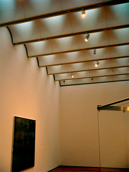
High Museum Extension, Renzo Piano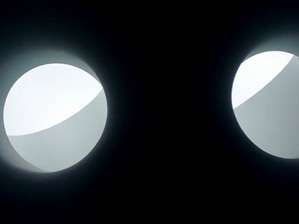
High Museum Extension, Renzo Piano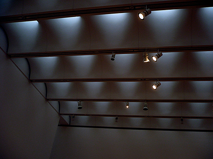
High Museum Extension, Renzo Piano
Piano's commission included a piazza, created by the addition of the Wieland Pavilion, Anne Cox Chambers Wing and Stent Family Wing, which includes an award winning cafe. All in all, a nice little piece of urban vitality. All combining to introduce and connect the museum into the surrounding neighborhood of midtown Atlanta which since the late 1980s, has been a primary area of growth in the city. Meier's building did not have this advantage. Where Piano's buildings are all oriented and open to the piazza with transparent and delicate glass facades, Meier created a compressed, entrance.
High Museum Extension, Renzo Piano (Courtesy ehpien)
High Museum, Richard Meier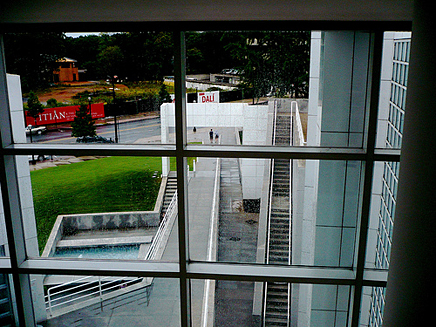
High Museum, Richard Meier
Lacking a human scaled piazza, he responded with an urban street in the form of a ramp. His entrance leads like a procession into a temple. Or a portal to a prehistoric art cave. Upon passing the front desk, one enters a soaring light-filled atrium. This atrium, and the corresponding Guggenheim-lite circulation ramp, allows for a meandering and exploratory journey of discovery through both the High Museum's art and the spaces which Meier created. These spaces are both repetitive and controlled. In the sense that Meier is able, through a repetition of geometries (columns, squares, rectangles, etc), to block or enhance sight lines. Thereby, isolating or shaping the visitor's immediate spatial experience. Each gallery is framed within a frame and presents a personal vision of space. It is like being inside someone's mind, both in terms of the mind of the architect, but also in terms of the curation and presentation of art, enabling the visitor to enter new mental planes.
High Museum, Richard Meier
High Museum, Richard Meier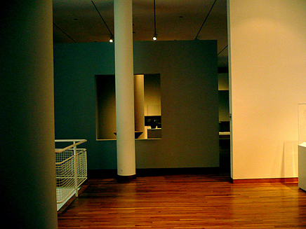
High Museum, Richard Meier
Piano's building lacks a real procession either to or through the art. Instead it has openness and light. The buildings are conjoined by glass bridges and one of my favorite moments was looking at the two buildings from inside this seam. From this perspective, the difference between the stone cladding of Meier and Piano's metallic and somehow still softer paneling was accentuated in the overcast light and drizzling rain. From here, I could look to one side and see Piano's enormous light-filled spaces, and to the other were Meier's geometric wombs.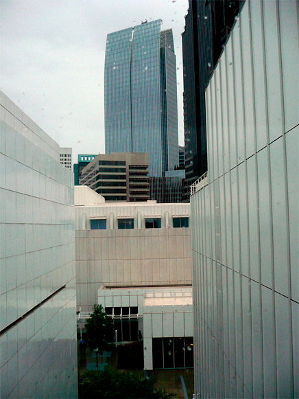
High Museum, connecting glass bridge: Meier's original building on the left, Piano's extension building on the right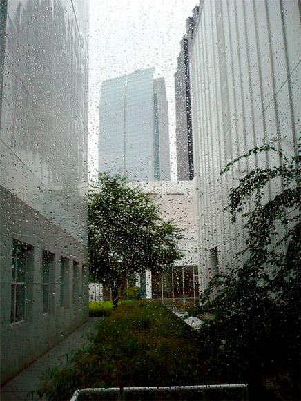
High Museum, connecting glass bridge: Meier's original building on the left, Piano's extension building on the right
It must be noted that the two commissions are not really comparable. The two projects responded to different contexts and demands. Piano, designed a cafe, spaces for large artworks, and multiple buildings. His piazza, once the trees are more mature, will be shaded and picturesque. Whereas Meier was creating a new cultural center and symbol for Atlanta, Piano was completing a cultural campus.
In an interview earlier this year, Piano was questioned about his designs for the recent expansion to the LACMA. He emphasized that for him flexibility and openness were key concerns in museum or gallery design, and this rather than a simple repetition of style was what explained any similarities amongst his spate of recent museum expansions. Similarly, Norman Foster in a recent conversation with Charlie Rose, discussed his project for the Sperone Westwater Gallery in the Bowery, NYC. For Foster, some of the best galleries and best spaces are industrial spaces "because they are less self-conscious". Such a bare space is more respectful "letting the art be the protagonist", as opposed to stealing the show by imposing the architect's personal vision.
But in the end, is architecture only about providing a respectful, functional space or also about introducing differing ways of experiencing space? Personally, in the case of an art museum or cultural building, I would argue the latter. We go to such sites specifically to be exposed to new ways of seeing the world. The architect can facilitate this goal as well. By introducing new spatial experiences and their own personal spatial visions. Why should the space respect the art? Maybe we need more disrespectful gallery spaces.
So what did my friend have to say to all this? His response was that Piano is an "architects architect". With his buildings, the beauty is in the details. He suggested that Piano's work is less about an overall narrative and more about moments. Where two surfaces or materials meet. About seams, joints or technique. Not spaces. Meier makes big visual moves, shapes space more experientially. It is an architecture which makes itself seen. Whereas Piano's seemingly minimal intervention requires detailed precision. Ultimately his work displays, for those who know to look, craftsmanship. Which perhaps is fitting. His firm is after all called Renzo Piano Building Workshop.
Creative Commons License
This work is licensed under a Creative Commons License .
/Creative Commons License
An ex-liberal arts student now in healthcare informatics, I am a friend of architects and lover of design. My interests include: learning/teaching, religion(s), sustainable ecologics/ies, technology and urban(isms). I was raised in NYC, but after almost two decades of living in North Florida I ...
1 Featured Comment
In a related discussion from his Festarch 2011 presentation Rem Koolhaas makes the case for why the Tate Modern not Gehry's Bilbao will in the long term be a more prescient model for examining the issue of art vs architecture and the tension between actual architecture or repurposes postindustrial spaces http://vimeo.com/26953585
All 10 Comments
Very well thought out observation Nam. I had the good fortune of visiting the high museum days before the formal opening of Piano's wing and was met with the same emotion. His work has always been sedate though with a measure of poetry. The high museum however lacks the play of drama embodied in others, say the de Menil museum.
The beauty of Meier's High in contrast to his oeuvre presents a restrained expression in the interior, that is light, airy and held together cohesively with a dramatic ramp and procession.
I think you make some interesting points, but one that I would make is that Meier’s soaring atrium is ‘replaced’ in the addition by Piano’s piazza. That space was always intended to be an outdoor room, and absolutely part of the entry procession, but it was also a way to connect the museum to the rest of the city. The addition was less about making the insulated experience.
Regarding Piano’s procession through the art, Meier was creating a space to house single collection of art that could be connected by the ramp through the atrium. His concern was connecting the galleries he was creating. Piano was not only adding to those existing spaces, but creating connections on multiple levels. For example, assuming the Stent Wing (the original Meier building) was intended to be part of the new procession, and not an insulated collection to be experienced on its own, it would be virtually impossible to create the large versatile spaces you saw and described in the expansion and still have a seamless sequence – if for no other reason, the fact that the original has an extra floor than the addition makes that idea very difficult.
Lastly, Piano is incredibly humble considering his notoriety, and I would think that he has great respect for the work of people like Picasso, Renoir, O'Keeffe, Rothko, etc., and because of this he lets his architecture take a back seat. He takes the same approach to Meier’s building. Once when he was asked in an interview specifically about the expansion not possessing the same jewel quality as the original building, he answered something to the effect that when your good you don’t have to worry about competing. He was confident enough in his own design to the point that it did not need to be provocative or overbearing.
nam, classic question asked. 'museum of space' might be the answer instead of architects trying to kill two birds with one wall. my candidate for m o s would be f o g he doesn't even have to be tipsy curvy..
or,
teshima art museum
http://www.designboom.com/weblog/cat/9/view/12559/ryue-nishizawa-teshima-art-museum.html
edge all very good points, particularly the last one re: confidence in his work...
Good article nam.
I eventually came around and started to appreciate the Meier wing more after the Piano extensions were added for many of the same reasons you identify.
The best museum I've ever been in is the American Folk Art Museum in New York by TWBTA which I think perfectly harmonizes with the art it displays. I wish more museums could be designed like that, as opposed to the pretty, flavorless white boxes that pop up everytime someone "want's a museum, but not a Ghery/Zaha/Etc". Meier's museum I think sits very well in that middle ground between white box and icon.
Nam - a couple of other points to consider about both buildings: Meier's was a commentary on the kind of urban planning that Atlanta had largely engaged in up to that point in it's history and was deliberately placed as an object in the lawn (eve Gettyn though, as you know, it sits in one of what should be the most urbane streets in Atlanta). The kind of promenade he creates through the ramps is also echoed throughout the galleries themselves (in fact a better comparison might be between the High and the Getty complex he completed 14 years later). For me personally, the compulsion to 'keep moving' as suggested by the architecture doesn't do as much to support a more contemplative experience of the art itself. In fact, ask yourself this: if it were a retail store selling Alessi, would you feel different about the quality of the space?
Piano's urban moves, at least at the piazza level, are perhaps more supportive of creating some really nice outdoor 'rooms' within Midtown (something which is sorely lacking - especially when you stroll 100 yards to the south and see the ACA courtyard - hard to believe it's the same architect). From an interior perspective, the Piano wings are really quite wonderful at the top levels - the daylight works, the proportions are quite good, and the overall atmosphere encourages more 'lingering' and less of a pre-determined route through the galleries. The effect doesn't work quite as well at the lower level galleries. So, there's tradeoffs in both. Where the Piano is a more satisfying building, to me, is that it rewards the repeat viewer of the art more, whereas the Meier is much better suited for a one time visitor who's going to churn through the latest blockbuster and then get back on a bus. Neither is 'bad' and actually make a pretty decent complimentary pair...
Greg,
The only place I might differ with you is re: the circulation. I think in Meier's building the circulation works very well from floor to floor and around the atrium. Yet, in terms of "keep moving" I think once you get into the galleries the repeated and insular geometries that Meier created actually promote a focu/contemplaion on the art in each gallery, more so than in Piano's. If only because the galleries in Piano's expansion are so large and expansive.
The one area of Piano's building where this isn't true is small traiangular slice of a gallery in the top floor towards the side of the main gallery (away from Meier's building).
I completely agree though about the urban moves with regards to Piano's plaza.
nam, I read this awhile ago and kept forgetting to comment. Very nice analysis, and the Meier building seems to be a lovely experience - it's so enjoyable to read the experience of an actual person moving through the building instead of only seeing pictures. The photos of the space between the two buildings are great - one of my favorite spatial experiences is to see these funny leftover "cleave" spaces.
In a related discussion from his Festarch 2011 presentation Rem Koolhaas makes the case for why the Tate Modern not Gehry's Bilbao will in the long term be a more prescient model for examining the issue of art vs architecture and the tension between actual architecture or repurposes postindustrial spaces http://vimeo.com/26953585
Block this user
Are you sure you want to block this user and hide all related comments throughout the site?
Archinect
This is your first comment on Archinect. Your comment will be visible once approved.