
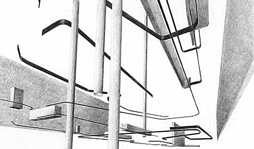
The Ken Roberts Memorial Delineation Competition is the most senior architectural competition currently in operation anywhere in the world. Recently, Archinect Senior Editor Namanand Henderson traveled to Dallas to judge this year's entries. Besides reflecting on the experience of judging, Nam also had the opportunity to explore some newish additions to the Dallas skyline. Twenty years have passed since the last time Nam was in Dallas, and he found that big things have been happening downtown.
by Namanand Henderson
Click here to view the winners of KRob '10 on Archinect's sister site Bustler
Context
The Dallas (DFW) airport is an aerotropolis, mega in scale. So is the city. The two merge at some point along 114. Last time I was in Dallas was almost twenty years ago. The years have been good to the Downtown. I arrive at night via cab. There is lot's of money evident in all the brightly, lit buildings, like billboards visible from the interstate.
An Arts District has taken hold along Woodall Rogers Freeway. Plans are currently underway to cap the entire section near downtown between the Fairmont Hotel and Dallas Center for Architecture. This sort of freeway capping is a big bid for pedestrian life downtown. A skyscraper of luxury condos is already sprouting near the eventual park across from the Nasher Sculpture Center.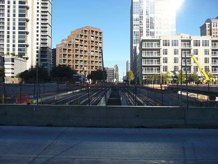
↑ Click image to enlarge
Looking North East across Woodall Rogers Freeway
The last morning I was in town I managed to take in the Arts District, relying on a BMW branded bicycle (checked out from the hotel). It was early and in general people downtown were already at work, so the streets and surrounding landscape(s) were mostly empty, except for the odd runner or performing arts worker crossing from one building to the next. I wasn't able to explore the interior of any of the buildings but just experiencing them as objects in a field was powerful.
I wonder how they will read once the freeway park is completed. There will be a whole new experience, for the north facing sides of these buildings.
While all of the architecture is of a high, professional caliber each of the recently completed buildings featured one or more details that particularly resonated with me. The Margot and Bill Winspear Opera House (by Foster + Partners), sits in Annette Strauss Artist Square where even the lawns are sponsored, and features a loud red, flying saucer-like aesthetic.Yet, this heft of the red performance spaces is matched by a large and metallic louvered system, which provides shade and mass to create a more layered edge to its envelope. This building in particular already against the freeway will have an especially new facade to present of itself. In this connection I noticed that the raw concrete, northern "rear" featured a delicate pattern of wire hardware to support a growing, green growth.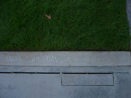
↑ Click image to enlarge
A sponsored lawn adjacent to Margot and Bill Winspear Opera House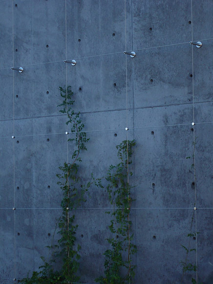
↑ Click image to enlarge
Future green wall facing Woodall Rogers Freeway
The Dee and Charles Wyly Theatre (by OMA/REX), presents an immediate verticality to the Winspear's feeling of horizontal, flatness. The spectacular tubular siding reflects the cold Dallas sky and makes the built in side board easier to read during the daytime. I was also able catch one of the external, movable back of the house innovations in motion. More than anything though it was the ADA ramp which extends all the way down the slope towards the Wyly's entrance and ticket booth which I spent the most time viewing. While at first assumed to be designed through the logic of ADA, the various cutbacks in the slope provide an amazing opportunity to develop little ecologies of wildflowers and grasses. The plantings were swarmed by a flock of starlings (or other city bird) I saw feeding/resting there. Moreover, the seeming drainage complexities of such a slope were I was told, expertly handled.
↑ Click image to enlarge
Flexible, modular Dee and Charles Wyly Theatre in action
↑ Click image to enlarge
ADA designed or green storm-water infrastructure?
Across the corner from both is Booker T. Washington High School for the Performing and Visual Arts . The school consists of the original school built in 1922 as the first African-American high school in Dallas and a sensitive, contemporary addition by Allied Works Architecture. In massing and material the structures though not alike are similar with the addition in particular, exuding a generic industrial feel that seemed somehow appropriate.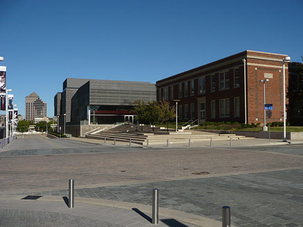
↑ Click image to enlarge
Booker T. Washington High School for the Performing and Visual Arts in Dallas: Lang and Witchell vs. Allied Works’ Brad Cloepfil
Judging, Presenting the Winners and a Lecture
The reason for my trip to Dallas was to participate in the 36th Annual Ken Roberts Memorial Delineation Competition as a judge. This was my first time judging anything as part of a formalized process. I felt that as a panel we selected strong winners though. I think part of the process for me, entailed holding my final judgment until I had allowed the other judges to explain their own positions. This dialog forced me to listen. Yet, also required that I have a clear opinion to express.
My own impression of the work was high. Some other notable juror impressions were: the repetition of a dystopic Blade Runner aesthetic, a distinction between digital, mixed and hand is not impossible, a lacking of "classic heroic shit", and repeated critique of the use of "lazy shadows ". As for the winners, Best in Show by James Thompson AIA, while a seemingly traditional pick, continued to resonate throughout the day with all of us. It also, perfectly illustrated the difference between the impact of the correctly chosen word vs the long sentence.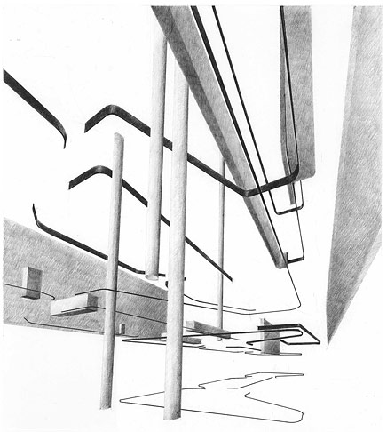
↑ Click image to enlarge
James Thompson AIA: Little Diversified Architectural
The juror selections allowed for each juror to highlight a submission of individual taste. After spending the day judging, judges presented the winners to a audience of mostly local AIA professional and students.
Qiaolun Huang's submission was selected for its complex perspectives and use of color. Each panel appealed when viewed at the individual scale, it could also be understood as visualizing a process. Viewed as a whole one juror remarked it would make a great calendar. Noteworthy for its storyboard(ed) character.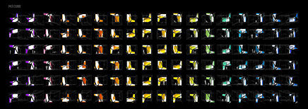
↑ Click image to enlarge
Qiaolun Huang: CORNELL UNIVERSITY
Sang Dae Lee's submission featured dynamic use of color. Lee's entry stood out. It questioned the line between rendering and physical model. The submission had depth, unique perspective and a digitized flatness.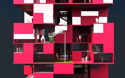
↑ Click image to enlarge
Sang Dae Lee Assoc. AIA: SOUTHEN CALIFORNIA INSTITUTE OF ARCHITECTURE
Cyrus Penarroyo's submission was chosen because, while at first glance a typical sectional drawing, it features a high level of detail. Simple, black and white. It also demonstrated a sense of humor: for instance the figures include scuba divers and couples having sex. The generic clip-art type imagery was also noted.
↑ Click image to enlarge
Cyrus Penarroyo UNIVERSITY OF ILLINOIS - CHICAGO
Afterwards, Dan Woods of Workac gave a lecture. He proceeded to frame the work of Workac as focused on the relationship between nature, architecture and urbanism. Some slide titles, included "there is no nature " and a jolt of nature , the idea being that designers need to go beyond sustainability and think about reintegration. Productivity, is the key mantra: of energy, food ecologies, housing and even social interactions. After the lecture, discussion continued. Someone noted the differences between recent downtown developments between Ft. Worth and Dallas. Both cities have enormous capital devoted and interested in encouraging further growth. There are committed local actors who have backed and continue to support a philanthropy of urban, cultural development.
Two questions in particular seem to be of broader contemporary concern. The first, was the need for post-facility programming. Whether it is a single museum or an entire cultural district, not only do projects need to be self sustaining in a budgetary sense, but more importantly in terms of population. Customer groups, students, visitor or, donors all are users, buildings should be used. Other than simply creating a physical structure or infrastructure what role can a designer play in post-occupancy developments? Would such an engagement cross the line into facilities management or event planning. Would that be a bad thing? These pressures of programming and funding in turn, contribute to the growing privatization of our built environment. Ft. Worth for example has developed at least in part as a result of privately controlled parking and security. Services provided through urban development.
Perhaps, one approach is to view the role of the public and civic, much like in the case of post occupancy programming, as providing a basic infrastructure or framework. Or maybe not. One thing is sure, urban development will happen. The question is for who and how. My belief however, is that urban development isn't just about physical development. It requires and must include more "soft" developments. Those of the civic-social, public-private and productive-creative.
An ex-liberal arts student now in healthcare informatics, I am a friend of architects and lover of design. My interests include: learning/teaching, religion(s), sustainable ecologics/ies, technology and urban(isms). I was raised in NYC, but after almost two decades of living in North Florida I ...
7 Comments
Nam,
I enjoyed your detailed overview. Your links are informative and helpful. But what do you mean by "classic heroic shit"? Is that the "heroic moderism" as characterized by the Smithson's in their essay The Heroic Period of Modern Architecture or the rough and tough industrial look as illustrated in Reyner Banham's book The New Brutalism. Ethic Or Aesthetic or just modern functional expressionism? Or?
eric chavkin
Eric,
Good question. It was actually a quote from one of the other jurors and I hesitate to speak for him. Perhaps, I can get a clarification though. I do think that the lack of "classic heroic shit" was noted in a positive sense...
As for how I read the phrase. I also felt it was representative of the fact that there was a lacking of any big statements being made graphically. While many of the submissions portrayed a personal aesthetic vision perhaps less so a personal ethics?
Does that make sense. I didn't see many visual manifestos as it were. Which given the focus on delineation is perhaps quite correct.
great write up...interesting to how our experiences differed, and how in some ways they were similar.
Visual manifestos are good. They put the cards on the table. And manifestos dont have to be 'classic modernist shit'. I'm thinking of the works by Venturi, Hollien, Tschumi, Koolhaus,... It's kinda of a straw man argument to equate manifestos with classic modernism. and old.
Now. What I like about manifestos in general, especially the visual ones, is that they explicitly state the design intentions as well as the ideas in order to bring forth debate. In the best possible scenario they confront the audience. I also think manifestos are more courageous than the personal poetic presentation. I think here it is better to engage than be admired.
eric chavkin
It’s interesting to me to look at the contrast of winners from 2009 and 2010. I must say that this year’s winning entry lacks rigor. Maybe 2 hours of work went into that. People in my office found it to be an odd choice. Not odd in an interesting way. I am curious how this submission was talked about.
Bartlett kids just need their own competition. They should be grouped separately. Too good
Thanks for giving us some insight into the judging. Thanks for posting
I enjoyed Nam's lace work like writing going in and out of different experiences and the impressions of his outsider eye. Thanks for interesting perspectives.
I don't really have too much positive view of cities branding themselves with arts and culture as these things often translate into palatable propaganda of underlying gentrification schemes. A win win situation for developers, philanthropists and their politicians. Cultural production in the hands of capitalism has some real issues in the background.
garch21,
Speaking for myself, (and keeping in mind the winning submissions had to be unanimous) I liked the winning entry because it was traditional in the sense of being a non-digital hand drawing. Not because I hate digital but because the majority were digital to the exclusion of hand. Plus, unlike some other entries it seems to represent an actual program, to be an schematic of flows... Abstract, yet I could still picture a structure.
Orhan as for the whole urban development through art and culture. I hope I sounded sufficiently skeptical of that sort of approach. Don't get me wrong it produces some wonderful buildings. But first it seems to be directed towards a certain slice of the urban population and second it has real problems to work through with regards to budget and customer base to ensure it doesn't just result in mostly empty buildings (except for the occasional big event).
Block this user
Are you sure you want to block this user and hide all related comments throughout the site?
Archinect
This is your first comment on Archinect. Your comment will be visible once approved.