

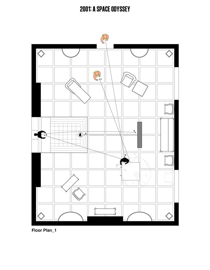
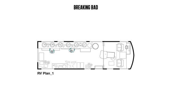
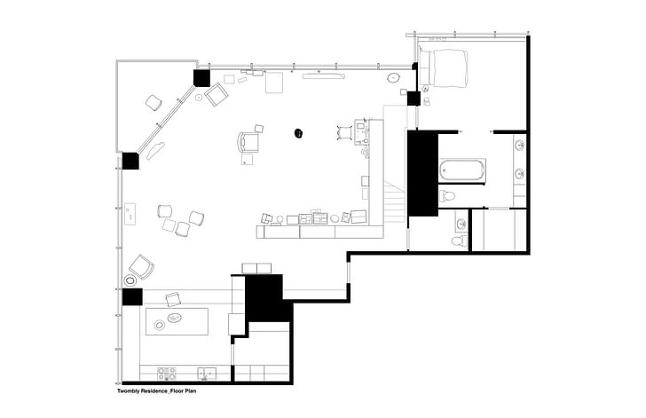
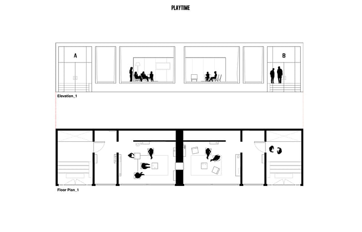
Filmmaking is a labor of love that shares architecture’s compulsion: to model a stratum of life down to the most precise detail, creating entire worlds that do not (yet) exist. It seems natural then that an architect and filmmaker would combine forces to create Interiors, a journal of reconstructed sections taken from famous scenes in classic films.
Interiors is made by Mehruss Jon Ahi (architect) and Armen Karaoghlanian (filmmaker), reveling in the intersection of their disciplines with crisp floor plan sections and scene walkthroughs. For their Cutting Room interview, Ahi and Karaoghlanian spoke with Archinect about their architectural critique of films (and television), and what Interiors may become in the future.
Describe your current professional work.
Mehruss Jon Ahi: I am the Creative Director of Interiors. I am also the Design Director for a design firm in the San Francisco Bay Area.
Armen Karaoghlanian: I am the Editor-in-Chief of Interiors. I am also an independent filmmaker based in Los Angeles.
How did you start collaborating for Interiors?
MA & AK: Interiors was founded in December 2011 and our first publication was released in January 2012. The relationship between film and architecture interests us both a great deal. We founded the journal because we wanted to further explore both mediums and bring together both of our backgrounds. Armen is a film scholar and filmmaker and Mehruss is an architectural designer, so merging our worlds together was a natural process.
How do you split the tasks of writing and drawing between the two of you? Walk us through the process of putting together an issue of Interiors.
Mehruss Jon Ahi: Armen and I both handle different sides based on our backgrounds. I handle the architecture side, which also includes the creative direction. Armen handles the film side, which includes all of the writing, editing and the liaising with various filmmakers. It’ been incredibly easy and fulfilling to work together because each of us knows our role and we don’t overstep them in any way. This is best reflected in each issue that we release, because we stick to the same layouts and structures. In that sense, there is a sense of familiarity with each issue for our readers. The design decisions (layout, structure, cover, icons) were all planned beforehand so that Interiors could develop its own brand or standard. We tend to be influenced by strong graphic identities, such as Apple, Nike, AMO and DONDA.
What is your critical approach to writing analytical pieces about architectural sections?
Armen Karaoghlanian: I’m very big on research, and if I’m not as familiar with a specific time period or architect, I start doing my homework. I don’t focus too much on technical specifications, whether it’s architecture or film, because I want our work to relate to the everyday person; with that said, I want the work to be as informative and detailed as possible.
How do you decide which films to feature?
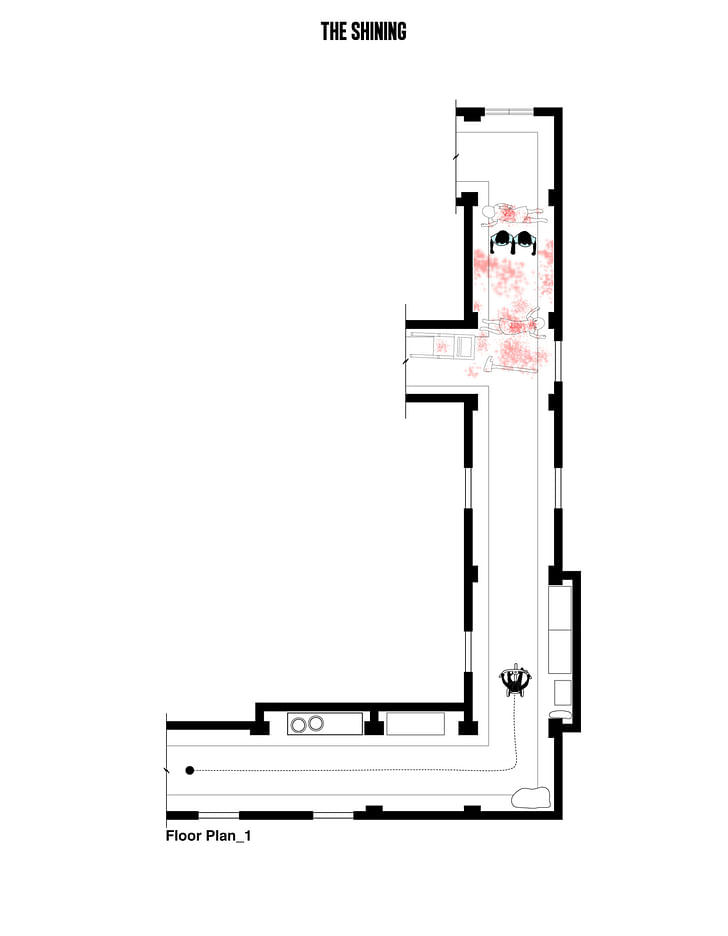
MA & AK: In terms of how scenes are chosen, we often select scenes that are integral to the narrative of the film. This could be an iconic moment in a film or a significant moment in the film in terms of a character. The first part of the process is choosing a scene or moment that is capable of being diagrammed. Often times, a scene is shot from only a few angles which makes it very difficult, if not impossible, for us to diagram. We pride ourselves in our accuracy so we always try to make sure that we are able to see a majority of the entire space. We then match those camera angles on a drawing and piece these moments together. Mehruss’ training and education in architecture has allowed him to make educated guesses regarding the lengths, heights and widths of interior spaces. Like any architect, you usually try to find a door or a window and base the rest of the room dimensions from that fixed dimension.
[Design process for Interiors Journal, using Spike Jonze's "Her"]
Who do you think is the ideal audience for Interiors? Who would you like to show Interiors to who might not come across it?
Mehruss Jon Ahi: I think the misconception is that this only appeals to film and architecture students. We have found out over the past two years that it’s possible for Interiors to reach a broader audience. We created an online store that features our diagrams as art prints because we discovered that people were treating our floor plans as such. We started doing exclusive pieces for websites and magazines and we are constantly trying to reach new artistic fields and capture new fans.
Armen Karaoghlanian: I am mostly interested in having more filmmakers become aware of our work. The filmmakers we have collaborated with have all expressed their admiration for our work. I’d love for Interiors to become part of the filmmaking process -- having us on set, seeing how spaces can change during filming, and having us write about the films before and after they’re made. I’d also love for filmmakers to become more involved with our process, because that’s when our work is at its best.
What is the end-goal of Interiors? Do you imagine compiling the sections into some kind of database that can compare the architecture of film environments through classic films?
Mehruss Jon Ahi: Personally, I think the sky’s the limit in terms of what Interiors can do. From the very beginning, we tried not to create an “end-goal”, only because we knew that it could go a million different ways. We’re constantly looking ahead in terms of where we see Interiors going and what avenues we’d like to start looking into. We were fortunate enough to be included in two exhibitions for The Hero Complex Gallery in Los Angeles, which validated the artistic merit of our architectural drawings. We have also formed a production company and are in pre-production on a short film. This will help incorporate our analysis into films. In addition, we will be teaching our first film and architecture class for Woodbury University in Burbank, California later this year and will be organizing several events throughout the school year. These are just some of the many ways that we hope to grow Interiors in the next year.
What can architects gain from studying film? What can filmmakers learn from studying architecture?
MA & AK: The fields of architecture and film often go hand in hand and I believe that having an understanding of each is extremely beneficial. The various artistic fields are so closely related (art, architecture, film, music, fashion) that it’s very important to have some level of understanding about all of them. If the medium of film incorporates all other art forms, then having an in-depth understanding of these art forms only adds to the filmmaker’s set of tools.
Former Managing Editor and Podcast Co-Producer for Archinect. I write, go to the movies, walk around and listen to the radio. My interests revolve around cognitive urban theory, psycholinguistics and food.Currently freelancing. Be in touch through longhyphen@gmail.com
3 Comments
The intrest for me is not the reproduction of architectural interiors for film but the illusions art directors create by modifying and mannering the architectural space. The camera is the eye here and illusionary trophs like dissovling walls, impossible pov.s, mobile mise-en scene are what I look for in filmed art direction/ architecture.
The tricks of the art directors trade are common folklore in the film world. Much more is out there than the same overused and academic examples in this case ie PLAYTIME, THE SHINNING, 2001.
Art directors like EUGENE LOURIE, ANTON GROT and ALEXANADER TRAUNER come to mind. and BTW all studied or were architects.
As architecture leers more and more towards the filmic I would suggest Netflix and TCM, my fav
Interiors is great
Fun project, but why these guys? This has been done before... No judgment on quality or anything else....
http://www.mymodernmet.com/profiles/blogs/inaki-aliste-lizarralde-tv-floorplans
Block this user
Are you sure you want to block this user and hide all related comments throughout the site?
Archinect
This is your first comment on Archinect. Your comment will be visible once approved.