The "Hero" Shot and Supporting Images
When working for architectural clients there are usually two types of images they're looking for. A main advertising style photograph, often called the "hero", and the more detail focussed shots, showcasing interesting design features, often less dramatic than the hero but just as important. Mostly the hero photos are displayed by themselves, perhaps on magazine covers or websites. Other supporting detail shots can be put together as montages or with added branding, used as printed pamphlets or promo packages. Todays images feature examples of both. Let's get started.
The Hero: MarkIs Main Entrance and Canopy

Advertising style architectural images are traditionally shot at either dawn or dusk to get that deep blue colour in the sky, and to also make use of any exterior or interior lighting on the building itself. Hero shots are usually very "graphic" in nature (at least mine are) with strong lines and accented angles. Here are some of my thoughts on this image:
How I Edited It - Workflow Video
http://www.youtube.com/watch?v=0lr2bJnuz-U
For those interested please have a look at this video and some of the others on my YouTube channel for other editing and BTS videos.
Detail Photos: Branded Pamphlet Mockups
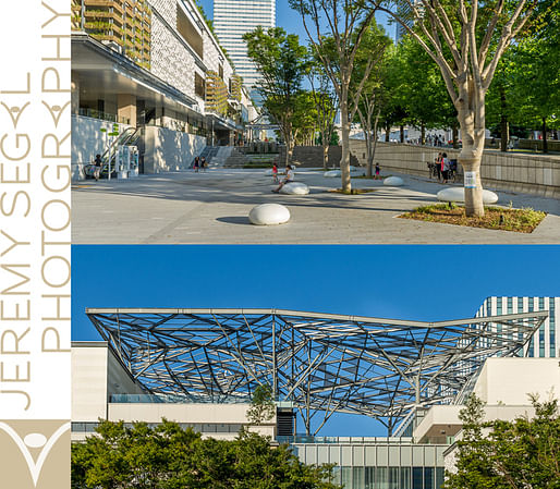
Here are a few extra detail shots I made along with the main photograph. I've created pamphlet mockups, branded with my logo, as a way of demonstrating how detail photos can be made stronger when viewed in context together rather than just individually. These supporting images are key in illustrating specific points of design and to make viewers more aware of the building as a whole.
Above you can see how simple yet visually pleasing two detail photos can be when used together. Add a sidebar with my logo and this could be used a nice little promo package for clients or for brand awareness on the internet. The 2:1 crops work nicely together as does balancing the blue sky with the green above.

I mentioned before that showing architectural detail shots together rather than individually can look really good because the shots next to each other provide visual reference. You can see the panelling detail, bottom left, next to a wider ground level photo with the same panelling visible on the wall above. They all tie in to one another.

Finally, I changed the colour and position of my logo to see how it looks. To be honest the sidebar with the lighter colour is a better choice but I want to show that were not limited in layout or design. It all depends on the photos that makeup the spread. Logo, no logo, alternate colouring, two photos, a triptych, it's all possible. Putting detail shots together into packages can really add visual interest. The sum can definitely be greater than the individual parts in this case.
Final Thoughts On MarkIs Design
Mitsubishi, as a giant multinational corporation with literally hundreds of designers at its disposal, you might think their designs would be unoriginal and boring, but somehow they manage to stay fresh and creative with most of their projects. Some thoughts on the overall design of MarkIs Mall:
Deliverables
I hope I've given you some insight into how I process a main hero image and how I present other detail images to clients. I Don't always create these types of photomontage as deliverables to paying customers, only if they ask. Most times the client wants to make their own so I deliver the individual high-res files for them to put together themselves.
Individual detail shots are a key component for the work I do and when presented together with one or two advertising style "main" photos as a package, really goes far in presenting the architects complete design vision to the viewer. A well-lit, well composed package of architectural photographs presented in the ways I talked about above can do very well with promoting any new design project or development.
A place to inform, discuss and display current architectural photography and to connect with lovers of digital photography and design. Showcase architects and their work through the display of skilfully crafted, beautifully artistic photography. Discuss and exchange ideas on photographic trends and techniques as they pertain to the architectural industry.
No Comments
Block this user
Are you sure you want to block this user and hide all related comments throughout the site?
Archinect
This is your first comment on Archinect. Your comment will be visible once approved.