Jun '12 - Mar '17

Hi Archinect,
< UPDATE: You can now subscribe to my blog on my website and get a FREE RESUME TEMPLATE right in your inbox. >
First, I want to congratulate all the new graduates this year!!! Are you ready for the real world? Finally, you graduated after five years (or more) of hard work, and its time for you to get out there and find a job. When I first graduated, I had no clue what to do with finding a job. (My school didn’t really have much support when it comes to architectural jobs unfortunately.) I blindly sent out a bunch of resumes and work samples, even though I didn’t know what a work sample was. So I decided this week I will share some of my thoughts on how to make your resume (while eating this fancy Sea Salt Fudge Truffle icecream...). Feel free to put in your ideas!
Here is my current resume:
See more resume examples after the break.
View full entry >>
(This will take you to my website.)
Don't forget to subscribe on my website to get a free template!
Joann
joannlui.com
Follow me @joannlui
I educate architects and designers (just like you) to craft a creative career that fuels your soul, reach your goals and share your talents to the world. I strive to make your life easier and give you real actionable strategies that I’ve used to build my career step by step to working in a world renowned architectural firm. More free resources are available at joannlui.com/blog.
15 Comments
So sorry dude or duddette....can't read your resume....everything is way to small....what da "
"F" they teaching you in schools these days? Actually buster you have the brawn to put it out there so go figure out how to reach the masses by giving them something to read.
Well...they are 10 pt fonts, which is pretty standard for a document. And the actual size is bigger than what's shown here. You know it's just a jpg that got shrunk to fit the page.
Thanks for reading though.
don't know what the other poster's problem was but i think you've shown some great resume examples here. informative, easy to read, and shows off your presentation skills. can i ask what fonts you used in your friend's UX resume?
@yyoj
The font I used is Klavika. Found it very useful when it comes to computer-related designers. The closest free font I can find would be Exo. Thanks for the encouragement :)
Your resumes look awesome! Thanks for the inspiration :)
@aliceye
Thanks :) Glad it helps.
nice work on the resume!which software did u work on?
@deema14
Thanks! I worked in Illustrator.
Wow I love your resume! So simple but chic! May I ask what fonts you used? :)
@sacyap
Thanks! I think I used Helvetica in my resume, and Klavika on the other one. Hope it helps!
don't fear the Serif.
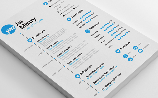
Joann - you (and others) may find these resumes or even these resumes.... interesting. They're all graphic/UX/UI graduates. Some of them are completely over the top, but they're way more graphically sophisticated than most of ours. Interestingly, for me, there's a lot more emphasis on communicating your skills with various software platforms. Even with that, there's a couple of solid ones in there for sure.
We're definitely in 2 different professions, but it's another take on to get your message across...
Gregory - Thanks for the links! They are very cool design, some are very over the top but some are quite good. Like this one: (and he uses the same colors I did!)
I think most of the time with colorful resumes you would actually send in a hard copy with some fancy paper. Since companies definitely won't print the resumes out with that much color. Making a resume like these could be a good way to practice self-branding and edit our graphic skills though. Often times in our profession, we need to learn how to communicate information graphically without being too overwhelming. Edit Edit EDIT!
In the spirit of #3, I would also like to add "grammar." On that subject, #4 should be "Make it relevant" not "Make it relevance."
Thanks!
The advice in the OP is fairly good, if somewhat generic. The examples, however, are poor. Far too cute and try-hard, particularly the UX resumes. When I get stuff like that, it goes right in the round file.
KEEP. IT. SIMPLE. Lose the graphics and the colors. Black (or dark gray) text on bright white paper. One and ONLY one (readable) font at 11 point or larger with LOTS AND LOTS of white space. Use bold and italics for emphasis. Except for the blue, OP's resume gets that right.
If you feel the need to brand your letterhead, keep it simple and elegant. It should not be distracting.
Focus your message. Prospective employers want to know two things about you: What can you do? and, How can you make me money? That's it. Give specifics about both, using examples from what you've done and how.
The format OP uses for work experience, etc. is pretty good. Busy people love bullet points, and the information is specific and on point.
Block this user
Are you sure you want to block this user and hide all related comments throughout the site?
Archinect
This is your first comment on Archinect. Your comment will be visible once approved.