
Over the holidays I visited the new Parrish Art Museum, in Water Mill, NY on Long Island. The museum, which opened a couple months ago, has a mind-boggling history. In 2006, Swiss architects Herzog & de Meuron unveiled their plans for a series of 30 angular, low-slung pavilions with over a dozen different roof angles. Projected construction cost came to $82 million, a good deal more than the museum’s original $65 million budget. In 2008 the Parrish appointed Terrie Sultan, formerly of Houston’s Blaffer Gallery, as its new director. Terrie asked the architects to completely rethink the entire project with a budget more in tune with the post-economic downturn economy.
 THE PARRISH ART MUSEUM IN WATER MILL, NY, IS AN ELEGANT, SIMPLE DESIGN.
To the architects’ credit, they did precisely that and made a much simpler building–one that is both more flexible and actually displays the art better. The building is not pretentious, flaccid, or in any way reflective of the “make shapes, make shapes” trend so common today. The architects created a simple, honest building, and a great example of getting the most bang for the buck. They demonstrated the fact that good design can come with modest means and is not only for the rich and profligate. Square footage dropped a small amount (from 80,000 sf as planned in 2006, to 63,000 sf actually built), and the project was completed for only $26.5 million. Amazing!

THE BARN-LIKE STRUCTURE IS OVER 600 FEET LONG.
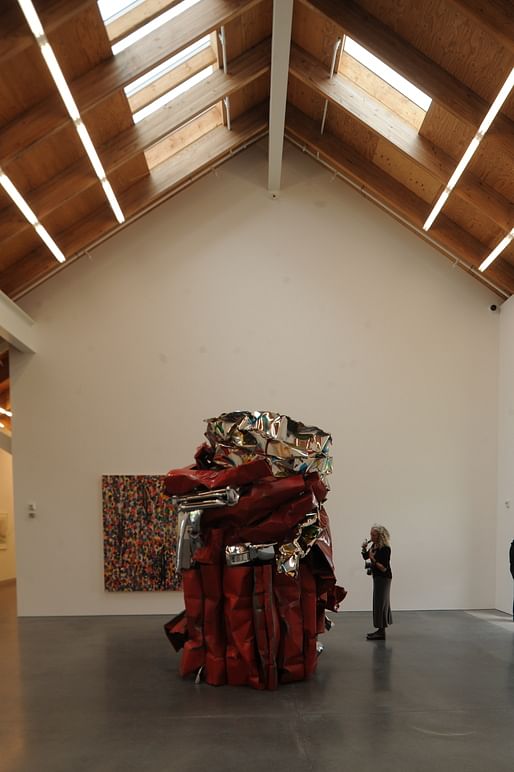
I spent the better part of a day there, and came away thoroughly impressed on all fronts. This building does just what it needs to do. It derives its form significantly from vernacular structures of eastern Long Island. The walls are made of rough, honest concrete with no fancy finishing; the material looks like what it is–big, heavy mud. Concrete was chosen both for its contribution to thermal stability and its association with the local potato barns. Very little artificial light is used as natural lighting is captured perfectly by orienting the building north-south on the site. What artificial light is used appears in the form of basic, simple fluorescent tubes. The result is gorgeous.
 WALLS ARE MADE OF ROUGH, HONEST CONCRETE, FREE OF ELABORATE FINISHING. INTEGRATED BENCH RUNS FULL LENGTH OF THE BUILDING.
Some of the architectural press has called the building “stripped down” and “overly cautious” and has even suggested the architects are “just passing the time until the next great ‘fireworks’ project comes along.” I beg to differ. Pierre de Meuron has said this project helped return them to their roots (like the incredible Goetz Gallery in Munich or the Dominus Winery in Napa Valley). This is powerful, authentic architecture with no need for hype or overindulgence. It demonstrates the Eames-like talent of its designer for making simple, sensible things incredibly potent.
It’s time to make architecture that is genuine, authentic and intrinsic to the problem, and it is refreshing to see such a clear example of the “old way” given up for a “new way” of looking at architecture.
 INTERIOR LIGHTING IS GORGEOUS. BASIC FLUORESCENT TUBES SUPPLEMENT THE ABUNDANT NATURAL DAYLIGHTING.

EXAMPLE OF LOCAL STRUCTURE TYPE WHICH INFLUENCED HERZOG & DE MEURON.


Although it may sound cliched, I live, eat and breathe architecture. I’m currently a principal in the architectural firm of PageSoutherlandPage and a professor, as well as the former dean, in the School of Architecture at the University of Texas at Austin. My teaching and my blog are aimed at educating people on the importance of great architecture in contemporary American culture.
20 Comments
very nice - though i'd like to see a different lighting approach than their dan flavin-esque answer. i mean i get its 'dumb' linear emphasis but in the photo above i think it detracts from the repetition of the rafters and skylights which is pretty darn tasty.
yeah.. 'elegant' only because its Herzog de Meuron. Bet no one would even notice or call it boring if it was some no-name architect who built it
I love the bench integrated into the cast base block. Love it so much. The whole building looks really lovely, and it is nice to see HdM get back to the most simple expression of material that made me like their work in the first place.
Also "Make shapes! Make shapes!" is my new favorite critique of architecture. I will use it frequently.
it's goofy for anyone to suggest that this project was inexpensive. despite the cut in budget, it still cost more per sq ft than any project i'll likely ever see.
I don't think I agree, Steven. So it works out to $420/sf (according to the numbers above, and we don't know if the $26.5mil is construction or project cost, of course). That's really not outrageously expensive, in my opinion, for a building meant to last - and provide appropriate museum-quality interior space - for 100 years, as this one probably is. According to wikipedia (hm) the cost of the new Speed Art Museum in L'ville is over $800/sf.
Now in general I do think construction costs right now are just really, really high, even with the recession - but are construction costs out of line with general inflation?
I blew by it on the train and noticed it accidentally. It is stunning sitting on the field of green. I can’t wait to get out there (it is not exactly convenient) and experience the building close up. My sense is that it will age gracefully and work well with the changing seasons. I would love to see a picture of it sitting in a snow-covered field.
Donna, I wonder if it has something to do with the the program of the PAM. For instance, the original design, based upon the numbers in this article, was more in line with the Speed you mentioned above; a little over $800/sf. But judging from the program of the Parrish, I'd say there's a different ratio of sf from back-of-house facilities (workshop/restoration, storage, admin) to front of house and public facilities (auditorium, cafe, gallery space) than what you might find in a museum which owns a ton of variety of work. The museum website describes a 2600 piece collection, but I don't know exactly what that would consist of. Anyway, the pictures I've seen of it suggest it has more in common with boutique art museums than large, institutional museums like Speed. Those kinds of museums probably have more facility and storage requirements, as well as interest in establishing large, public areas for urban spaces (like what you see at the Grand Rapids Art Museum, also by wHY).
I tracked down a floor plan off of arcspace if anyone is interested, even though its pretty hard to read.

That's a very good point, mfischer. I don't know the answer.
I'm confused now - the text on arcspace says the skylights are north-facing for optimal daylight for art, but Larry's pictures clearly show south-facing skylights as well. I wonder why.
the speed's only $833/sf if you ignore that the existing facilities are being completely renovated in addition to the new construction. but i get your point.
i remember adjaye's museum out west (CO? NV?) a few years ago was considered (by arch record) a bargain at over $500/sf. the parrish was cut from over $630 to about $430 so - yeah - savings were realized.
i'm reacting to the breathlessness of some of the reviews i've seen suggesting that this is such a bargain when so few architects will ever see a $400/sf budget. i disagree that a 100yr building has to be this expensive. (i'd chalk up higher museum costs maybe to the specialized hvac systems.) i've done some projects that i'd expect to last 100 yrs, but i've never had more than a $200/sf budget for any project.
I do see your point. Most of my very high end custom kitchen work was between $2-300/sf, so yes, over $400 is definitely pricey.
It is shocking that the cost/sf of building something has gone so much higher over the course of my career compared to the average salary of an architect. Seriously, jeez.
Maybe there's a premium for "honest" concrete, I hate it when it lies to me. All kidding aside though I love the simple bench outside. Such a nice gesture of welcome.
$420 a square foot is actually pretty baseline in NYC, and it is fiendishly expensive to build in Suffolk County too. The money looks right to me considering how much care went into the design and construction.
stain grade parallams, polished concrete... that's not cheap...
lovely building, though.
the best part is that the redesign allowed H&dM to play to their strengths. btw it's worth a visit just to see the collection.
here's a good plan:
(http://1.bp.blogspot.com/-u5lcY2oRR14/UHvKDPPLJnI/AAAAAAAALeY/-OPewUCpiho/s1600/Parrish+Art+Museum+by+Herzog+%2526+De+Meuron12.jpg)
also, a personal plug with more great photos by Yoo Jean Han: http://www.domusweb.it/en/architecture/parrish-art-museum-/
i love the straightforwardness of this project. but, i like interstate rest stop architecture. so who's to say. i am tired of relentless form making for the sake of form making. every wall doesn't have to swoop every janitor's closet doesn't need to be shaped like a shard. i've always looked at museums as containers for the art and not a competitor to the art. architects step away from your swoop making gadgets.
zazen!
me no likey. the long blank wall, the seemingly uniterrupted length of the building from outside, is disheartening. and what with it being in what seems like a verdant middle-of-no-where. ...too somber and desolate. for some reason it reminds me of concentration camps.
thats because its a camp for concentrating.
tammuz i can see where you're coming from. that first image kind of evokes barbed wire fences. i hope during the spring, summer, and autumn it would seem more cheerful and lush.
Spike win's the trophy!
Block this user
Are you sure you want to block this user and hide all related comments throughout the site?
Archinect
This is your first comment on Archinect. Your comment will be visible once approved.