This past semester, students explored digital tools in the intermediate digital design class at CPP. Serif fonts weren’t included as part of the donor geometry provided to the students. The use of the letter U, however, was required. Clean curves became the basis of this class.
Students began by studying the curvatures and intricacies of the deceptively simple sans serif fonts to establish flat figure-ground compositions. Some used the negative space to formulate color. Others explored pattern, value, and tone through their study of intersected curves derived from the letters. Another group simply piled the letters into an accidental composition and studied the residue, while some used rigorous systems to lay out the composition. Pedagogically, a multitude of approaches was encouraged, and consistency was achieved through clear problem statements in this calisthenic process.

The course objective was to engage second-year students in advanced digital processes starting from drawing conventions of complex geometries to three-dimensional physical models, studying the relationship between the drawings and model itself. Why, then, not start with fonts? Donor geometry derived from fonts elevates the compositional problem to include scenarios composed of higher degree curvatures, bezier curves, and tangential problems.
Despite this, the most commonly engaged processed was linear extrusion. One student asked for clarification, “You say that these are just extrusions; what do you mean? What should I do differently?”
Fonts provide latitude in interpreting three dimensional forms. The class looked at ways to interpolate surfaces between curves, deriving geometry from the donor curves by use of systems-driven operations. Alternatively, some students interpreted 2D conditions as 3D form. One student carried over a series of spatial nesting operations from the two-dimensional composition, resulting in a translation of the nested graphics into three-dimensional space. Another student developed a compositional rigor established in the 2D work through a series of permutations.
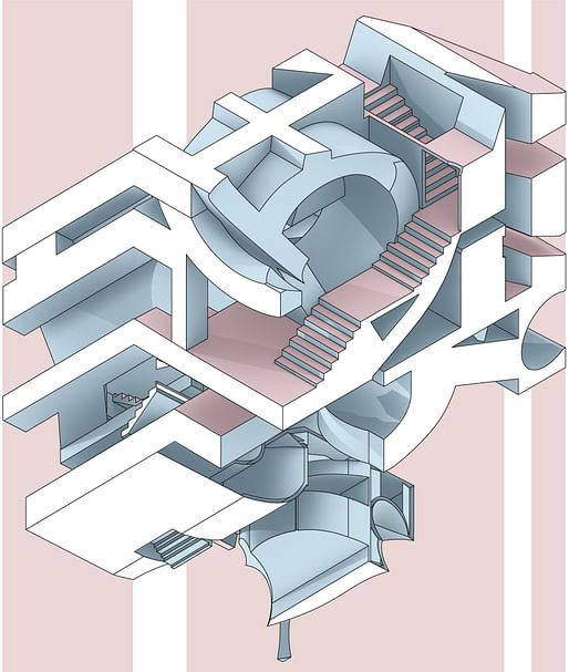
The introduction of access stairs and circulation encouraged a proto-architectural investigation into scale and gravity. Students edited their abstract, three-dimensional compositions architecturally, seeking consistency in the spatial conditions, while adhering to the theme of their exploration.
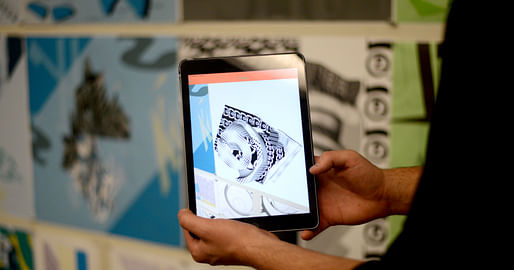
Pedagogically, the course sought to explore novel spatial configurations, oscillating between perceived notions of volume and graphic flatness. Complementary methods of representation were used; students focused on projective and non-perspectival drawing. The course provided an overview of historic precedents in drawing conventions, from prospettiva soldatesca, or soldierly perspective (oblique projection), to the developed surface technique used by Robert Adam. An augmented reality app written for the course leveraged contemporary technology to provide an added layer of information during presentations.

Subsequently, students hybridized drawings into three dimensional models, as counter-reliefs. Engaging in a quasi-sculptural process, architectural studies of space took on pattern and form, exploring both spatial and abstract ambitions. The three-dimensional work reacted against the flat-plane drawing developed thus far.
Focusing on technique, students worked to reference their prior process and criteria in the continual development of their work. Appropriate selection of digital fabrication processes and materials reinforced their ambition.
Students were presented with examples of craft-based techniques, heavily referencing Vincent de Rijk’s work with resin. Untreated 3D-print models were generally discouraged; instructors engaged the students in elaborate post-production processes that included vacuum-forming, casting and hydro-graphics. These processes allowed further integration of the drawing with the object, such as explorations in translucency, color, and patterning. Some studios focused on the resolution of edge conditions in patterns, oscillations between stereotomic operations within masses, and the reading of the pattern as a plane.
One student proposed, “I’ve got access to dental plaster for cheap.” Just like that, dental models were born. Other students used aluminum, polyester, and acrylic.
For the concluding reviews, drawings were produced with annotations, offering students additional opportunities to create a dialogue between typeface-originating model, drawing and annotation. Drawdels, hybrids between models and drawings, were paired with corresponding drawings, focusing the discussion on consistency, intention and composition. Drawdel relief models, hung alongside drawings, focused the discussion around consistency, intention, and composition.
Juror comments during reviews included Bryan Cantley asking, “What is the difference between ‘curvy’ and ‘very curvy’. Can there be straight and very straight?” The student had humorously imbued his drawing with criticism of the annotations themselves, opting instead to employ descriptive annotations as an added visual layer.
The panelists reinforced a key takeaway for the instructors of this class: the need to disrupt the linear process of delivery of the work. Perhaps, favoring iterative processes over sequential ones would generate a very different outcome; templates could become part of the work rather than frameworks to place the drawing within.
In retrospect, would it have been intriguing to study the impacts on the geometry produced by the introduction of serifs?
Investigating architecture's ability to reach a broader culture.
Are you sure you want to block this user and hide all related comments throughout the site?
No Comments
Archinect
This is your first comment on Archinect. Your comment will be visible once approved.