Apr '15 - Apr '15
Have you ever been to the Contemporary Arts Museum in the Houston Museum District? Have you ever been there at sunset and seen how the museum appears to fade away somewhere between the earth and sky? If not, allow me to introduce you to one of Houston's most popular buildings. On the other hand, if you have already seen it, let me present to you one more time the Contemporary Arts Museum of Houston through the lens of the architecture student!
A group of Houstonians founded the Contemporary Arts Museum in 1948, after an epoch marked by much destruction caused by World War II. The goal was to present the general public with lectures, social projects, and art exhibits that were considered to be very influential in Modern times. This undertaking became very popular and drew large crowds and exhibits to its original facility. Nearly two decades later, the museum’s director decided to expand the museum’s footprint, and commissioned Gunnar Birkerts, a Latvian-American architect, to design and build a museum larger than its original facility. The director purchased a 9000 square foot lot in the Houston museum district, right across from Mies Van Der Rohe’s famous Museum of Fine Arts.
This museum is a non-collecting museum that presents artwork moving in new directions. When it opened in 1972, the museum presented a controversial exhibition because of the non-traditional media that was being used. Since then, it has reached out internationally and has showcased the works of many international artists such as Vincent Van Gogh, Joan Miro, Luis Jimenez, Robert Rauschenberg, and many others.
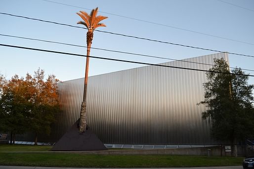
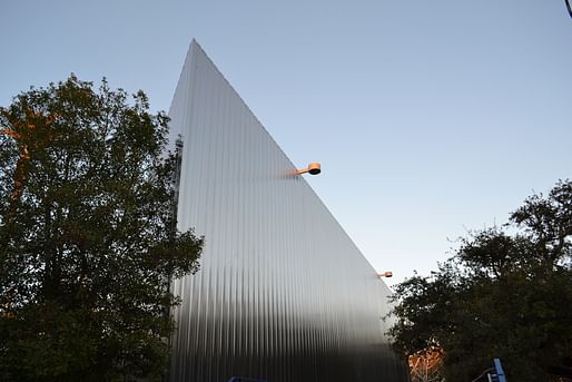
The architect Gunnar Birkerts had big shoes to fill with this commission as he was in competition with Mies, whose building stands only yards away. In order to make this new museum stand out, Birkerts used a stainless steel skin system, or envelope, around the parallelogram shaped building to deflect away from Mies’ museum. The parallelogram proudly points straight to the sky like a sharp knife.

The stainless steel skin is very reflective, and is corrugated which distorts the reflections on the steel. In fact, looking at this building, one can see the essence of its immediate surroundings. For example, the golden glow during sunset as well as the green colors from the trees can be seen in the reflection of the skin system. It is as if the museum confined all its surroundings in its stainless steel, including Mies’ Museum of Fine Arts.

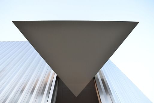
A pyramid shape at a corner of the building marks the hidden recessed entrance to the museum. Indeed, the entrance into the skin system is very narrow, and is easily overlooked. The pyramid volume previously mentioned acts as a sun shading system.
The inside of the museum contains art galleries on both floors, as well as a large gift shop. The open floor plan is very democratic and allows for a wide variety of gallery arrangements.
Additionally, there are gardens and art installations both at the front, and at the back of the building. Both landscape and building complement each other and help accomplish the architect’s original intent to deflect away from the building across the street.
At the time of the construction, modernism and the international style had all been popular architectural styles. On the other hand, Brutalism, which involves enormous amounts of concrete, was becoming even more popular and was used by many famous architects such as Le Corbusier, Tadao Ando, Louis Kahn, Alison and Peter Smithson, and many others. However, this is not the course that Birkerts and associates decided to follow. Instead of using concrete, the architects used metal as the main structure, and the skin itself. This movement is better characterized by the modernistic aesthetic which promotes clear and simple shapes such as a parallelogram, in our case.
Modernism supports the use of materials that can be produced industrially; steel, glass, plastics, etc. Famous modern buildings that utilize these materials include the 1958 Seagram building in Manhattan, the 1970 World Trade Center with its extensive use of steel for its structure, the 1968 New National Gallery in Berlin, designed by Mies, which uses both steel for the structure, and glass for the enclosure, and many more. Following the new trends of the day, Birkerts uses steel as the main component of the Contemporary Arts Museum. The steel plates from the skin are placed vertically, emphasizing the verticality of the plates’ joints and folds which is also a characteristic of the modern movement.
Aside from a modern approach on the design, Birkerts was also influenced by the International style. This movement is described by surfaces stripped of all ornamentation, and an open floor plan. Buildings that embody these characteristics are Le Corbusier’s Villa Savoye, Mies’ Barcelona Pavilion, or even Gropius’ Bauhaus in Germany. Similar to these buildings, the Contemporary Arts Museum exemplifies the International Style by having a very plain envelope deprived from any adornments, and open floor plans.
In conclusion, the Contemporary Arts Museum captures one’s attention by its reflective materials, sharp corners, and simplicity, while deflecting away from the museum across the street. Additionally, its free exhibitions draw people to view the modern art, and ultimately, inspire the human mind.

You probably know what it is like to be a university student, but do you know what it is actually like being an architecture student? Here, you will read about the wonderful world of architecture, and live the adventures through the lens of the architecture student!


1 Comment
The triangle over the door and the signage in the photos were not part of Gunnar Birkert's original design, they were added in the 1990's by Houston architects Stern and Bucek.
It originally looked like this:
Block this user
Are you sure you want to block this user and hide all related comments throughout the site?
Archinect
This is your first comment on Archinect. Your comment will be visible once approved.