The Hague, NL
Atelier PRO designed the new head office for Anthura, a global specialist in plant and seed breeding. Primary goal was to create a contemporary environment where the company could work, meet and receive clients, which expresses its core values and tells 'Anthura's story'. An building befitting of Anthura
The head office, greenhouses and R&D department of Anthura, a market leader in anthurium and orchid breeding, are located in the glass horticultural area around Bleiswijk, the Netherlands. The company occupies a state-of-the-art greenhouse complex, and opened a new research centre in 2019. Its office building, however, was severely outdated, and the surrounding outdoor spaces also gave a cluttered and unattractive impression. Atelier PRO designed a new head office that improves the company’s outward appearance, serves as a model for the other buildings on site and better reflects the company's international position and innovative, high-tech character.
From ‘inner’ to ‘outer’ world
The floors and load-bearing structure of the existing building have both been reused, whilst the façade and floor plans have been completely redesigned. Objective, however, was not only to create a new working space, but also a place where Anthura could receive clients and demonstrate their core business. Therefore, the office has been connected to the technical 'inner world' of the greenhouses - and in particular to the display greenhouse directly behind it. Before the conversion, the façade of the display greenhouse was completely closed to the street; atelier PRO replaced it with a transparent glass screen, which makes the lab-like settings on the inside visible; these serve as a backdrop for the office building. The office has the same transparent, campus-like appearance, emphasising its relationship with the adjacent laboratories and greenhouses.
Scale and appearance
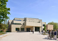
An additional challenge was the difference in scale between the greenhouses - with a total floor area of 450,000 m²- and the office building - which totals at about 2,000 m² - and how to bridge this difference so as to emphasise the office’s importance. To give the office building more 'weight', it was placed on a slightly raised pedestal, visually detaching it from the continuous glass façade behind it. Vertical façade elements serve to optically enlarge the building - in part because the individual floors are no longer directly visible - and give it the appearance of a 'large' corporate head office, befitting the size of Anthura. The verticality also mirrors the typical architecture of the greenhouses - a horizontally articulated building would not fit in with the context.
Function and experience
In the interior, two different experience layers can be distinguished. On the one hand, there is the exhibition layer: publicly accessible spaces which serve as a physical ‘customer journey’ to the display greenhouse. In order to create a genuine exhibition experience, we collaborated with a graphic designer as well as an exhibition designer.
Anthura’s members of staff have their own layer, in the heart of the building, around the canteen. The technical areas, with facilities that are not dependent on daylight, are located in the centre of the office building. All surrounding areas have been kept open as much as possible; flexible workplaces alternate with concentration areas. The overall atmosphere is, yet again, representative of the company, with warm tones, abundant greenery, and perennial and changing plants throughout. In addition, Anthura’s character served as the basis for the graphic ‘layer’, which was applied throughout the entire building and includes signage in the outdoor space.
Garden and context
Between the office and the greenhouses lies an enclosed garden, designed by Oase Landscape and Urban Design. Drawing on the area plan by atelier PRO, Oase were responsible for the overall landscape concept, and succeeded in translating the tropical indoor atmosphere to the outside world.
Anthura successfully demonstrates how a building can act as an identity carrier. The project, however, is also interesting from a wider point of view: greenhouse areas are neither urban nor agricultural. They are highly built-up, but without any rules regarding building regulation; buildings, therefore, often develop more or less ‘by themselves', without being actively designed. With the design for Anthura, atelier PRO wants to explore the typical features of these greenhouse areas, and raise questions about the juxtaposition between urbanity and rurality - but also what the future holds for the Dutch landscape. The project demonstrates that, even in areas where things 'develop by themselves', it is still possible to actively define the environment.
The interior is also designed by Atelier PRO.
Status: Built
Location: Bleiswijk, NL
Firm Role: Project architect
Additional Credits:
Client: Anthura bv
Landscape designer: Oase Stedenbouw en landschap
Acoustics consultant: ABT
Structural engineer: Pieters Bouwtechniek
Services engineer: HE adviseurs
Photography: Eva Bloem

