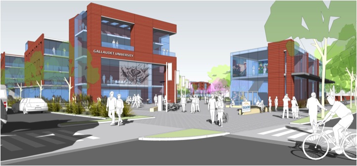
Christopher Keane, of Dangermond Keane Architecture, titled his lecture "Lessons from Gallaudet" which focused on challenges that arose while creating a functional yet aesthetically pleasing design for the school. Gallaudet University is the world's leader in a liberal arts program targeted towards the deaf and hearing impaired. Originally designed by Fredrick Law Olmstead, the campus was gradually becoming too outdated and dysfunctional needed a face lift.

Keane discussed "Deaf Space" and it's design guide that consisted of 5 points.
1) Space & Proximity
He defined proxemics, the study of nature, degree, and effect of the spatial separation individuals naturally maintain. Keane then discussed how deaf proxemics begin with eye contact and space and well being (how it is important to be aware of the degree of enclosure and how you must give a sense of the surrounding so nothing comes up surprising the students). There are different types of gatherings, formal and informal, and you need to design the environment and space in a way that supports the needs of the deaf/hearing impaired and creates visual space that promotes interaction with each other. For example, classrooms are situated in a U-Shape so students can see each other as well as the teacher and in an outdoor setting, there needs to be a place for personal belongings to be placed in order to free the hands for communication.
2) Sensory Reach
This point seemed like one of the more important ones because the deaf/hearing impaired are missing a sense so the others are heightened. Because they cannot hear their surroundings like someone walking down the hall, the buildings and rooms had to be designed in a way that accommodated for the lack of hearing. Solutions to this problem was making sure there was transparency in appropriate areas like elevators, reflective surfaces to give a visual of the surrounding area that isn't in the direct line of sight, and vibrations that allowed students to be aware of movement that wasn't visible. An example of using vibrations was the material of a seat in an office space that was connected to the threshold of the door that alerted the person when someone approached.
3) Mobility & Proximity
This point focused more on how the design of the campus affected the students ability to get from one place to another. Pathways were designed with a type of rumble strip, similar to those on a freeway, that alerted you if you were straying off the designated path. These types of guidelines were important because the deaf/hearing impaired need to look at the other person in order to communicate and may not be aware of their surrounding areas. Another example of accommodating towards the mobility of the students is automated doors. This allowed communication to continue without distractions like opening doors.

4) Light & Color
Vision is the most important sense to the deaf/hearing impaired. Because it is the most use sense, it causes fatigue. In order to prevent your eyes from getting tired, design features like color, solar control and lighting were taken into consideration. The color green is the only color that doesn't require muscles to be processed and is known, along with blues, to be the most relaxing colors. Therefore, these colors were used on the interior to insure the most relaxing environment. Color schemes were also used to differentiate and direct those between varying spaces. Solar control and lighting also affects the vision. To ensure that lighting didn't distract the students, design features like dimming lights and transitional areas when exiting buildings that allowed eyes to adjust to the outdoor light from the sun were integrated into the design.
5) Acoustics & EMI
He then discussed hearing aids and cochlear implants and how buildings and the surrounding environment affected the efficiency of the aids. An example of it was when a student entered a building and had to take the aid out or turn it off because reverberations created interference that made the aid ineffective.

I understand that when designing a project as specific as a deaf/hearing impaired university that there are extra precautions and details that need to be addressed but I didn't realize to what extent. One of the most interesting points that I hadn't realized was how important color and lighting were to the deaf/hearing impaired and how certain color schemes were better suited for specific areas.
Keane concluded his lecture by saying all that all projects are cultural and that culture matters!
(Author: Angela Yoshioka)
Guest speakers visiting from different places coming together and lecturing about their projects, groups, and firms at the University of Hawaii Manoa: School of Architecture.
No Comments
Block this user
Are you sure you want to block this user and hide all related comments throughout the site?
Archinect
This is your first comment on Archinect. Your comment will be visible once approved.