Archinect
Andrew Mann Architecture

Andrew Mann Architecture

San Francisco, CA

anchor
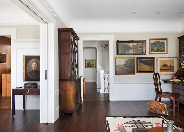
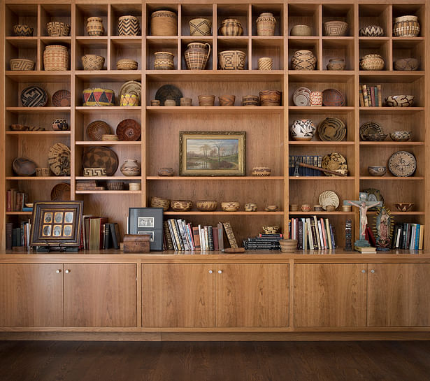
Creating ample gallery space for the owner’s Native American artifacts, baskets, craftsman furniture, landscape paintings and other decorative objects was one of the central design moves.
14 more images  ↓

Modern Craftsman

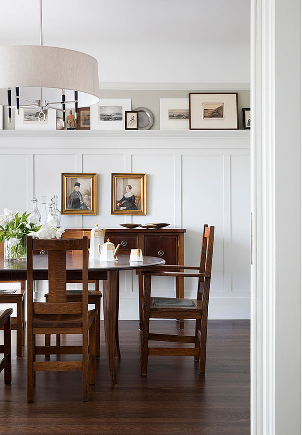
Designed for an avid collector, this modern interpretation of Craftsman style architecture by Andrew Mann Architecture provides gallery space for the owner’s Native American artifacts, baskets, craftsman furniture, landscape paintings and other decorative objects. The architecture is meant to be crisp and simple so as to highlight and bring those collections to the foreground. Its modern-ness is intended as a contrast to the traditional or intrinsic character of the furniture, artwork and artifacts. The architecture is intended to create aesthetic hierarchy and provide focus to those elements in a gallery-like setting, allowing the owner to develop tableaus that can change over time, all the while creating a warm, comfortable, richly layered welcoming home.

 
Read more

Status: Built
Location: San Francisco, CA, US
Firm Role: Architecture
Additional Credits: Landscape - Scott Lewis Landscape Architecture
Builder - Saturn Construction
Photography - Paul Dyer Photography
 
Constructed in 1911, the multi-unit Edwardian building was originally residential space over a brewery.
The overarching concept was to design a container to store and display the owner’s beautiful objects.
Meanwhile, clean lines, simple details and a consistent vocabulary of materials were used to create a backdrop for artwork and display spaces for objects.
Given the confined configuration of the house’s urban setting, focus was given to pulling as much natural light into interior spaces as possible.
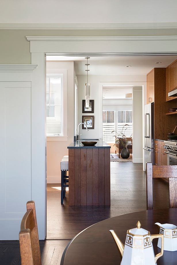
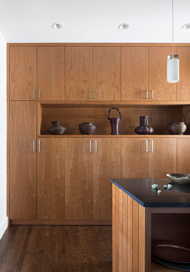
A consistent vocabulary of cherry casework is used throughout the house, including the kitchen.
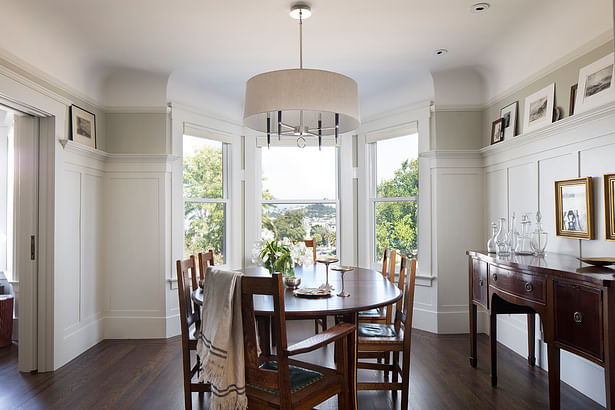
On the upper floor, the entry hall, formal living room and dining room at the front of the house maintain their authentic character and detailing, albeit brighter through the painting of dark wood with lighter hues.
The cherry casework is used throughout as a unifying design element.
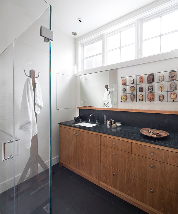
The vocabulary of cherry and infusion of light is evident in the upstairs bathroom.
Formally dark and cramped, Andrew Mann illuminated the center of the house by maximizing windows.
The light-filled staircase creates an effortless central axis to the home.
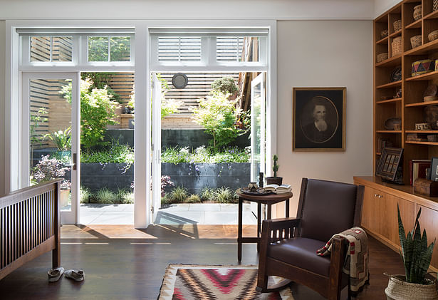
On the lower level, the new master bedroom takes advantage of the existing tall ceiling heights with a large expanse of windows and doors to visually connect to the garden and create a bright, airy space.
The master bathroom provides additional display space, and continues the vocabulary of cherry and infusion of nature light.
Shelves, nooks and cubbies are integrated into these components to provide display for the owners varied collections and are intermingled with functional elements for everyday use.
The terraced garden outside the bedroom extends the interior space.