Paris, FR
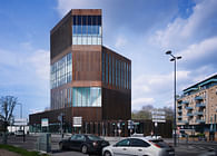
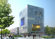
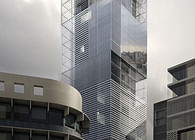
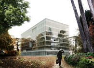
What volumetric? What typology? The first phase of our research, taking into consideration urban problems, typologies, and energy consumption was to question the form of the future BankMed headquarters; we made a comparative study opposing the classical tower scheme with a hybrid typology consisting of assembled volumes. A sensible approach could lead to a balanced use of verticality versus horizontality, composing with the context; a justified use of mass versus open space generates public and private urbanity. An innovative typology is generated: an hybrid. When we felt convinced in our choice by the comparative study of the two models, we engaged in the following phase by refining the different parts of the project. The negative of the tower The central volume, the heart of the project, is imagined like a negative form of a tower. An empty space that one penetrates, that serves the surroundings spaces and that adds value in terms of light, comfort, sensations and urban character. It's about finding affiliations, a singular story inside of the project, in the way that traditional Oriental patio houses, that posses this fabulous relationship between exterior and interior, its generous spaces and possibilities. The matrix that has generated this form is situated at the intersection of several questions: - The creation of a variable volume that generates different typologies of work spaces - The relation to the sun's path in the sky, in order to obtain the staging of the “piazza”, and also to assure freshness and shade - The relationship to the Solidaire neighborhood - The tower is presented like a catalysis of the city, it reconstructs the concentration of history, culture and place - The relation to the headquarters l: encourage pedestrian flows in the north and the connection to the existing tower - Our proposition on the lower part of the building, the base, becomes a project of urban topography where the altimetry, the environment and the programmatic conditions structures the site, and represents an opportunity to generate specific qualities Materiality To the simple plan is opposed a detailed and delicate research in facade and space. Recognizing interiority for its special parameters as a separate condition from the exterior lead us to research 2 separate materiality: To define an Atrium façade differently from the exterior envelope. - The atrium: a magic mass Atrium is cladded with alabaster sand stone or Onyx Marble. This stone color range from warm honey veins tones to warm red. Its inner crystalline and striated structure allows translucency as the light is able to travel in depth. When cut in thin layers alabaster acquires an opalescent quality, furthermore by applying a perforation process to it, the stone is dematerialized and achieves a unique phenomenon: We can see through stone. It is that effect we imagined will qualify the atrium: A transparent materiality. By its solid character, the atrium space expresses its monumentality, while in light and transparency it conveys a feeling of interaction and conviviality. Life will therefore impress the walls. During daytime, the inertia of alabaster protects from direct sun light, at night the effect is reversed to let artificial light shine through and fill the atrium space with a magic floating feeling. - The exterior façade: a kinetic mechanism While choosing deliberately a compact architecture, when it comes to exterior perception we were looking for a refined composition of glass and steel which will result in an immaterial mass, elegant and responding to the different hours of the day. This objective was reached combining a holistic approach, where solar, thermal, corporate image and urban scale where questioned to create a unique identity. Technically, the external façade is a double skin, a first layer acts as a solar protection where needed while staying permanently open to main views. A system alternating copper and glass louvers, inclined strategically to protect on one side and open at the other end. This technique borrowed to kinetic art achieves while protecting different perceptions. Depending on the angle, the building is perceived as a solid mass, a glass architecture or an in between moiré of two materials. The envelope unfolds a story, a structured sequence, almost cinematographic. - Vocabulary: Ghost of the tower The architecture of the tower resulting in layers of complexity translates the dichotomy of material/ immaterial presence. The space fits around a central volume on the interior side and wrapped with a sunscreen envelope on the exterior. The first screen is composed of perforated copper sheets embedded in glass, used to achieve protection, reflection, and visual penetration. Thus, within this framework everything is superposition, depth, transparency, contre-jour, reflection. Light and Character. Sequences of urban spaces are reflected by the exterior skin, either referring back to the city or penetrating the volume. The atrium appears in the shadow, reveals its presence differently according to light and angles of vision.
Status: Competition Entry
Location: Beirut, LB
Firm Role: LAN Architecture (Lead Architect)
Additional Credits: LERCH BATES (Vertical circulation and facades), FLACK + KURTZ (Fluids), Franck BOUTTE (HEQ), BOLLINGER + GROHMANN (Structure), DG jONES (quantity surveyor)
