
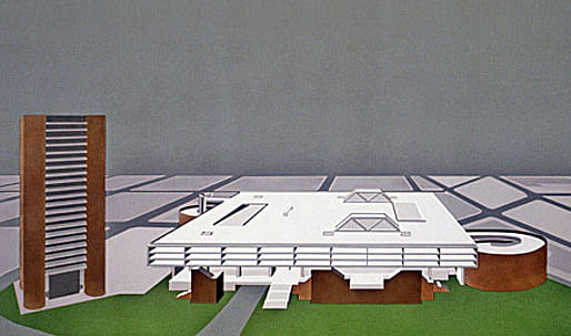
Perspecta 40 Monster In November 2006, the editors of Perspecta 40 Monster interviewed Kevin Roche at his offices in Hamden, Connecticut. We were initially drawn to the work of Kevin Roche John Dinkeloo Associates—in particular the firm's heroic projects of the late 1960s through 1970s—by the bold, rational manner in which these projects addressed scale. In some cases openly dismissing "the business of being visually pleasant"1, Roche Dinkeloo demonstrated in their work from this period a remarkable ability to propose architectural solutions that were simultaneously innovative to the point of absurdity, yet seemingly inevitable on account of relentlessly logical, research-based underlying arguments (typically presented as step-by-step slideshows which Roche would use to explain and build the case for the firm's design proposals). The results were at times overpowering (not altogether a bad thing in our opinion) and in the best instances the firm's work of this period very nearly approaches the sublime.

Clearly, a debt is owed to Roche Dinkeloo—whether consciously or not—by a generation of architects practicing today. It is thus with great sadness that in early 2007 we witnessed the destruction of one of the firm's most compelling projects from the 1970s—the New Haven Veterans Memorial Coliseum. In an effort to counter the loss of this and other similar (currently unfashionable) projects of the 1960s and 1970s which are increasingly coming under attack as of late, Perspecta 40 presents a full documentation of the Coliseum as it was initially conceived, alongside a photo essay (excerpted below) by Colin Montgomery of the building undergoing its slow, painful dismantling.
In the end, Perspecta 40's presentation of the Coliseum could be read as a cautionary tale—both showing the building and, by example, warning of what can befall a work of architecture once it is deemed "ugly" by the general public.2 Are there limits to our collective aesthetic tolerance? In thirty years will today's ambitious, large-scale projects face the same fate as the Coliseum? Perhaps only time will tell…
Jacob Reidel
Marc Guberman
Frida Rosenberg
Editors, Perspecta 40 - Monster
1 See the 1970 interview with Kevin Roche in: John W. Cook and Heinrich Klotz Conversations with Architects (New York: Praeger Publishers Inc., 1973) (excerpted in Perspecta 40)
2 Not coincidentally, this brings us back to the Latin roots of the word "monster", i.e. monstrare "to show" and monere "to warn". See Terry Kirk and Edward Eigen in Perspecta 40 for more on this.
Perspecta 40: We see in your work—especially in the late '60s and early '70s—an interesting approach to addressing scale. With the Oakland Museum of California [1968], the large building almost disappears below ground. With the Center for the Arts at Wesleyan [1973], you break the large program up among smaller pavilions. In the case of the unbuilt project for the Federal Reserve Bank Tower in New York [1969], you proposed lifting the building off the ground plane, in a way entirely removing its presence from the street while elevating its prominence on the skyline. How have you approached scale throughout your work, in particular reconciling the monumental with the day-to-day activities of the street?
Kevin Roche Scale is a very elusive aspect of architecture and of course it relates to the particular nature, use, environment, and location of the building. Scale is something that was very well understood in Classical and Islamic architecture, and while it was fairly well understood in Revival it was always better understood in the original form.
I was fascinated in the mid-sixties by highway construction and by the Golden Gate Bridge—fabulous structure, great sense of scale, perhaps a bit overwhelming when you stand underneath the bridge. In terms of the modern aesthetic it is not so good, but in terms of an abstraction of scale it is absolutely fabulous. The highway engineers, in addition to solving the problem of getting from one place to another, stumbled into large scale by dealing with cost-effectiveness—how to make the longest span in the best possible way—and I found that very interesting as an accidental aspect of our environment which began to emerge after General Eisenhower committed the country to building the interstate highway system.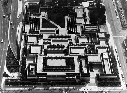
Oakland Museum of California, 1968.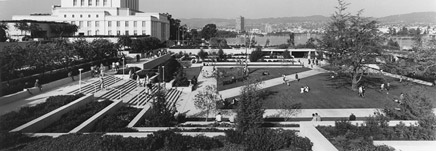
Oakland Museum of California, 1968.
I use that analogy of the "highway scale" in a building such as the Ford Foundation, which has two different aspects to it from an urban design point of view. It has 42nd Street, which is a large-scale street, and then it has a medium-height residential area adjacent. I use that as a contrast in development to the idea of accommodating the individual. How do you deal with the individual, the one person who is committed to that boring day-in and-day out—working at a desk or now staring at a computer—how do you make something which accommodates the worker and gives a little aspect to his or her life?
We have done this in several different locations by introducing greenery, based on the old Jung theory that humans must connect to greenery or to nature. In the case of the Ford Foundation the site is an urban environment, so on one hand you say, "Let's get something that reminds people of the outside." On the other hand you have this element of the larger scale that deals with the immediate environment and also makes the statement, "Hey! Here I am. This is me. I am the Ford Foundation. I am important." This brings up an important aspect of monumental architecture. Why do we care about scale? Because it arrests us. It makes us stop. We look and we pay attention and the message is understood.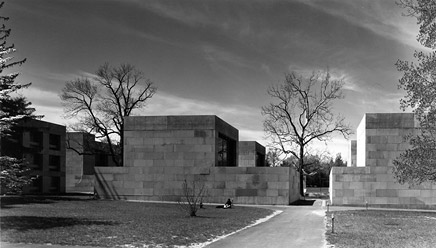
Center for the Arts, Wesleyan University, 1973.
The same applies to the Knights of Columbus Headquarters in New Haven [1969]. The site is next to the highway—the Oak Street Connector. Place yourself in that moment in time, in 1960 when Mayor Dick Lee was trying to revitalize the city. The site that we had was right on the edge of the Connector. The project needed to recognize that. And so this fairly strong set of four cylinders established an identity right there that you are now entering the city—this is the gate, this is the formal entry. Again the scale is modified as you look at it from the cylindrical towers to the smaller scale of sun-shading in the steel, to the multiple floors. The other aspect which I felt was very important was to keep the floors small so that there would be a fairly intimate relationship in the working environment, and there would be wonderful views all around.
P40: In the case of the Interstate Highway, you mentioned cost-effectiveness as one driving mechanism that can help steer the actual form or materials being employed. I wonder if you see anything today, in current work, which is a mechanism that architects like yourself or others are employing in their work to achieve large-scale projects.
KR: That is a very good question. I guess probably Frank Gehry is a good example of a person dealing with very large-scale projects such as the Atlantic Yards development in Brooklyn. It is a very, very tough problem. How do you deal with the underlying drive to provide as much possible rental space—which is the reason the project is being built—and at the same time do that in a way that is sympathetic to the community, the urban design, and the humanist aspects of it. It will be interesting to see how that develops; it will be interesting to see how it will be experienced. Certainly he has shown his genius at providing these forms that become interesting.
It is another way of saying "Here I am." When you see this distortion of the rectilinear form into something else, it immediately arrests your attention. It is not the same old cube. It is a twist of a cube, or a bent cube, or a broken cube, an exploded cube or something else and so your attention is immediately attracted to it. You never get the message across unless you wake people up. People don't see architecture. Most people are only peripherally aware of architecture. They don't see any of the details of architecture that we worry so much about. Their preoccupations generally are elsewhere.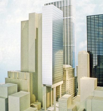
Federal Reserve Bank Tower (unbuilt), New York City, 1969.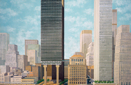
Federal Reserve Bank Tower (unbuilt), New York City, 1969.
Federal Reserve Bank Tower (unbuilt), New York City, 1969.
P40: Do you think there has been a change over time in how buildings can say, "Here I am?"
KR: Oh yes, and there are many, many ways it can be done. It is rather simplistic, but when you have a large building—and the building has a special relationship either to the environment or the city—you have to undertake some method for arresting people's attention, because otherwise it doesn't exist. It only exists when people see it, and this is as old as the profession of building itself. This goes back to when somebody first put one stone on top of two stones and then a king or prince or chieftain or a leader said, "I want more. I want something that expresses my God-like presence."
P40: How do you make that transition from the first monumental gesture that arrests our attention, to more intimate details that relate to the scale of the occupant or user?
KR: I like to start not with the person who is hiring us, but with the person who is intimately going to be using the building—in the case of an office building, the office worker. I have interviewed thousands and thousands of office workers, laboriously asking them "What do you want? What do you see? What do you care about?" and it is a very humbling experience. I recommend it to you when you are practicing architecture to really talk and understand and listen, because we as architects tend not to. We tend to decide "This is what is going to be," but we should never start that way. We should start with the person who has to use the building.
Next you must concern yourself with the person who is going to see the building but not use it, the passerby. Then you begin to consider why this is being built. If it is a purely commercial venture it's one thing. However, if it has a more elevated reason—let's say it's a public building of some sort, a museum or a temple or a church or a monument—then you begin to think of that. Moreover—of course that which we all strive for—is how to achieve the most lasting effect, not in the sense of being overwhelmed, but in the sense of creating an object of real beauty. That is where classical architecture had that great virtue and why it became so popular and why it so relevant even today.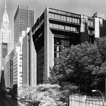
Ford Foundation Headquarters, New York City, 1968.
Ford Foundation Headquarters, Interior Court.
P40: The prioritizing of the user brings to mind Eero Saarinen. Of course, we've heard the stories of when he was doing Dulles Airport in the late '50s, for example, and interviewing every worker about how much light they needed and other details …
KR: I certainly learned that from Eero. I had a brief encounter with Mies where I learned that there is a right and a wrong way, and the wrong way was any way other than his. But Eero didn't have a right and a wrong way. He had an almost research approach to his buildings.
P40: In your work how do the small-scale details fit into the large gesture? Is that a place where you can bring it down to the scale of the individual occupant?
KR: Well that is an interesting point because when I started working in architectural offices in 1945 you pretty much had to invent everything from door handles, to door knobs, to hinges. There wasn't anything off-the-shelf. There was no such thing as a Sweet's catalog, for example. In the '60s when we were working on General Motors at Saarinen's office virtually everything was invented—the door pulls, everything. That is quite different now. A curtain wall for instance is really an off-the-shelf element. When you put stone cladding on a building it is an off-the-shelf element. Manufacturers come back with a video showing you how they are going to put on the rain screen and how they are going to do this and that, which 40 years ago you would have had to invent.
P40: One could argue that this is a good thing. Have we as architects lost anything as a result of these developments?
KR: What is lost is the individual inventive aspect. What is gained, I suppose is some sort of universal experience, but again what is lost is that everything looks the same. But it is changing, these things gradually keep developing.
This is all by way of saying that the circumstances under which we practice are changing quite rapidly, and of course the use of the computer, which has allowed Frank Gehry and many other people to do what they do, could not have occured forty years ago. I just happened to be flipping through a magazine this morning and someone was saying—maybe Thomas Mayne—that now with the computer every office has the ability to make these odd-ball shapes, so to speak. It is no longer identified with the single creative individual, it is becoming universal.
There was once a time when an architect had a position in society and in the culture, where people recognized that the architect had a right to make decisions and could be relied on to produce a significant work of art. Nowadays you, as an architect, get pushed around by the client—very severely—as if you were a draftsperson and didn't really have any particular skills. It is as if all you are bringing to the table is your ability to work on the computer, and the client is going to make the decisions for you. This is also driven by the commercialization of buildings being built for profit. When they are being built for profit, the person who is in charge of the profit aspect of the project is a controlling voice.
P40: You mention some of the opportunities afforded to architects by the computer. Although, as you stated, there may be less autonomy for the architect given the relationship to the public and the client today, could you say that technology, on the other hand, may allow the architect to reclaim the master-builder role?
KR: It will be very interesting to see what will happen 100 years from now. I think that there is going to be more of what you get in Japan for instance, where you have large construction /engineering/architectural firms with 3,000 employees and the architects are simply cogs in the wheel. They are not what you like to think of yourself as—an individual creator. They are simply cogs in that gigantic wheel which is serving the construction industry, and I think that is what is beginning to happen here.
All it will take will be for some of our large architecture firms to stop taking on construction management—which many of them have done already—and then to be bought out by a construction firm. That will give you a full-service entity, but that is a whole different profession from the typical architectural practice we have today. However, this is happening.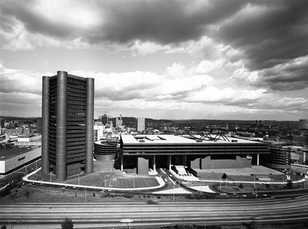
Knights of Columbus Headquarters (1969) and New Haven Veterans Memorial Coliseum (1972), New Haven, Conneticut.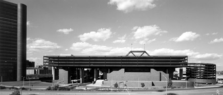
Knights of Columbus Headquarters (1969) and New Haven Veterans Memorial Coliseum (1972), New Haven, Connecticut.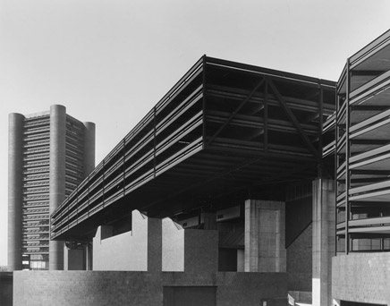
Knights of Columbus Headquarters (1969) and New Haven Veterans Memorial Coliseum (1972), New Haven, Connecticut.
P40: Looking back on your work in the '60s and '70s with the City of New Haven—where you built the New Haven Veterans Memorial Coliseum [1972] and the Knights of Columbus Headquarters—do you believe projects of that scale could be realized in a place like New Haven today?
KR: It would be very difficult today for a lot of reasons […] You could be building in the middle of nowhere and a community suddenly emerges out of the woods and begins to tell you what is wrong with you. And what is wrong with you is almost inevitable; it is never going to be about what is right with you. You, the architect, are always the wrong guy.
The participatory aspect of architecture—which I believe in and I encourage—is on the other hand a tremendous pain in the neck at times. You get people who have absolutely no idea what they are talking about ranting on and on and on. I'll give you an example. At the Metropolitan Museum of Art in New York they desperately need space, but they have nowhere to expand. They can't go up, so in the American Wing courtyard—we are redoing that at the moment—we are excavating underneath the courtyard in order to provide about 10,000 square feet for desperately needed facilities and storage.
So at the Upper East Side Community Board hearing, I was making a presentation about this and a woman said to me, "You simply don't understand geometry." She said, "If you understood geometry, you would know that if you are building under the museum, you are building into Central Park." I wasn't able to make the connection myself, but she was able to make a very strong point of that, and it took about fifteen minutes to get through it all. That's a pretty good example of the kind of argument that you will get.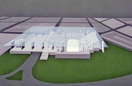

“The parking becomes a shelter, a universe, under which a whole variety of activities can take place.”
P40: And that didn't happen before?
KR: No. It did when we designed the original master plan for the Metropolitan Museum of Art [1967].
P40: You worked with Mayor Dick Lee in New Haven during the '60s. What was he like as a client?
KR: Dick was great. Wonderful, wide-ranging, fine mind and personality. Dick had a great vision for New Haven. Unfortunately, he retired before he succeeded in pulling it all together, and he was succeeded by a series of relatively less active governments. But he was a visionary.
P40: One of the major projects you designed for New Haven under the Lee administration—the Veterans Memorial Coliseum—was recently demolished. We certainly wouldn't be the first ones to say that this was a remarkable building. Could you perhaps tell us a bit about the project, and what led you to make the heroic gesture of elevating the parking so high into the air?
KR: The technical problem we had with the Coliseum was that there was a high water level on the site; we couldn't put the parking underground, and I was concerned that if you put 2,400 cars underground it would be such a vast parking lot that nobody would use it because it would be too scary. The city wanted to keep Orange Street open, which divided the lot into two parts. A coliseum, which is going to have circuses, is going to have to deal with very large trucks which have to be driven onto the floor. Elephants have to be taken to that level. It was important to get the floor of the ice rink at grade level. Parking couldn't go underneath. If it couldn't go on grade, the next logical thing was to put all parking on the top. In my mind this would remove it. It doesn't visually remove the parking, but it removes it from the activity along the street. The parking becomes a shelter, a universe, under which a whole variety of activities can take place. Unfortunately, the other program elements such as exhibition space never materialized, partly because Dick retired in the middle of the whole project, partly because it was one million dollars over budget, partly because the succeeding administrations really just didn't have the stomach for it, and partly because—although the arena had a few years of pretty good success bringing in events—the Coliseum faced new competition with the opening of the Foxwoods [1986] and Mohegan Sun [1996] Casinos. At the casinos there are events going on every night to which they practically give away the tickets. What group of dentists, for example, wants to have a convention in New Haven at the Coliseum when they could go to Foxwoods or Mohegan Sun and see all of the other entertainment?
And so the convention market disappeared, and the local hockey team didn't make it, and there were no sports. So the Coliseum got off to a bad start. Then, of course, the exhibition part of it was never built … so the combination of all of these elements made it pretty much inevitable that a coliseum would not work in New Haven.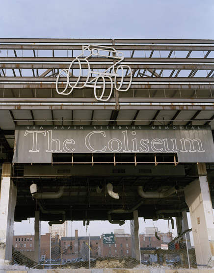
"Monsters are born too tall, too strong, too heavy: that is their tragedy."
-Ishirō Honda (Director of Gojira , 1954)
Image: "Monere" for Perspecta 40 by Colin Montgomery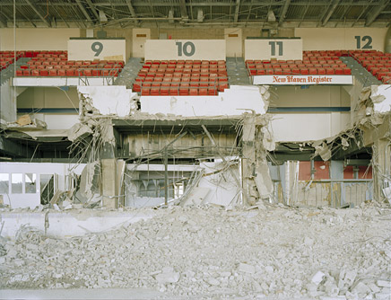
"Monere" for Perspecta 40 by Colin Montgomery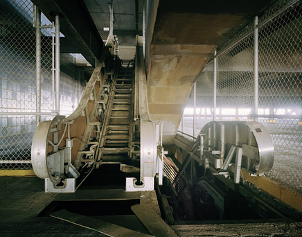
"Monere" for Perspecta 40 by Colin Montgomery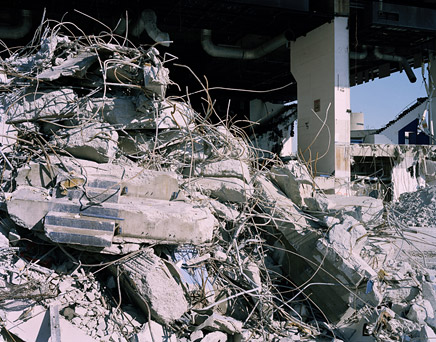
"Monere" for Perspecta 40 by Colin Montgomery
P40: When we look at the Coliseum, we can't help recalling El Lissitzky's Cloud-hangers, or perhaps Yona Friedman's Superstructure drawings …
KR: Superstructures were in the air at that time, but I wasn't thinking of that. I was really thinking of the project one small step at a time, and going forward with the process.
P40: Almost like the research method you were talking about with Saarinen?
KR: Right. Exactly. Where else are you going to put it? And how do you do that? And parking lots are 62 feet wide and you put a truss every 62 feet … Of course, you have to have a pre-disposition to do a monumental building as well.
“The technical problem we had with the Coliseum was that there was a high water level on the site; we couldn’t put the parking underground.”
“If it couldn’t go on grade, the next logical thing was to put all parking on the top.”
P40: So in your process, do you sketch out the initial monumental idea, establish what that is going to be, and then step back?
KR: No, I never do that, because if you do that you lose the opportunity to find out where you are going. It is much more interesting … the way you start on this little journey, you push yourself forward, and things suddenly start to appear and begin to emerge and the light comes on at a certain point.
I got the idea for the Ford Foundation as I was crossing the Quinnipiac Bridge one morning because we lived in Guilford at the time. I remember exactly the moment on the bridge when it suddenly occurred to me to wrap the building around and make the atrium. Prior to that, we had done a lot of legwork, a lot of research. There is just a moment when it all comes together.
P40: We’d like to talk to you about some of your work in Asia, in particular the Millennia complex in Singapore [1994].
KR: Well, it is two office buildings and a hotel. There was an opportunity to do something that would be a statement when you come from the airport that would say, “Now, this is Singapore.”
With the hotel we decided several things. We decided first of all that we were going to put the bathrooms on the outside wall. You can have a room and a bathroom beside it, both with windows. Now this was a radical departure for hotel design; the bathroom has an octagonal window so that visitors can see the central city framed through an octagonal opening. And in the bedroom/living room area there is a rectangular window with an awning—both buildings have awnings on them, because Singapore is on the equator, and a relatively small awning gives you shaded windows.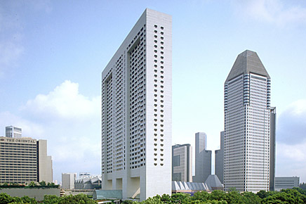
Millennia Singapore, 1994.
The massing of the building is a slab. I felt that if you put a slab on the ground, then when you approach the site on the highway all you will see is the hotel. If the hotel is raised up 90 feet in the air—a little bit of a memory to the Federal Reserve building—it is possible to see the Central Business District.
Then with the two office buildings, the first was rotated so that it related to the CBD. I put it up on four big columns to get it up in the air and have a public space underneath, making it part of the plaza. The other building was determined by the way the boulevard curves around.
So all three buildings—the hotel and the two office buildings—are responding specifically to that site and the geometry of the site. The first office building was rotated in such a way that it was on axis with the arrival from the airport and illuminated at the top so that it can be seen from quite a distance. It serves as an announcement to the city … a little bit like the Knights of Columbus Headquarters in New Haven.
P40: Have you found that it is easier to think big in places like Singapore? How does it compare to working in the United States, for example?
KR: Not particularly. I must say there seems to be a general problem of clients becoming more bureaucratic. It used to be that one could deal with a single responsible person, but this appears to have morphed into large groups with very disparate ideas as to what should be done.
P40: For better or for worse, the heroic building and urban renewal decades of the '50s and '60s in the United States demonstrated a popular willingness to think big. Are we simply afraid of that now?
KR: I think that Ground Zero is a good example of what we cannot do. We seem incapable of rebuilding there. It's been five years this November [2006] and nothing has really happened … it is this constant manipulation and negotiation. Now, New York is a complex city to build in during the best of times, but I don't think it would be any different at any other major urban center. No matter how much will there is, there still must be the authorization and ability to do it. But somehow we don't seem to have that at the moment, and part of it is the participatory nature again, for whatever reason, of the people who feel intimately involved with 9/11, part of it is the complexity of the city government, part of it is the whole nature of politics which is really not dedicated towards the best in building.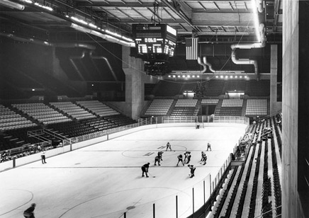
New Haven Veterans Memorial Coliseum, Arena Interior.
P40: Coming back to New Haven, how was the city different under Mayor Dick Lee?
KR: That was a different time because Dick was committed to doing something, and he had connections in Washington. New Haven was one of the premier cities with regards to government plans for urban renewal. Looking back, there were some good things that happened and others not so good. But it is always easy to criticize after the fact. Too often today we criticize before the fact.
You have to destroy something to build something in any urban environment. I will be curious to see if New Haven can pull something off on the Coliseum site. How long will it take to actually realize something there? There has been a lot of talk for the last couple of years, but it will be interesting to see how much can be done.
I gave a lecture series once in Sweden, and they took me to various places in Stockholm to show me new developments. The interesting thing was that the architects who were showing me around weren't living in any of these developments. They were all living someplace else. I think there is a little lesson in that. The architects prefer to live in the old city with attractive, quirky spaces. That is more attractive than the rational world of development. What grows naturally is perhaps richer, in the final analysis, than anything that can be suddenly imposed.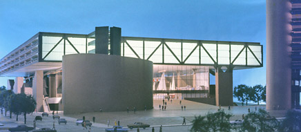
New Haven Veterans Memorial Coliseum, Model with Intended Exhibition Hall. (“Unfortunately, the other program elements such as exhibition space never materialized.”)
P40: In the end, is it possible for a large, monumental building—such as some you have designed throughout your career—to reconcile with the life of the neighborhood and the street?
KR: Well it depends on the particulars. I can say yes and no. In Europe a large church, for instance, can—and has—developed entire cities and towns around it. But that is because the whole civilization of that town was focused on that church. If today the alternative to the church or the temple is the shopping center…well, the difference with the shopping center is that the people are driving from wherever they live. The act of driving has eliminated the city in that context.
The fact that you are driving means that you don't necessarily want to live where you work, or want to shop where you work, or want to do anything else where you work, because you have all of this imagined freedom to bridge. You can go anywhere at anytime. I go to New York two or three times a week, and I used to be able to drive from here to midtown Manhattan in eighty minutes. Now it can be up to three hours, and that is in a matter of twenty years.
The only answer is to probably revert back to where communities are pedestrian, and New York is an interesting example, because it could easily be a pedestrian city. If you live there for a little bit you think, "what the hell are all of these cars doing?" You can get around. It has perfect subway, bus and pedestrian movement, and you have a very large population. New York in my mind is one of the great urban lessons, central Manhattan is what I am talking about, largely because of the river. This lesson hasn't been learned in any other city.
Urban sprawl is endemic to every large city anywhere in the world. It is a frightful problem. When I went to Beijing for the first time in 1973 or so, there were no cars. Everyone was on bicycles, and all of the city was essentially one and two stories. Twenty years later you have high-rises, Mercedes, traffic jams, and you can see the old city in the first stages of being destroyed by a new city. I suppose this has to go through a cycle, and I'm not sure where it is going to end up later on, but it is a very interesting subject to try to fathom … where are we actually going with all of this? What role can/might the architect be able to play in this? That said, I don't think that we architects should delude ourselves. Unless we become politically active, we can never affect this in any way. I wish I could have ended on a more optimistic note.
Kevin Roche
Kevin Roche joined Eero Saarinen and Associates in 1950. Following Saarinen’s death in 1961, Roche supervised the completion of 12 outstanding projects. He has master planned and designed diverse facilities noted for their advances in design concepts throughout the United States, Europe, and Asia. Completed works include 8 museums, 38 headquarters, 7 research laboratories, performing arts centers, theaters, campus buildings for 6 universities, and Central Park Zoo. His work at the Metropolitan Museum of Art for the last 40 years includes a master plan and all the new wings. He is the recipient of the Pritzker Architecture Prize, the Academie d’Architecture Grand Gold Medal, the Gold Medal Award from the American Academy of Arts and Letters, and the AIA’s Gold Medal Award.
Colin Montgomery (Photographer of "Monere" )
Colin Montgomery is a visual artist who has exhibited widely in the United States
and Europe. He recently received the Arts Club of Washington, Solo Exhibition Award, the Marie Walsh Sharpe Foundation Space Program Award, and the Tierney Foundation Photography Award, and is a 2006 MFA graduate from the Yale University School of Art. His interest in megastructures includes Hong Kong’s New Towns, Brazil’s Brasilia, and the Bronx’s Co-Op City. He lives and works in New York.
The editors of Perspecta 40 - Monster:
Jacob Reidel
Jacob Reidel is currently working in New York City for REX. He received an M.Arch degree from the Yale School of Architecture, and an AB in Architectural Studies from Brown University. Prior to graduate school, he was a NYC elementary school teacher and Teach for America corps member. In 2006 he co-founded The Royal United States Architects , whose work has been published most recently in 306090: Models and the New York Times .
Marc Guberman
Marc Guberman is currently working in New York City for Foster + Partners. He received an M. Arch degree from the Yale School of Architecture and an MBA from the Yale School of Management, as well as an AB in architecture history and economics from Brown University. In 2006 he conducted a research project Context(ual) Impacts while living and working in Osaka, Japan, and has worked on other publications including The Yale Building Project: The First 40 Years and Eero Saarinen: Shaping the Future .
Frida Rosenberg
Frida Rosenberg is currently working in Stockholm for AIX Architects and teaching at Lund University in Sweden. She received an M.E.D. from the Yale School of Architecture; an M. Arch degree from Chalmers University and a B.S. in Architecture from U.T. Arlington. Her M.E.D. thesis Shifting Identity in Swedish Urban Structure from Folkhemmet to Globalization portrays Sweden’s urban environment against a socio-political background. In 2004–06 she was a research assistant for the book and traveling exhibition Eero Saarinen Shaping the Future .
Excepting Colin Montgomery's photographs, all images were provided courtesy of Kevin Roche John Dinkeloo Associates LLC
Creative Commons License
This work is licensed under a Creative Commons License .
/Creative Commons License
1 Comment
'You, the architect, are always the wrong guy'
Block this user
Are you sure you want to block this user and hide all related comments throughout the site?
Archinect
This is your first comment on Archinect. Your comment will be visible once approved.