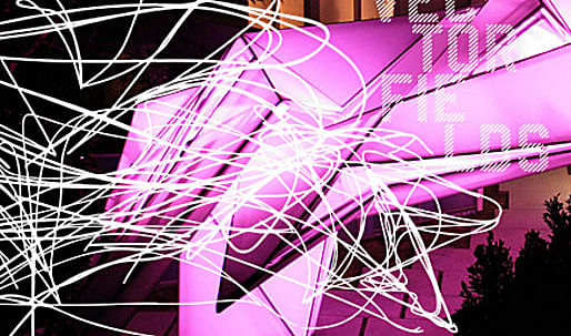

ShowCase is an on-going feature series on Archinect, presenting exciting new work from designers representing all creative fields and all geographies.
We are always accepting nominations for upcoming ShowCase features - if you would like to suggest a project, please send us a message.

This ShowCase, the Frank & Kim Residence in Pasadena, is Part 1 of a two-episode installment dedicated to the exciting work of Los Angeles-based firm BplusU and their recently published book Vectorfields . To also see Part 2, click here .
The Frank and Kim residence is located 9 miles north of downtown Los Angeles on a hillside property in Pasadena. The existing two story single family house is placed at the end of an elongated property, on the edge of the hillside with a large terrace and a pool overlooking San Marino.
Besides some major remodeling inside the house, we were asked to redesign the front property so it can be used for larger social gatherings and to create a new spatial continuity between the front yard, the entertainment areas of the house and the terrace, pool and garden in the rear.
↑ Click image to enlarge
The translucent fabric of the canopy filters day light at varying amounts depending on the angle (Photo: BplusU)
As a main feature element for the front yard, we designed a large canopy that will be used for receptions and social events, and articulates a new dynamic entrance to the house. The 65 feet long cantilevering steel structure is clad with a white translucent fabric. The canopy is lit from the inside with a combination of white and colored LED light fixtures to illuminate the garden with a soft glow during the evening, articulating a vibrant path to the building and marking a spatial continuity throughout the site.
↑ Click image to enlarge
The play with gradient transparency is best viewed at nighttime (Photo: Joshua White )
↑ Click image to enlarge
The canopy seen from below at night (Photo: Joshua White )
↑ Click image to enlarge
The garage mixes fabric and concrete as primary materials (Photo: Joshua White )
As part of the design process, we developed many iterative models using a continuous folded surface geometry that emerges from a single plane and through techniques of splitting (delaminating) and shifting creates a multi-layered volume with varying translucent qualities. We were interested in the effect this geometry had on the gradation of light. By changing the material property, we were able to produce the desired light quality from the inside utilizing white & colored LEDs as a light source.
↑ Click image to enlarge
A combination of white and colored LED light fixtures illuminates the garden with a soft glow during the evening (Photo: Joshua White )
↑ Click image to enlarge
At night, the illuminated canopy articulates a vibrant path to the building, marking a spatial continuity throughout the site (Photo: BplusU)
The same had to work during daytime as sunlight passes trough the surfaces from the outside. As part of this process, we built many prototypes with different fabric materials and revisions to the geometry before finding the right relationship of material property to geometry to achieve the effect we were looking for. Finding the right material was a big part of the challenge.
↑ Click image to enlarge
The 65 feet long cantilevering steel structure of the canopy under construction (Photo: BplusU)
↑ Click image to enlarge
The finished steel structure ready for transport (Photo: BplusU)
↑ Click image to enlarge
Siesta (Photo: BplusU)
↑ Click image to enlarge
Carefully maneuvering the canopy into place (Photo: BplusU)
Originally we were looking at thin sheets of Corian, a solid surface material with translucent qualities, but the material was too heavy and started sagging over the long spans. So we started researching fabric, which we have been interested in using as a building material for a long time. We were looking for a canvas like fabric with a flat finish that had the right amount of translucency and that fulfilled all the technical and quality requirements, like UV resistency, fire rating, durability, etc to last for the next 20+ years. Sail fabrics had the translucency qualities but were not resistant to UV and fall apart over years, while most architectural fabrics come in a glossy finish and look rather opaque during the daytime.
↑ Click image to enlarge
Canopy elevations
↑ Click image to enlarge
Fabric layout plan
It was the start of a design process where material properties and geometry were closely linked together. Issues of a gradient transparency and the use of fabric as a building material continue to play an important role in our work.
BplusU is a full service architecture firm headquartered in Los Angeles, California, established in 2000 by architects Herwig Baumgartner and Scott Uriu who have over 15 years of professional experience each. BplusU's mission is to push the boundaries of architecture and urban design. Using technology and research in combination with hands-on design, their projects are often informed by the mapping and transforming of imperceptible forces using sonograms. BplusU has developed analytic and generative software that has allowed them to implement their theories into three dimensional form. BplusU is on a continuous mission to research and experiment with new technologies, building materials and construction techniques using 3-d technology and manufacturing techniques, often from outside of the architectural profession.
BplusU has worked on projects nationwide and abroad. Their work comprises cultural projects (including museums, concert halls and exhibition spaces), educational and transportation facilities, master planning and urban design, offices and mixed use developments, restaurants, and residential work. BplusU recently completed the Frank/Kim residence in Pasadena, California (2010) and is currently working on a variety of projects including: a mixed use development in Downey - Los Angeles (2012); City Futura - an urban development project for Milan, Italy (2030); a housing development in the United Arab Emirates (2012); Soundcloud - an event structure in Downtown Los Angeles, California (2009); the CKC residence in Pasadena, California (2009); and others.
BplusU's work was recently exhibited at: the 12th Architecture Biennale in Venice, The A+D museum in Los Angeles, the Milan Stadtkrone show, in Milan, Italy; at the University of Applied Arts in Vienna; and at the CCRD in Hollywood, California. Their work has been widely published in magazines and books such as Architectural record, Angeleno magazine, Azure magazine, The Architect's Newspaper, FORM magazine, Future Arquitecturas, Architecture live 6, Elemente magazine, Interior and Design, Dialog, 360 Modern Architecture, ArcCA, Mark magazine, The 1000 x Architecture of the Americas, Capital magazine, Arte magazine, Archinect, as well as on television and radio interviews.
Creative Commons License
This work is licensed under a Creative Commons License .
/Creative Commons License
5 Comments
somewhere between an expo pavilion and a burning man installation... though with any luck it'll last a bit longer
I actually like this place, but if I lived here, i would require a wife that both dressed/ looked like Erin Gray ( Buck Rodgers period) and I too would be greeting guests in a Lycra bodysuit.
Although this structure seems more superficial than rational it makes an excellent case for having a little frivolous behavior in one's life. Why not combine stage set antics in our boring lives?
The only downside is cleaning this complex awning over time.....but in my Hollyworld mentality....I 'll leave that to others to deal with.
I always wondered what Leb Woods Architectural drawings from the 90's might look like if built.
Here we have an interpretation as a suburban entrance canopy.
The reuse of Lebs' formal language (derived from the images of areal warfare) is exciting. Unfortunately..... The forms as built tend towards the leaden.
Looks quite interesting. More form than function? Article does not say what material was ultimately used. Fabric must have a long lasting top coat and be fire resistant to pass building code. Congrats for finding a client willing to take some architectural risks.
Nice work.......not totally sold on the form, but it is a great experiment in digital/analog design. In the article you discuss the process of selecting the fabric and the different materials that were eliminated. Unfortunately, I did not see the specific type of fabric that you used noted anywhere. Could you post the exact material type as it might be useful to myself and other architects who might want to perform similar experiments. Thanks very much, John
Block this user
Are you sure you want to block this user and hide all related comments throughout the site?
Archinect
This is your first comment on Archinect. Your comment will be visible once approved.