The name suits ”” too well. Clients wanted prefab, and instead got a creative architect's iteration of prefab. Twice over budget, construction a nightmare and it's still not finished. NYT
"We wanted prefab, and instead we got a creative architect's iteration of prefab. It's not Green. It's not solar. It was twice over budget and construction was a nightmare and it's still not finished. But it is real architecture, and that's rare, with beauties only an artist can give you."
That article just leaves bad taste in my mouth. What's the point? One speaks poetically, one speaks about caulk, and no consensus is reached by either party. And the author - overstepping the role of neutral reporter, aka laziness? - doesn't try to shed light on any of it.
Wait, sporadic, please clarify: what's the crap, the project, or the article?
I actually love the house and think it's one of those follies that some architects get to do, some of which end up in the history books. Not sure this one will, but time will tell. It's an early, early use of CAM technology, yes? And guest houses always have a silly program, so it's a fun little project. And the Owners already agree that it's the work of "an artist", though they are being nasty about it now I'll bet 10 years from now thaty'll be so glad they took a risk and did it.
Wish we could have seen the inevitable Holl watercolor that inspired the structure... Also, I think that more exterior shots would have been helpful. I couldn't really decipher the Moore/Ronchamp connection from the images. My only beef with the project itself is the outrageous disregard for the budget. I'm under the naïve impression that constraints are a cornerstone of good design.
LB ... I thought that the article was crap ... I do believe that the project is captivating and different, but I cannot justify why any architect should go so over the budget. It's sorta like ignoring the clients need. That said, if the client is happy it's all well and good. and I agree... I do like the project and it looks fun. But the article was all lost in its own story.. couldn't make out what the writer was trying to convey.
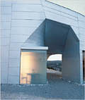
The pictures, I thought were very unprofessional.. bad composition, bad angles ... etc .. etc .. I'm sure they could have at least attempted to make it look presentable. I can honestly say that I could have done a better job of taking the pictures!!
and that picture where they show the stairs ( I think the 2nd one?) .. very bad finishing there.. unless it was intended that way for a rustic look ...
I'm really curious how this only cost a little over 600 grand. You can't build shit for 600 grand now.
I agree with the comments that the article is way too vascilating about making it's 'point'. From this reader's chair, it seems like the clients and the writer are saying the architect messed up a little but it's still pretty cool. 'Unlivable' sounds terrible in a soundbite but people overstate things all the time. I love the caulk comment.
The one fault I can find with S.H.'s office is the lack of appropriate insulation. In a building that's largely opaque, there doesn't seem to be any reason they couldn't have acheived a very good level of insulation somewhere in that wall section between the metal skin and the plaster.
Going over budget isn't anything that unique, a client who goes to a Stephen Holl is crazy to think they can do a house for $300 a square foot....
just because somethings a work of art don't mean its good art. they shoulda just got a trailer like everyone else in new mexico. but if your name is mei mei you gotta spend the bucks.
liberty i love ya but you need to step away from the computer and get some rest. there's plenty of art thats bad out there and its still art. this thing is just lacking in grace and beauty, its clunky. at least if it was cor-ten it would match the other rusted out wrecks that inhabit the new mexico landscape...
And I love you too vado even if sometimes what you call art I call a failed effort. Art has to earn that label (in some usages of that label, at least).
But stepping back a moment, I wonder if it's ever correct to call a building art. I feel comfortable calling it "a piece in (MeiMei and husband's) collection", but it's still actually a building with a function, a utility of some sort. Like a mimbres bowl:
Though a guest house program is so silly and casual that the funkiness (or clunkiness) is part of its utility. And it photographs gracefully - from a distance, that is!
And yes you are right I do need to get some rest if I actually want to meaningfully engage in this conversation.
"When a dream home is a nightmare to live in."
"The Poet Mei-mei Berssenbrugge, co-owner. "We wanted prefab, and instead we got a creative architect's version of prefab.""
"The cottage's original budget was $300,000. It wound up double that, and counting."
"Humidity has taken its toll on the walls. Tuttle says the house is "too hot in the summer, too cold in the winter.""
i don't think it's among the best of holl's work, and i'm usually a fan. it'll be a shame if he gets credit for some level of sublimity/poesy in cases where the cladding is just poorly detailed, the interior plaster has varicose cracking before the house is complete, and the interior environment is uncomfortable. as free and as a guesthouse program is, you'd think that some level of comfort and accommodation would be essential.
all that said, i still like it. i appreciate the owners' comments about it being part of their collection, making it clear that this was at least part of their agenda. if they can afford the cost overruns, good for them. that will be forgotten in a few years and they'll have something of which they can be proud...i hope.
let's just hope the plaster doesn't completely fail and the interior can be made more comfortable.
love the kitchen, btw.
my main beef is still with the author of the article. the captions of the pictures (above) are all about stirring the pot rather than making cogent points about the project or the situation. the nyt usually does a better job.

18 Comments
"We wanted prefab, and instead we got a creative architect's iteration of prefab. It's not Green. It's not solar. It was twice over budget and construction was a nightmare and it's still not finished. But it is real architecture, and that's rare, with beauties only an artist can give you."
they deserve what they got. fuck um...
That article just leaves bad taste in my mouth. What's the point? One speaks poetically, one speaks about caulk, and no consensus is reached by either party. And the author - overstepping the role of neutral reporter, aka laziness? - doesn't try to shed light on any of it.
Gossip, nothing more. Nice pics, though.
agree abt the article, lb. it's the arched eyebrow approach > author doesn't want to commit to any particular thesis so much as provoke.
curious whether there was ever any clear communication abt what they wanted and what holl thought he was doing.
what a load of crap ... I honestly was not impressed with the pictures either ...
very weak ...
Wait, sporadic, please clarify: what's the crap, the project, or the article?
I actually love the house and think it's one of those follies that some architects get to do, some of which end up in the history books. Not sure this one will, but time will tell. It's an early, early use of CAM technology, yes? And guest houses always have a silly program, so it's a fun little project. And the Owners already agree that it's the work of "an artist", though they are being nasty about it now I'll bet 10 years from now thaty'll be so glad they took a risk and did it.
I'm with sporadic cause I wasn't impressed either. Didn't read the article, just looked at the pictures.
Nice blue sky though...
Wish we could have seen the inevitable Holl watercolor that inspired the structure... Also, I think that more exterior shots would have been helpful. I couldn't really decipher the Moore/Ronchamp connection from the images. My only beef with the project itself is the outrageous disregard for the budget. I'm under the naïve impression that constraints are a cornerstone of good design.
Here you go squaresquared:

Not as poetic in the built reality, definitely a little ragged looking.
LB ... I thought that the article was crap ... I do believe that the project is captivating and different, but I cannot justify why any architect should go so over the budget. It's sorta like ignoring the clients need. That said, if the client is happy it's all well and good. and I agree... I do like the project and it looks fun. But the article was all lost in its own story.. couldn't make out what the writer was trying to convey.
The pictures, I thought were very unprofessional.. bad composition, bad angles ... etc .. etc .. I'm sure they could have at least attempted to make it look presentable. I can honestly say that I could have done a better job of taking the pictures!!
and that picture where they show the stairs ( I think the 2nd one?) .. very bad finishing there.. unless it was intended that way for a rustic look ...
maybe that's just a bad contractor's work ..
Well, sporadic, I guess I'm the only one now who feels the building is weak. Awkward, unpleasant spaces and poorly crafted.
Good photography can make anything look good, but didn't anyone consider that these are just ordinary photos of a bad building?
Guess you have to be there in person to make a fair judgement.
I'm really curious how this only cost a little over 600 grand. You can't build shit for 600 grand now.
I agree with the comments that the article is way too vascilating about making it's 'point'. From this reader's chair, it seems like the clients and the writer are saying the architect messed up a little but it's still pretty cool. 'Unlivable' sounds terrible in a soundbite but people overstate things all the time. I love the caulk comment.
The one fault I can find with S.H.'s office is the lack of appropriate insulation. In a building that's largely opaque, there doesn't seem to be any reason they couldn't have acheived a very good level of insulation somewhere in that wall section between the metal skin and the plaster.
Going over budget isn't anything that unique, a client who goes to a Stephen Holl is crazy to think they can do a house for $300 a square foot....
just because somethings a work of art don't mean its good art. they shoulda just got a trailer like everyone else in new mexico. but if your name is mei mei you gotta spend the bucks.
vado I'd question whether you can call it art if it's bad. And they didn't want a trailer, they wanted a piece of art. It's part of their collection.
liberty i love ya but you need to step away from the computer and get some rest. there's plenty of art thats bad out there and its still art. this thing is just lacking in grace and beauty, its clunky. at least if it was cor-ten it would match the other rusted out wrecks that inhabit the new mexico landscape...

And I love you too vado even if sometimes what you call art I call a failed effort. Art has to earn that label (in some usages of that label, at least).

But stepping back a moment, I wonder if it's ever correct to call a building art. I feel comfortable calling it "a piece in (MeiMei and husband's) collection", but it's still actually a building with a function, a utility of some sort. Like a mimbres bowl:
Though a guest house program is so silly and casual that the funkiness (or clunkiness) is part of its utility. And it photographs gracefully - from a distance, that is!
And yes you are right I do need to get some rest if I actually want to meaningfully engage in this conversation.
"When a dream home is a nightmare to live in."
"The Poet Mei-mei Berssenbrugge, co-owner. "We wanted prefab, and instead we got a creative architect's version of prefab.""
"The cottage's original budget was $300,000. It wound up double that, and counting."
"Humidity has taken its toll on the walls. Tuttle says the house is "too hot in the summer, too cold in the winter.""
i don't think it's among the best of holl's work, and i'm usually a fan. it'll be a shame if he gets credit for some level of sublimity/poesy in cases where the cladding is just poorly detailed, the interior plaster has varicose cracking before the house is complete, and the interior environment is uncomfortable. as free and as a guesthouse program is, you'd think that some level of comfort and accommodation would be essential.
all that said, i still like it. i appreciate the owners' comments about it being part of their collection, making it clear that this was at least part of their agenda. if they can afford the cost overruns, good for them. that will be forgotten in a few years and they'll have something of which they can be proud...i hope.
let's just hope the plaster doesn't completely fail and the interior can be made more comfortable.
love the kitchen, btw.
my main beef is still with the author of the article. the captions of the pictures (above) are all about stirring the pot rather than making cogent points about the project or the situation. the nyt usually does a better job.
he he he
he said caulk!
he he he he he he he!
and he said that every Holl was packed with caulk!
Block this user
Are you sure you want to block this user and hide all related comments throughout the site?
Archinect
This is your first comment on Archinect. Your comment will be visible once approved.