
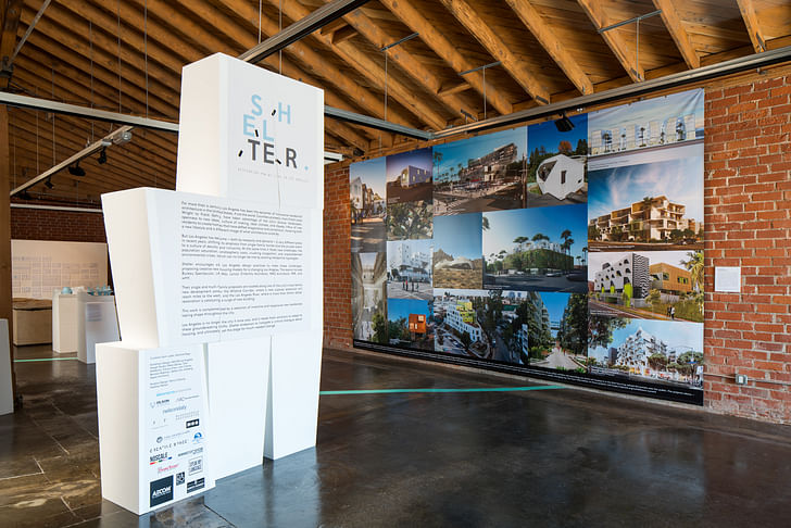
With all the media attention on California’s drought, the “atoning L.A.” narrative has gotten pretty common. The city’s gluttonous lawns, sprawling infrastructures and indulgent residents – in short, its sinful stereotypes – have become untenable as the drought, a housing crisis and pressing sustainability measures come knocking at the city’s door.
For much of that preceding history, the gem in L.A.’s architectural crown was its single-family houses: the Case Studies, the indoor-outdoor atmospheres, the suburbanite’s castle. But as sins are being repented and L.A. shifts priorities towards a more progressive urban identity, those icons must too change to keep up.
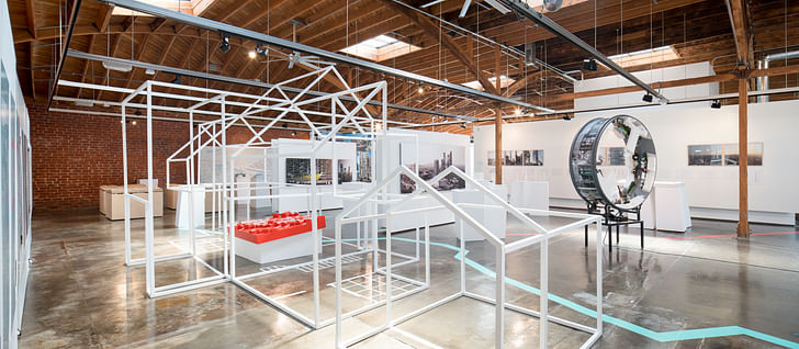
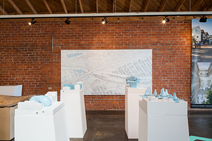
Shelter asked six firms – all with a foot in the city, whether new or established – to imagine new forms of residential architecture for Los Angeles.Responding to this pivotal moment in Los Angeles, “Shelter” imagines a variety of speculative housing options for the city. The debut exhibition at the Architecture and Design Museum’s new location in Los Angeles' Arts District (having moved from its location on the Miracle Mile), “Shelter” asked six firms – all with a foot in the city, whether new or established – to imagine new forms of residential architecture for Los Angeles. Some feasible and other fantastical, each project riffs on the problems and pathos of housing across the city. In the atonement vein, co-curator Sam Lubell introduced the exhibition by saying “we’ve run out of room and we’ve run out of options.”
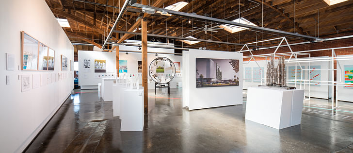
To ground the exhibition, curators Lubell and Danielle Rago asked that each exhibitor base their proposal on one of two locales: the Los Angeles River, and the so-called “Wilshire Corridor”. Both areas are highly-visible and densely significant to the city’s structures – ongoing master planning for the L.A. River has swept up Frank Gehry, and is digging up all kinds of contention for precisely what, and how much, should be developed. Wilshire Boulevard, one of the city’s major east-west arteries and the backbone for some of the city’s densest neighborhoods, is finally getting a subway extension underneath a highly trafficked stretch. Both can be seen as epicenters of what the L.A. Times’ architecture critic Christopher Hawthorne has deemed the “Third Los Angeles”.
corridors, and not a particular demographic, frame the discussion of housingIt’s telling that these corridors, and not a particular demographic, frame the discussion of housing. Upon first hearing the exhibition’s name, I automatically assumed it had to do with social housing: Shelter brings to mind the bare minimum of human habitation, and how in L.A., growing populations of new residents and the homeless have dwindling, if any, access to housing stock. But Shelter isn’t about designing for the 21st century family, or the millenial, or the homeless, in Los Angeles – it’s about forming new expectations of how housing and the city should interact.
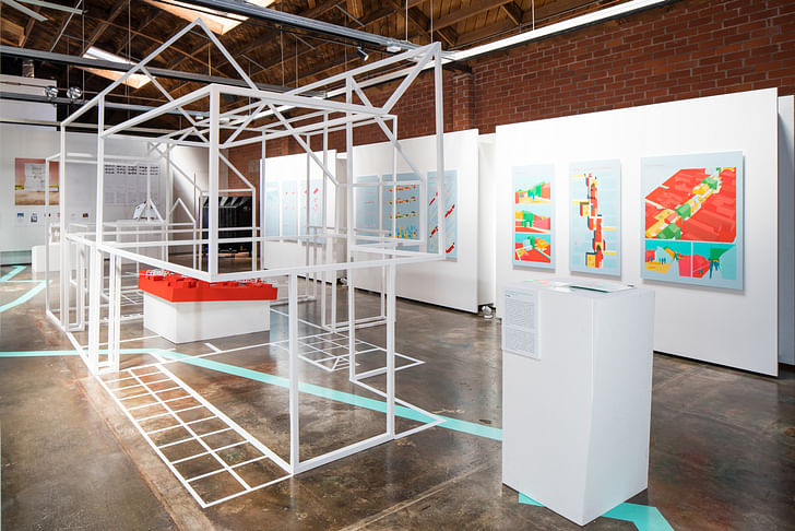
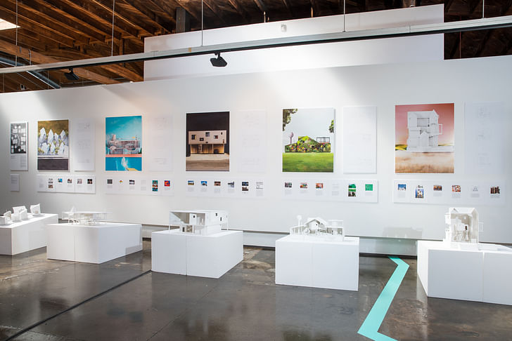
Blue and red lines on the A+D’s floor guide the visitor through the exhibition, visiting projects on the River first, then heading to Wilshire’s. The focus on corridors, rather than individual sites, wasn’t just to give the exhibitor’s more choices of how to situate their projects. It was also to express L.A.’s identity as born from its sprawl and extent, rather than discrete sites. “We wanted something that stretches across different neighborhoods and kind of unites them,” Rago explained.
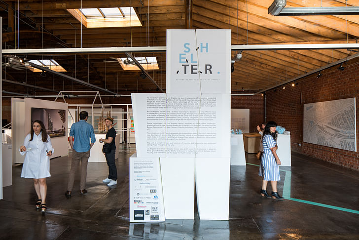
Shelter is about merging L.A.’s residential spaces with its civic topography, forming a less privatized residential existence in the city.What the exhibition finds along those corridors then is visions of how L.A. could rethink its expectations of urban life. Rather than crafting innovative jewel boxes or next-generation Case Studies, the housing imagined in Shelter is about merging L.A.’s residential spaces with its civic topography, forming a less privatized residential existence in the city.
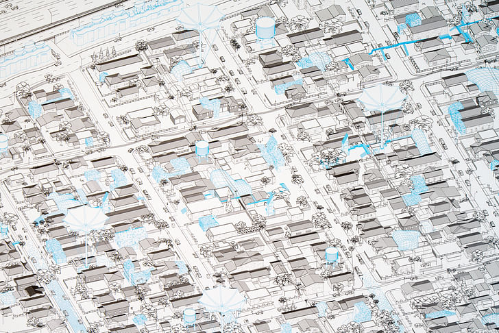
This opening up to the public realm focused on both environmental access and urban space. Lorcan O’Herlihy Architects (LOHA) presented some formal experiments on how to take advantage of fringe, leftover scrap-lands along the River, and develop multi-functioning housing that integrates water infrastructure and public spaces. Proposals from both PAR and MAD naturally gravitated towards the Museum Row area on Wilshire Blvd., placing residential towers at a richly developing node, in the company of Peter Zumthor’s LACMA redesign, a revamped Peterson Automotive Museum, a new subway stop, and Renzo Piano’s new Academy of Motion Picture Arts and Sciences.
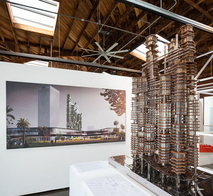
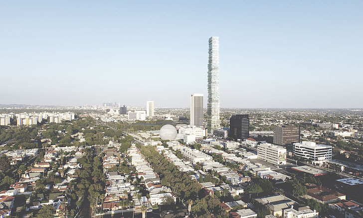
MAD’s “Cloud Corridor” tower builds off of founder Ma Yansong’s “Shanshui City” ideal of dense urbanism that incorporates nature, while PAR’s 6030 Wilshire tower softens its 930-foot tall monolithic image with extended green terraces and integration with the upcoming transit stop (Herzog & de Meuron's Beirut Terraces and 56 Leonard in New York City come to mind). Both proposals also referred to the Museum Row as a cultural epicenter of the city, and a place that Angelenos would naturally want to place their front doors (which traditionally, has hardly been an expectation of housing in the city). The renderings for each project are striking, and try to soften the anonymous, sore thumb image of the type. But while such verticality seems inconceivable on today’s Wilshire next to Zumthor’s oozing LAMCA, the drama of the proposals speaks loudly enough to at least start the conversation.
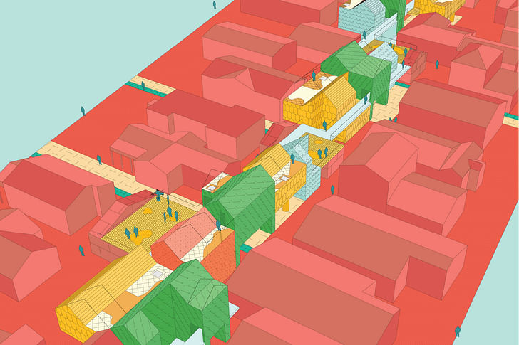
Approximately nine miles east of Museum Row sits Elysian Valley, a tiny community situated between the I-5 freeway and the L.A. River, and the site for nonprofit LA-Más’ “Backyard Basics” proposal. Also known as Frogtown, Elysian Valley has been a lightning rod for discussions of riverfront development – the neighborhood has a history of fighting to keep by nature of its site, falls into L.A.’s prickliest patch of developmental issuesdensity low and developers out. But as property values are rising along the river, residents are struggling to keep the housing stock affordable and appealing. Where a tower would be inconceivable, LA-Más put forth a re-fangling of the “Granny Flat”, bringing density to existing lot lines horizontally, while also configuring it with transit hubs to link the neighborhood up to a larger community plan.
LA-Más’ own office is on the river in Frogtown, and their Granny Flat proposal was born out of months of research and collaboration with the community to find a “resident-led and resident-owned” housing model – research that predates the exhibition and may outlast its November run as well. Of all the proposals on display at Shelter, theirs is the closest to a full design-led solution, and by nature of its site, falls into L.A.’s prickliest patch of developmental issues: gentrification, affordable housing, river development, density and transit access. It is in many ways Shelter’s most promising vision for L.A.’s immediate future.
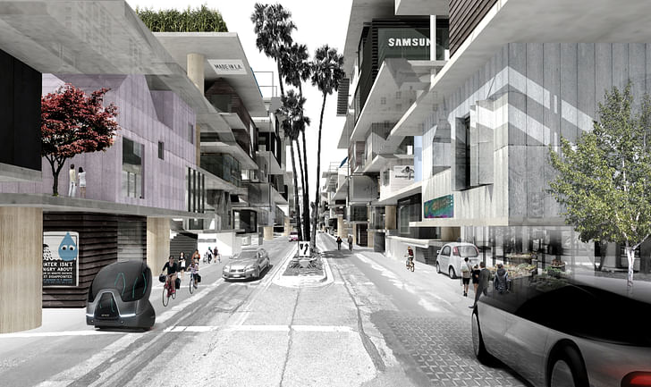
wHY Architects, based in Venice, took on Wilshire Blvd. as their site and material. “Un \ Folding Wilshire” imagines both the street’s surface and above space for mixed-use development, including “sharing economy” businesses like Airbnb and Uber as status quo, and integrating them structurally into the streetscape (which has also been drastically narrowed). Underneath the strip, the fresh Metro extension will run, as the above space teems with a new public-private cocktail of automated vehicles and parks in the aesthetics of parking garages.
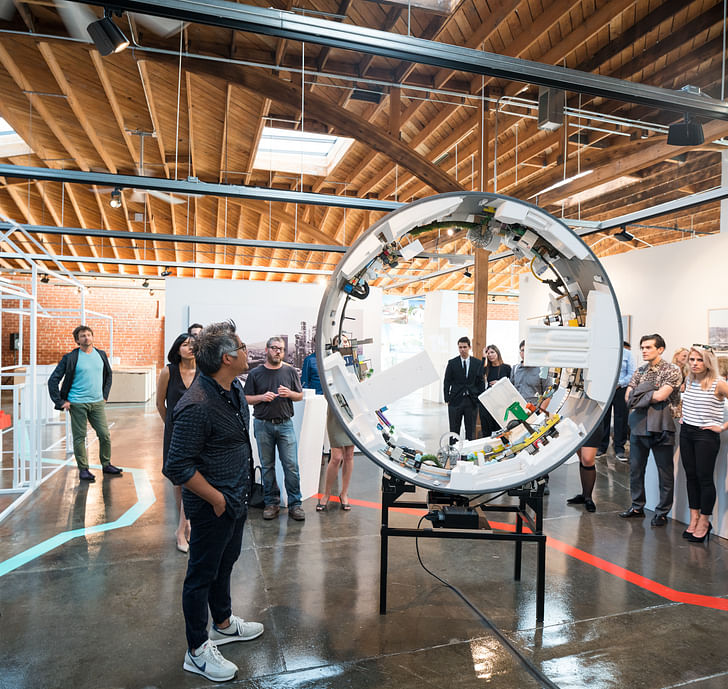
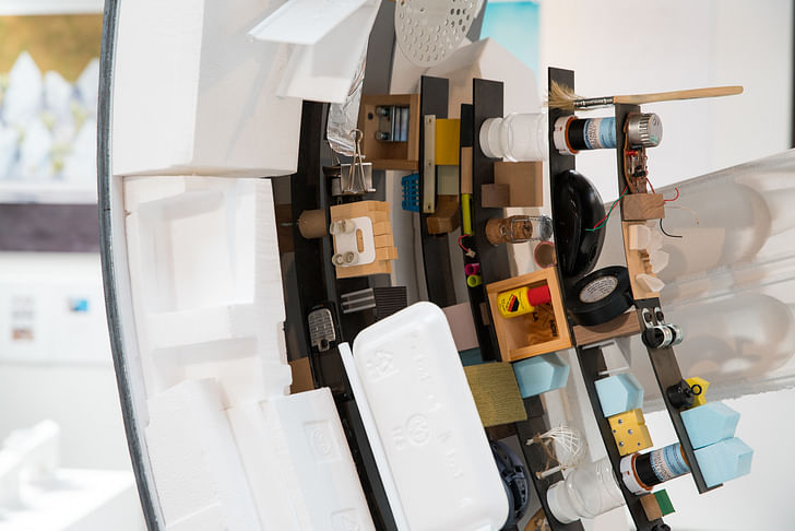
a new public-private cocktail of automated vehicles and parksTheir vision was easily the most fantastical – not because it couldn’t be done, but for its remixing of the public/private relationship that currently characterizes “L.A”. Along with a series of renderings, their idea was illustrated by a giant ring, approximately five-feet across, its inner surface paved with styrofoam forms and household objects to resemble an urban topography, as it revolved on a horizontal axis. To everything, turn, turn, turn.
And of course, whither to the single-family house? Bureau Spectacular, in fine playful form, offered a variety of next-gen versions of some of L.A.’s most standard domestic types for along the River, as distinguished by different versions of “normal” southern Californian architectures. David Hockney’s “A Bigger Splash” plays the pool in the foreground of a post-and-beam number with rooms of scooped out kidney pool volumes, alongside storybook pictures of flora-pasted bungalows, next to a deliciously dingy dingbat and an immaculately white and minimalist Queen Anne.
The entirety of Shelter came together in under five months – a relatively quick turnaround that lends the proposals a relevant and limber tone. And regardless of the proposals’ feasibility, what is ultimately so satisfying about Shelter is its optimism – that the linearity of the city can be adapted for more sustainable, public forms, no self-flagellating atonement required. So long as its existing framework can inform new ideas, L.A.’s past sins need not prevent it from thriving in the future.
“Shelter” is on view at the Architecture + Design Museum in Los Angeles from August 20 through November 6.
Former Managing Editor and Podcast Co-Producer for Archinect. I write, go to the movies, walk around and listen to the radio. My interests revolve around cognitive urban theory, psycholinguistics and food.Currently freelancing. Be in touch through longhyphen@gmail.com
1 Comment
Great article!
Block this user
Are you sure you want to block this user and hide all related comments throughout the site?
Archinect
This is your first comment on Archinect. Your comment will be visible once approved.