
Continued from Part 1...
Shelter: Wiggle Room and Shifting Spaces
The ‘wiggle room’ in Venturi and Scott Brown’s ‘mitten’ spatial layout derives from unspecialized forms of generic spaces, central concentration of core and access, modularity and regularity of architectural elements, generosity in space provided both in height and plan, and evenness of lighting. (Sketch 4) Such ‘wiggle room’ allows for initial flexibility in the layouts of the building’s first users, and anticipates future growth of programs and recombinations of spatial layout between occupancies. In addition to these flexibilities, this paper identifies a particular type of subsequent flexibility emergent in contemporary architecture, which begins to engage another reading of ‘wiggle room’ -- one that allows for a shifting between programs during occupancies. (Sketch 5)
Sketch 4 - Diagrammatic illustrations of Venturi and Scott Brown’s generic loft building and flexible spatial configurations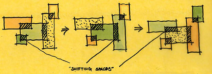
Sketch 5 - Diagrammatic illustrations of ‘wiggle room’ as ‘Shifting Spaces’ in-between programs
‘Smart.space,’ a small residential unit designed by New York based architecture firm AvroKO, is an example of how spaces can be shared by overlapping programs, allowing their uses to shift during occupancy, thereby maximizing the use of limited space. For example, the division between the kitchen and the guest bedroom ‘shifts’ to allocate the space between them to whichever function is primary, depending on the time of the day. (Figure 16 and Sketch 6) In this way, the simplistic moveable partitions and furniture, which vaguely alter areas through occasional rearrangements, can be taken to the next level.
Figure 16 - The adjustable kitchen and the collapsible guest bedroom of ‘smart.space’ in New York, by AvroKO, built in 2005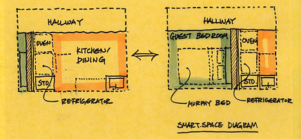
Sketch 6 - Diagrammatic illustrations of the adjustable kitchen and the collapsible guest bedroom of ‘smart.space’
‘Shifting spaces’ may not even require movable elements. Lynch argued that spatial flexibility can be achieved if "the pattern (of programs) is arranged so that each use most liable to grow has, in at least one direction, a substantial low intensity buffer zone between it and the next important activity,"xxii hence allowing the programs to expand and contract without running over other uses. ‘Shifting spaces’ takes this idea further, by assigning a generic function, which is a common denominator of surrounding programs, to the suggested low intensity interstitial buffer. The sharing of common functions in the interstitial space will not only maximize usage of the area, but also smooth the transition of programs, increasing efficiency and effectiveness of spatial flexibility.
One such example is the lobby of the W hotel in Times Square, which locates two specific programs in one open space -- a welcome-desk and a bar - with a generic sitting space in-between the two. During the daytime, this interstitial space belongs to the welcome-desk as the function of check-in/check-out becomes more dominant, while in the evening, the sitting area appropriately caters to the bar. Similar spatial configurations can also be seen in older, small European boutique hotels, where the lobby functions as a tea-room in the afternoon when the function of check-in/check-out diminishes. The spatial layout and program allocation thus allow the designed space to house multiple programs and shift its function accordingly. (Figure 17 and Sketch 7) This idea can also be expanded to larger-scale applications. A generic parking lot can be strategically placed within convenient proximities to both a baseball stadium and a corporate office zone. This allows the parking lot to be shared by the two programs with different peak hours during the day and the week, and prevents the inefficiency and redundancy of having two separate parking lots.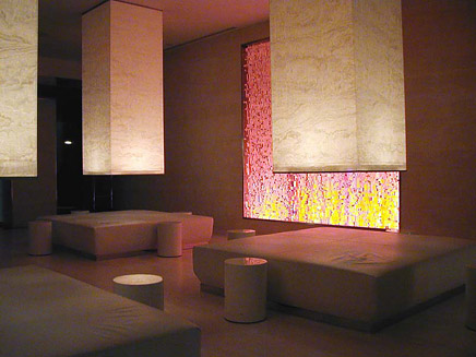
Figure 17 - The sitting space between the welcome desk and the bar in the lobby of the W hotel in Times Square, New York, by Yabu Pushelberg, built in 2001
Sketch 7 - A spatial diagram of the lobby
Expanding the Architectural Vocabulary
Innovations and evolutions of architectural elements can contribute to the creation of spaces with overlapping programs. Rem Koolhaas’ design for a house in Bordeaux, France, incorporates a hybrid vertical circulation/floor system. The movable floor, originally designed to accommodate a handicapped client, shifts its location in a similar way to AvroKO’s ‘smart.space’, but vertically. When the first vertical circulation system was invented and proven safe by Elisha Otis in 1852, its architectural possibilities and impact on society were imagined to be boundless: however, over the years it became internalized and pushed into a building’s core - merely contributing to architecture’s growth in height. The house in Bordeaux further investigates the possibilities of the vertical circulation system, creating spaces that shift between solid and void, open and closed, and providing sectional flexibility to suit the programs below or above.xxiii (Figure 18 and Sketch 8)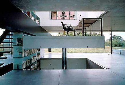
Figure 18 - The movable floor of the House in Bordeaux, France, by Rem Koolhaas, built in 1998
Sketch 8 - Diagrammatic investigations of flexible spatial layout in sectional view
Curtain wall systems, now widely used on modern buildings, can create exterior-like space within interior by establishing a visual connection between them, and may encourage a smoother overlap between programs. (Figure 18) The curtain wall system is more than a mere hybrid of the two conventional architectural elements of wall and window - it is an engineering innovation that uses gravitational force to its advantage. Glass panels are hung onto the structure like a curtain, being stabilized against the lateral wind load by the downward gravitational pull. This opens up greater possibilities for building enclosure system, thereby expanding the contemporary architectural vocabulary.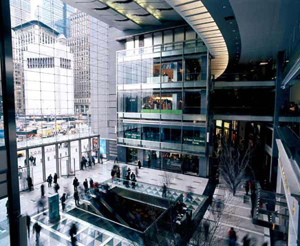
Figure 19 - Entrance of Time Warner Center in New York and the curtain wall system, by Skidmore, Owings, & Merrill, completed in 2004
Toyo Ito attempted in 2001 to redefine architectural elements through his Sendai Mediatheque project in Japan, proposing ‘plate’, ‘tube’ and ‘skin’ as the three primary elements of architecture.xxiv (Figure 20) Yet, contrary to this reductive approach, changing paradigms of contemporary society call for an expansion of the available architectural vocabulary. Engineering and electronic technology can and ought to expand the possibilities of architectural elements beyond the conventional floor, column, wall, and window to allow the architectural language to mature in today’s multi-cultural society, and to reflect its complex redefinition of function and the increasingly blurred boundaries of spaces.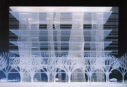
Figure 20 - Sendai Mediatheque in Japan, by Toyo Ito, built in 2001
Signage: Architecture in the Information (and Interactive) Age
Venturi and Scott Brown promote architecture that clearly acknowledges, engages and accommodates symbolism and iconography, emphasizing architecture’s historic function of communication and information. Unfortunately, this communicative aspect is often rendered ambiguous or lost in the abstract forms of some recent Neo-Modernist, Deconstructivist architecture. "As a method of analyzing texts based on the idea that language is inherently unstable and shifting"xxv, Deconstructivist architecture detaches certainty from its communicative aspect.xxvi Learning from the historic and social relevance of the hieroglyphics in ancient Egypt, the mosaics of the Byzantine and Early Christian Churches, and the stained glasses of Gothic architecture, (now considered fine art, but originally intended to communicate religious content), Venturi suggests the use of ‘pixelated electronic surfaces’ such as LEDs, as the signage that is able to communicate an unlimited amount of information in real-time, for a post-industrial, electronic, Information Age.xxvii (Figure 21, and 22) Scott Brown presents a different way of thinking about this notion in an interview with the architectural magazine, RES: "Baroque architecture needed a depth of one yard to do its decoration; Renaissance architecture perhaps a foot, Rococo one centimeter, and Art Deco could suggest seven or eight overlaid surfaces in one bas-relief, one centimeter deep."xxviii For the wall surface of their 1978 Best Products Catalog Showroom in Pennsylvania, Venturi and Scott Brown designed ornamentation that is merely a two-dimensional color change. 30 years later, in an age where events and paradigms change at unprecedented rates, they promote light emitting surfaces as decoration, for their flexibility and immediacy of communication. (Figure 23, 24, 25, 26 and Sketch 9)
Figure 21 - Hieroglyphics on a section of the obelisk in front of the pylon at the court of Ramesses II, Temple of Luxor, Egypt, built in the 1300s BC and a Mosaic inside a Byzantine Church in Sicily, Italy, built in the 12th century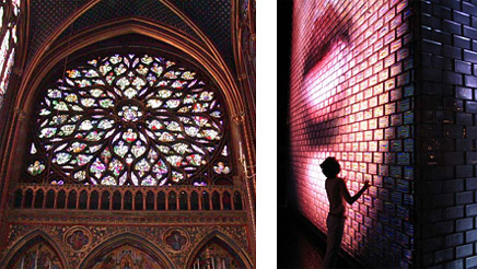
Figure 22 - Gothic stained glasses -- the rose window -- inside La Sainte-Chapelle in Paris, France, which was added to the building in the 15th century, and an LED installation at the new Millennium Park in Chicago, completed in 2004
Figure 23 - Italian Baroque architecture detail by Andrea Pozzo and Italian Renaissance architecture detail from History of Architecture and Ornament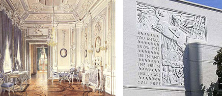
Figure 24 - Rococo architecture detail in Gatchina Palace in Russia, and Art Deco bas-relief details on a science building of Berkeley High School in Berkeley, California, by Henry H. Gutterson and William Corlett, Sr.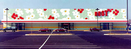
Figure 25 - Best Products Catalog Showroom in Langhorne, Pennsylvania in 1978, by Venturi, Rauch and Scott Brown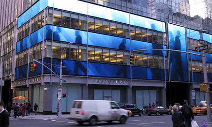
Figure 26 - A decorative application of LED panels on an office building in New York, in 2007, by Kohn Pederson Fox Architects, completed in 2001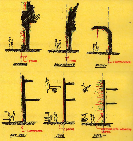
Sketch 9 - Illustrations of changing depths of decoration in architecture over time
One of the defining characteristics of the new Information Age is interactive communication. The stained glasses of Gothic churches, hieroglyphics of Egyptian pylons, and conventional books all communicate content, but the communication is unidirectional - from a source to the masses. In contemporary society, the exchange of information is increasingly interactive: the fundamental concept of the World Wide Web is that information is searched through on-line software programs that receive researchers’ interests and provide them with suitable matches. Input-driven electronic devices support interactivity by allowing communication between the source and the user, while smart technologies in modern buildings measure the environment and adjust lighting and temperature levels automatically to create a comfortable atmosphere. In addition to the benefits it bestows in providing immediate access and limitless depth of content, electronic signage can and should be used in architecture to incorporate interactivity, further improving efficiency and quality of communication and thereby enhancing spatial flexibility. (Figure 27, and 28)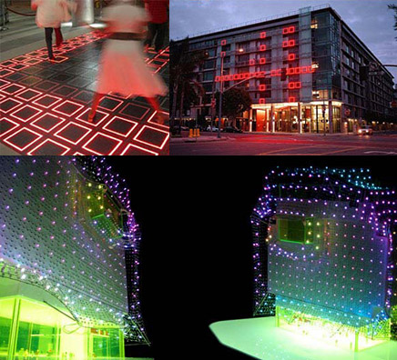
Figure 27 - ‘EnterActive’ in Los Angeles, designed by Electroland, built in 2006, uses LED panels on its façade that respond to the movement of tentative visitors, and Cloud 9 Architecture’s Habitat Hotel to be developed in Barcelona, Spain, by has an ‘energy mesh’ façade which conveys the amount of solar energy collected during the day by glowing in different colors at night
Figure 28 - Dario Buzzini’s interactive wall, developed in 2004, and Kinecity’s ‘Comment Wall’, an idea developed in 2005, both continuously display messages and images which are input or requested by users
Evolving the Trinal Relationship: Interactive Signage, Flexible Shelter and Updated Context in Contemporary Architecture
Towards the end of Architecture as Signs and Systems , Scott Brown questions whether architects will be prepared to surrender architecture’s task of symbolic communication to the graphic artists who design electronic messages. "Will designing the shed and the frame that holds the decoration be enough for us (the architects)?" she wonders.xxix One must further question whether it is enough for architecture to remain a simple frame for the decoration. Is the arrangement of the electronic signage put on the frame of a shelter enough to accommodate shifts in social paradigms and the resulting fluctuations in spatial relationships? After all, architecture can and ought to explore ways in which signage engages shelter to ultimately evolve the trinal relationship of signage, shelter and context in current times.
In the contemporary context, architectural enclosures must incorporate yet another function -- adaptation to sustainability issues. Society’s growing interest in sustainable technology is acquiring an urgent tone as damages inflicted on nature through modern industrial development continue to intensify. (Figure 29) Advanced sustainable building technology often uses flexible enclosure systems, which condition the interior and minimize energy waste by harvesting solar power and allowing for natural ventilation, shading, and lighting. For example, the façade of the Caltrans District 7 Headquarters, designed by Morphosis, is an integration of operable shading devices, photovoltaic panels, and communicative/decorative signage elements. On the surfaces of the Philological Library at the Berlin Free University, Norman Foster arranged transparent glass panels to interactively track the movement of the sun and aluminum panels to allow the building to "breathe", enabling the library to rely on natural ventilation for 60 percent of the year.xxx (Figure 30) These panels are still rigid and the integration limited, compared with the variety possible in urbanistic relationships or with what the shelter can do behind its signage, but this kind of manipulation of conventionally rigid enclosure systems foreshadows the potential of redefined engagement of signage and shelter in the building envelope.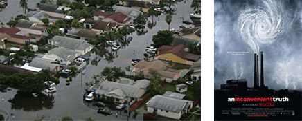
Figure 29 - A picture of the aftermath of the unusually powerful hurricane Katrina in New Orleans, Louisiana, in 2005, and a poster of the controversial documentary movie "An Inconvenient Truth" about environmental anomaly and its causes, by politician/environmentalist, Al Gore in 2006
Figure 30 - The Caltrans District 7 Headquarters in Los Angeles, designed by Morphosis, completed in 2004, and the Philological Library at the Berlin Free University in Germany, by Norman Foster, completed in 2005
As discussed above, the updated meeting of signage and shelter is full of possibilities to be further questioned and explored: Does a constantly changing electronic signage undermine the inherently permanent nature of architecture? Should the signage be a wrapper for the shelter? Should the signage and the shelter even be integrated together, or should they be physically independent of each other, as Venturi and Scott Brown once suggested? How can the interactive signage respond to the blurred boundaries between exterior and interior, or interior and interior, as in the ‘Shifting Spaces’? The correlations between the duality of architecture and the notion of functional flexibility in today’s context are important themes that should continue to be investigated in contemporary architecture. (Figure 31, 32, and Sketch 10)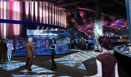
Figure 31 - An interior rendering illustrating illuminative electronic decorations in a design for a casino in Atlantic City, New Jersey, by Arquitectonica, expected to be completed by 2011
Figure 32 - A department store building, wrapped in decorative LED panels in Seoul, Korea, by UNStudio, built in 2004, and a rendering illustrating the translucent ‘SmartWrap’ façade application by Kieran Timberlake Associates, developed in 2003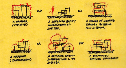
Sketch 10 - Illustrations of possible engagements of ‘signage’ and ‘shelter’ in contemporary ‘context’
Venturi and Scott Brown’s theories are too often placed within historical parentheses that prevent a renewed understanding of their ideas within ongoing architectural dialogues. In exploring cultural and societal conditions that affect contemporary approaches to architecture, this paper highlighted the relevance of their works in the discourse on flexibility and communicational interactivity of architecture. The current interest in technologically advanced surfaces represents one extension of their ideas. The 2004 issue of Praxis magazine dealt precisely with this topic, documenting emergent technologies such as Kieran Timberlake Associates’ ‘SmartWrap’, a revolutionary new façade material that incorporates climate control, energy harnessing, lighting, and display into a thin composite film.xxxi Such trends indicate a discipline-wide interest in how signage engages shelter, first introduced by Venturi and Scott Brown in the 1970s. In placing their theories within all these developments in contemporary architecture, this paper aims to establish Venturi and Scott Brown’s ideas as the starting point of an expanded relationship between signage, shelter and context.
- ACKNOWLEDGMENTS -
I would like to thank Denise Scott Brown, Robert Venturi, Sun-Young Park, Peter Feigenbaum, Sam Nicholson, Robert Aitcheson, Aaron Bowen, Jiwon Choi, Asiya Chowdhury, Ronald Evitts, Fernanda Freitas, Eric Hofmann, Jiin Ko, Eugene Kwak, Christopher Lee, Yoonwhe Leo Moon, Hillary Nicholson, Kevin O’Connor, Sebum Oh, Silvia Saponaro, James Simmons, Yong Sin, Anthony Tong, and James Venturi for their advice, encouragement and criticism in the writing of this essay.
[xxi] Scott Brown, Denise, "The Redefinition of Functionalism," Architecture as Signs and Systems: For a Mannerist Time , p. 162.
[xxii] Lynch, Kevin, "Environmental Adaptability," pp. 16-24.
[xxiii] Hill, John, "One-Family Home," A Weekly Dose of Architecture , (1999).
[xxiv] Ito, Toyo, Image of Architecture in Electronic Age , (2001).
[xxv] Besley, Catherine, Post Structuralism: A Very Short Introduction (Oxford: Oxford University Press, 2002).
[xxvi] Salingaros, Nikos, Anti-Architecture and Deconstruction (Soligen, Germany: Umbau-Verlag, 2004).
[xxvii] Venturi, Robert, "Architecture as Signs rather than Space," Architecture as Signs and Systems: For a Mannerist Time , pp. 93-101.
[xxviii] Ashlock, Jesse, Signs and Systems: Q+A with Robert Venturi and Denise Scott Brown , (2004).
[xxix] Scott Brown, Denise, "The Redefinition of Functionalism," Architecture as Signs and Systems: For a Mannerist Time , p. 164.
[xxx] Pearson, Clifford, "Free University Library," Architectural Record (November, 2006), p. 139.
[xxxi] Gilmartin, Benjamin, "SmartWrap," Praxis (February, 2004).
Creative Commons License
This work is licensed under a Creative Commons License .
/Creative Commons License
14 Comments
thanks. this kind of credibility is often held back fom VSBA due to rampant laziness and summary judgement of their work as post modern etc... there has not been many architectural practitioners pushing these ideas with such clearity and purpose as they have done.
nice hand sketches, clear and effective, used to illustrate points in this piece.
re: wiggle room and shifting spaces. the author should check out stewart brand's 'how buildings learn' if he hasn't already. both reinforcement and further expansion on some of the glove/mitten theme points made here.
the mitten & glove illustration is a beautiful discussion and something very tangible for contemporary critique of architecture. it can be looked as a physical reference in the critique of recent buildings as (from my own interpretation and partial distillation) VSBA brings out.
i, too, often look most recently publicized buildings and projects and use related questions of;
what other uses can i apply to this building? or, what else can be applied or invented for its use?
often this leads me to depth of architects' projections and inclusion of time dimension into their conceptual constructions and their own critiques of contemporary thinking or anything else if any. sometimes the conclusion is mute or irrelevant. but nevertheless it is often entertaining for me to say the least.
ie; can you see an adoptive or flexible use of libeskind's denver museum or mayne's cal-trans? i am not saying or asking these in a dismissive way, just using the question in a manner to dissect or understand or further materialize the applied designs and systems, both technologically and socially-including the wider contextual discussion in VSBA's words.
i am a bit surprised that SANAA is not mentioned in the essay because their topological investigations have deeper dimensions which might not be apparent from the ephemeral atmosphere they create with thin materials i.e. glass and steel columns with the smallest diameters nor from the clarity of organization seemingly too simple to be perspicuosly called as diagram architecture, not too mention the picture perfect qualities their architecture possess. their interests in investigating the limits with a buffer space on top of topographical mapping between inside and outside certainly deserve an analysis with symbolic meanings especially in relation to VSBA's comment about exceptions.
Thank you for the wonderful comments/observations. I've been getting emails from London, Turkey, New York, Boston, etc. with similar comments as these. It is great, and yet also surprising, to know that many architects are in sympathy with what's disccussed in the article.
-to metamechanics: I cannot speak for VSB, but I think the Decon. idea of unmotivated architectural elements can be relevant but only for a short period of time - maybe for a split second, in the long history of architecture - if architecture was to be treated as an evolution of ideas. Deconstructivism seems more like a quick, exclamation-mark-like reaction, rather than a real response, to the later-day globalism and multi-culturalism. (a "tower of babel" type of panic from not being able to fully understand different cultures)
When different cultures meet, at first, people only see what they want to see -- the good and easy-to-relate things. For example, Earlier-day Modernists saw Japanese high-culture and its simplicity and elegance as something they can and should relate to, sometimes in order to strengthen their arguments. However, after decades, when the later-day modernists observed Japan's B-rated, highly-commercial pop culture scene, mostly influenced by the Western culture then, only a handful of intellectuals - such as VSB - could evaluate, understand, and even learn from it. Others arrived at convenient conclusions that do not require much understanding, or sometimes even oppose dialogues -- one of them, deconstructivism. Now, this is just one way of looking at the development of architectural dialogue that has happened in the past half a century, but the point is that I think the new generation of architects can and should go beyond the exclamation mark reaction, and learn from the optimistic architects who pioneered a way of learning from everything. (Although these architects can appear to love ironies, that does not make them pessimistic. De(con)structive ideas are way more pessimistic.)
- to Steven Ward: Thank you for enjoying my (and Bob and Denise's) hand sketches.
And I will defnitely read "How Buildings Learn." How do you think it reinforces the arguments discussed in the article?
- to egoist: your comments about SANAA/VSBA connection is very interesting. I am sure SANAA does extensive topological studies, though I am not as familiar with them.
Could you tell me a little bit more about SANAA's interests in buffer spaces/mapping/symbolic meanings in relation to VSBA's mannerist comments?
- to Orhan Ayuuce: I think the questions you ask are all valid and important.
It is relatively well understood among architects that what they draw on pieces of paper (or computer screens) should consider/accommodate the future context, since the transition from the paper drawings to an actual built environment normally takes months if not years. However, it is often forgotten that the built architecture can - and should - last beyond its original use.
This adds another dimension to our understanding of 'function.'
In the 1960s and '70s we recommended changes to keep the Modern architecture we love responsive to its times. Forty years later we are happy to read this author's reappraisal of what we said. Steven Song puts aside the debris of misunderstanding that accompanied the first reception of our ideas and sets them back along the tracks we had intended. Then he adapts and expands our thesis to meet conditions that young architects in practice today will face.
In doing so, he gives us hope that the newest generation of architects, as they again reformulate Modernism, will maintain and strengthen its good base -- what a gift to two old architects! Denise Scott Brown.
i feel humbled to make a comment on the concepts after knowing that professor scott brown had visited the discussion. i will do my best to make a responsible feedback to steven, and please correct me denise if i misinterpret anything.
steven, i don't think i am in any better position to speak to you about sanaa's projects because i was responding to your article based on what i read, not from experiencing their buildings nor from acquainting them in person. however, mannerist approaches have been applied in many occasions to form exceptions about which new rules can be created throughout history. in sanaa's monograph, they talk about how separating rooms and then regrouping them is a method applied in many of their projects. also, sejima san speaks about non-hierarchical spaces without relying on the orders of classical hierarchy, not to mention that their projects have enormous miesian characteristics. but i think it is very important to think about the symbolic implications of creating new orders for the reasons we all know too well. nonetheless, if we suspend the consideration of possibly dangerous situation, contemplating about fundamental spatial relations does help to create interesting architectural topological situations, and sanaa seem to be masterful at maneuvering the relations between inside and outside and what is inbetween. also, in some of their projects, they break down the programs to very small rooms, but in other projects, the spaces they introduce seem very flexible in regards to function. in similar regard, a buffer space can be metaphorically interpreted as an exception. about architecture as signs, although sanaa do not use digital surfaces, hence the method of communication is less direct but more atmospheric, by extensive use of glass and manipulating the layers of the material and the curvature, their architecture seem to communicate with people and environments through transparency, opacity and reflection. in that way, i think their projects are often interpreted to be representative of virtual worlds, our present reality.
Help me out here Peter. Isn't the variation in say a loft or these examples of signage are really just "units" ie surface phenomenon" that conform to a set of "rules" ie the way things get put together. That is although many variations may be possible those variations are all serve a set of rules. ie structure?
Also, how is a building that is a sign ie a billboard ie an advertisement ie signage ie a surface treatment a "SIGN."
As far as Mannerism goes, don't we all want to bring our Madonna with a Long Neck into the world?
i have been to a number of sanaa buildings. i have been to only a few VSB buildings.
based on the experience of the buildings and not the text...my feeling is that sanaa is interested in spatial concerns. signage, at least in an overt way, is not relevant. the non-hierarchical sequence of spaces is certainly a common theme in their work. i would not equate this with mies' version of space though, which is neutral and immense and even "location-free". sanaa's sense of space is much more intimate and non-universal, which is why i think they are interesting at all. making place out of nothing is not easy when the goal is to remove all markers at the same time.
the wiggle room diagram is very clever, but i am not sure that signage is meaningful as architecture (anymore?). interactivity is a priori a condition of ALL architecture, so i wonder what is special about the facade? do things that move in "grotesque" ways only qualify as interactive? this is perhaps my bias from living in japan and in a traditionally finished home, with sliding doors and so on. flexibility and mutability are part of the package, without any celebration of the fact. the examples you give above are all lovely, but why are they evidence of a paradigm shift, or an impending one?
interesting text though. worth reading, even if i don't agree entirely
to Orhan Ayyüce
i agree with the "summary judgement" analysis, though in mentioning thom mayne's cal trans building, i have to say i was struck at its decorated shed-ness. a bfb (big fucking box), decorated with screening/facades. i didn't get inside (it was closed the day i was there) but i imagine, as a governmental building, maximum flexibility was desired/required, and the building became a vsb-ian shed/loft.
With permission from Harvard University Press, I have placed two chapters from Architecture as Signs and Systems on our VSBA web site. These cover much of the subject matter that Steven Song has responded to in “Shifting Paradigms” and I hope that setting the three articles in parallel will help to continue this fascinating discussion, which I believe is the right one to be having today.
Block this user
Are you sure you want to block this user and hide all related comments throughout the site?
Archinect
This is your first comment on Archinect. Your comment will be visible once approved.