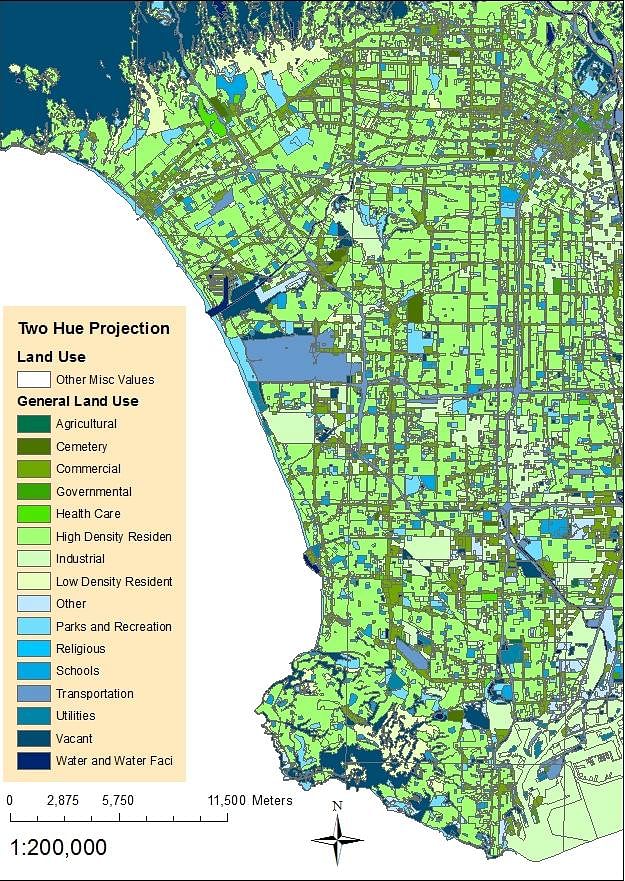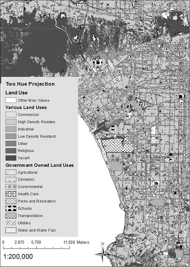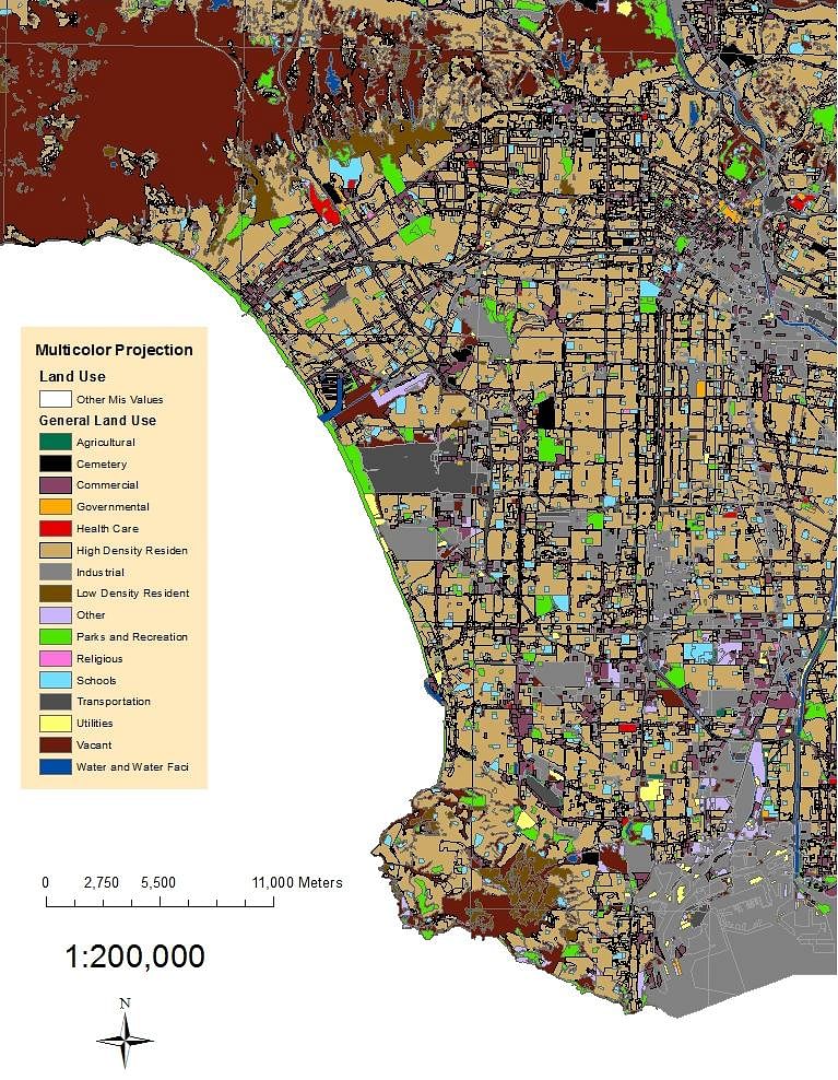
For my first three maps of land uses I chose the 1:200,000 ratio of a map of the LA County. I loaded up the various uses of land. In the multicolor projection, I had a lot of color choices to choose from because the map was only limited to color blindness and not the number of colors. I chose a light brown color for the LA County shapefile, while combining bright and dark colors for the land uses. What I realized was that the bright and dark colors would not always translate well for color blindness. It made my map look mostly grey and brown (seen in the first picture screen capture below), which was interesting. Learning from this, in the next land use picture I chose a two hue color scheme of blue and green. This allowed me to maintain the limited color choices of color blindness as well as display the information I wanted in a uniform manner. Blue and green was translated into blue and shades of yellow for color blindness, but still made it easy to see the different polygons. Lastly in the third map, which was black and white, I struggled a bit. After making my map, I realized that it became too cluttered with the multiple types of textures and symbols that were present. This is an example of how not to make a black and white map. Although it translates very well because it maintains black and white for color blind individuals, the need for symbolism is overwhelming because of the lack of color. Black and white maps should be straightforward and to the point, otherwise their meaning can be lost because of clutter (as seen by the screen capture below).
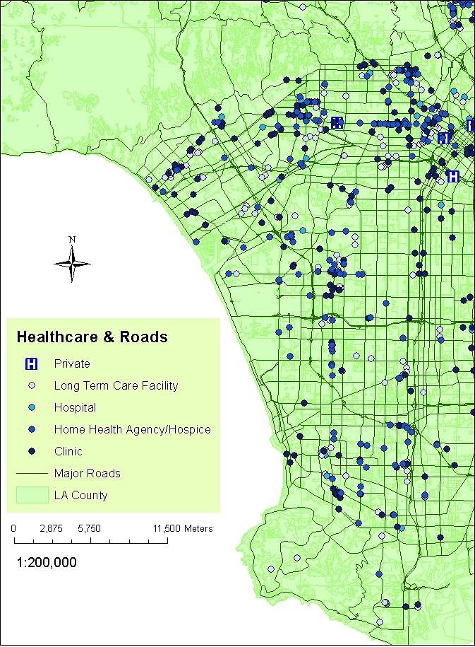
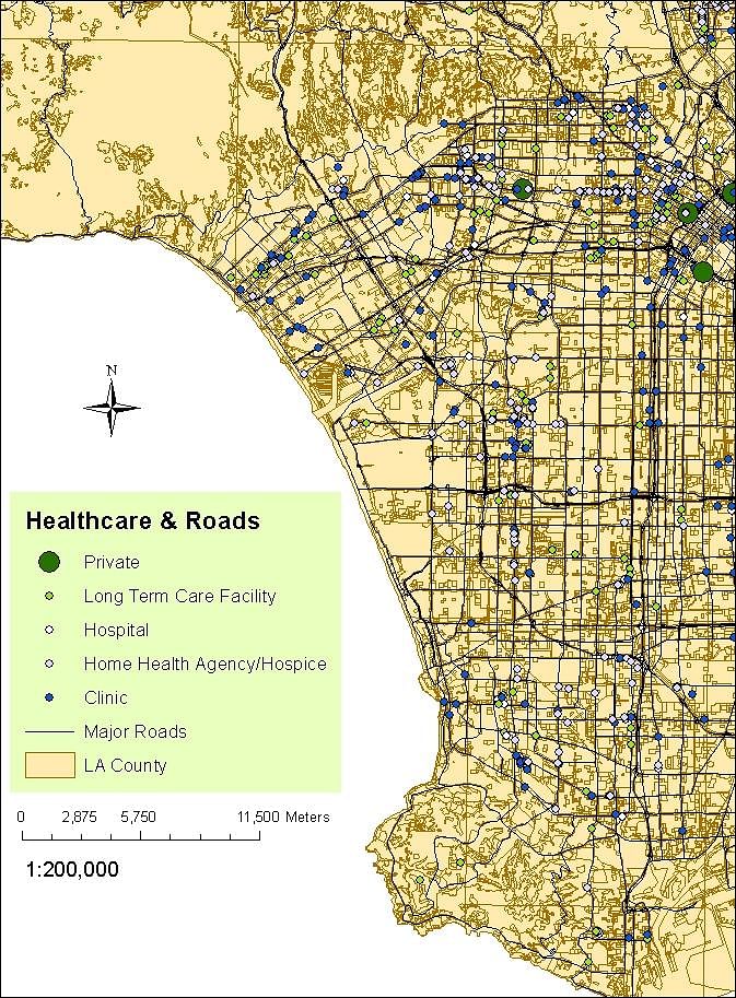
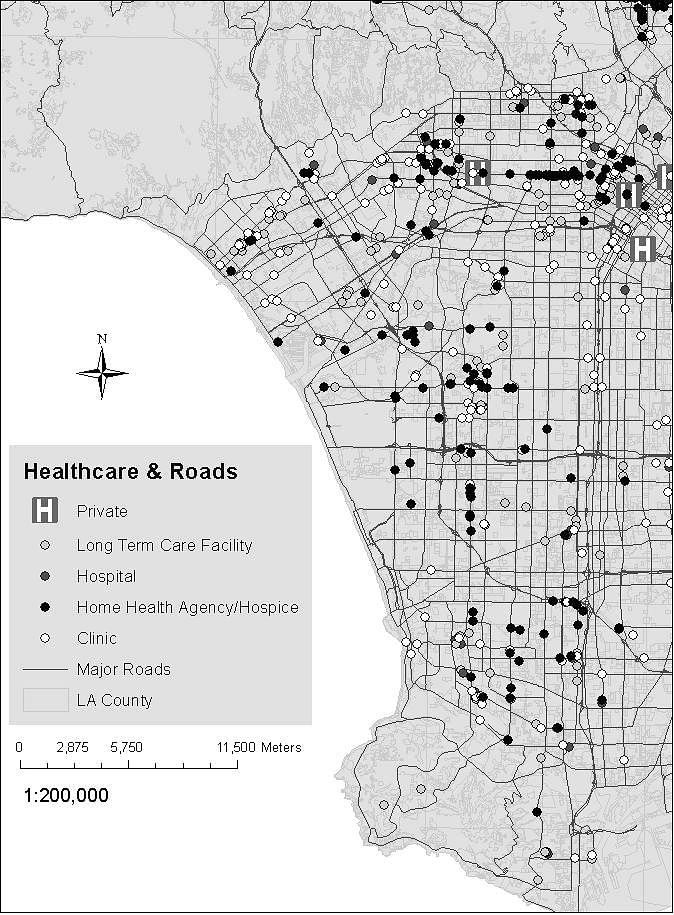
For the second part, I used the LA County shapefile combined with the major roads and care facilities shapefiles. I used simple markers such as dots for my points and on the first multicolor version, I used a tan LA county underneath black major roads and blue or green points for the various care facilities. Those colors translated very well for color blind individuals. Dark colors for urban areas such as buildings or roads are better choices because they stand out better on light surfaces such as earthy tones of light green or brown. Other bright colors stand out on lighter colors, which is useful when trying to point out several key locations. At the same time, too much color is not useful because then the viewer does not know which data is more important than the other. On the second version of the two hue projection, I again used a combination of blue and green. It was a bit tricky because working with two colors was a lot harder than multiple color choices. The blue green translated to yellow and blue once more and the information was straightforward. Usually colors like red stand out and would be useful for certain labels such as hospitals, but when accounting for color blind individuals, it was not the best choice of color to go with. I was impressed with this version. Lastly, the black and white version of the roads and care facilities projection was cleaner than the previous land uses one. It was easier to make than the land use maps because there were not as many different types of care facilities. More care facilities meant that one would need more symbols because different colors were out of the question. One thing that I learned from making black and white maps was to group data into categories to limit the different amounts of symbols needed. The website color brewer and vischeck were instrumental in my understanding for how to account for color blind viewers as well as make my maps more concise and readable.
Status: School Project
Location: Greater Los Angeles Area
My Role: I aquired all of images myself through land use files in ArcMap and ArcGis.
Additional Credits: I would like to thank Professor Reagan M. Maas as well as my very knowledgeable and helpful TA P.J. Khan.