
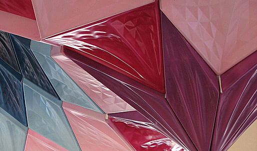
Tessellated Manifolds was created by students from Washington University in St. Louis led by Marcelo Spina of P-A-T-T-E-R-N-S, Daniel Carper and Ken Tracy. The project's scope was a full-scale installation that transformed the centralized classical staircase of Givens Hall. The installation seeks to enhance and transform the spatial atmosphere of the vertical stairwell foregrounding conditions of figuration, lighting, materiality, texture, coloration, and corporeality. At first revealed through a large exterior opening, the installation accompanies the user's visual background upon entering into the building, spiraling vertically through the 2nd and 3rd floor studios, and crescendos as the ornamented foreground of the vaulted ceiling. The project sensitively engages occupants through its formal description of proximal and cuspate peaks while dissipating into subtle saddle surfaces around its edges.
The studio investigated both, the abstract mathematical constructions of saddle minimal surfaces, and the rich tectonic and ornamental tradition of Arabesque and Islamic patterns, especially focused towards muqarnas and stalactite features. In doing so, the studio aimed at generating a new definition of superficial interiority in architecture by articulating a loose and interstitial manifold network that challenge the conventional divisions of wall and ceiling, surface and volume, monolithic and discrete, opaque and porous, monochrome and colored, figure and figuration.
As a Digital Fabrication Studio, the class was concerned with developing a complex project throughout all phases of design, fabrication and installation including the development of a coherent tectonic and assembly system, intricate detailing and affluent materiality.
Installation Design Concept and Effects
The final installation of Tessellated Manifolds was a result of an initial digital speculation and an immense investment into manual experimentation. This digital to manual feedback created a platform to advance fabrication processes and design decisions ensuring the completion of the installation while preserving all of the desired design ideas.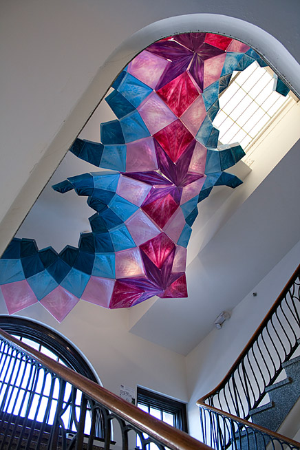
↑ Click image to enlarge
Photo of the Final Installation at Givens Hall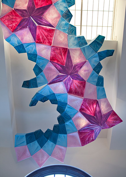
↑ Click image to enlarge
Photo Daytime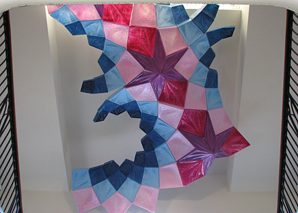
↑ Click image to enlarge
Photo Daytime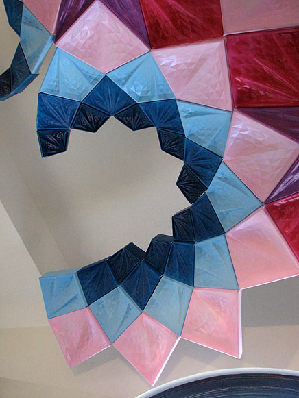
↑ Click image to enlarge
Photo Daytime, Closeup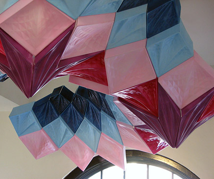
↑ Click image to enlarge
Photo Daytime, Closeup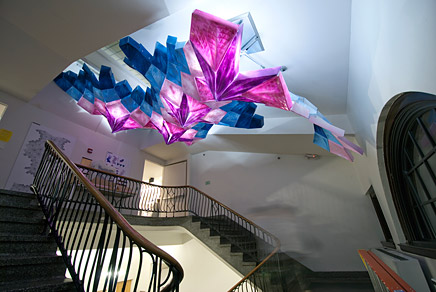
↑ Click image to enlarge
Photo Nighttime
↑ Click image to enlarge
Photo Nighttime
↑ Click image to enlarge
Photo Nighttime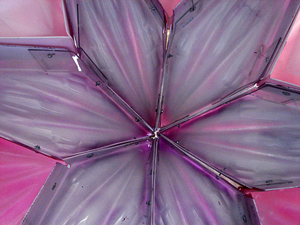
↑ Click image to enlarge
Photo, Inside Detail
StalacTile, Tessellated Manifolds final installation is comprised of six unique tiles types; totaling 157 tiles fabricated using CNC milling and thermoforming technologies. Of these six tile types, four are rhombuses each with a unique scale and rotational logic. Once aggregated, these four rhomboidal tiles form a small meta-tile, which is then duplicated and rotated to systematically grow into a larger field condition. The fifth and sixth tile types are introduced to further the installation's capacity to accumulate.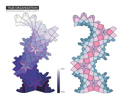
↑ Click image to enlarge
Tiles Organization: Elevation Diagram, Tiles Layout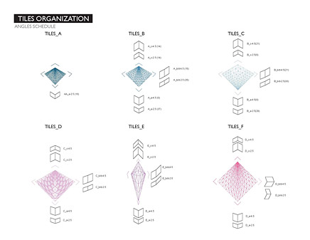
↑ Click image to enlarge
Tiles Organization: Angles Schedule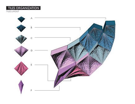
↑ Click image to enlarge
Tiles Organization: Tiles Layout
↑ Click image to enlarge
Tiles Organization: Color Study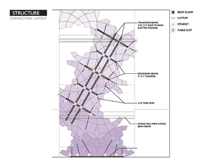
↑ Click image to enlarge
Tiles Organization: Connection, Layout
The inherent tessellation of the system’s cells is further augmented by the inner tessellation of the surfaces: the smaller the cells, the larger the amount of tessellation. This exponential mathematical approach to texture and relief creates a sense of infinity in the surfaces. While StalacTile consist of a finite number of tiles each of them with a familial and yet distinct coloration, the installation aims to maintain a playful ambiguity between its implicit figuration and its latent potential to convey embedded and incomplete figures.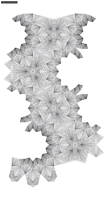
↑ Click image to enlarge
Isocurve Plan Board
The tiled surfaces of Stalactile are textured yet subtle, pointed yet blunt, and immersive yet receding in their affect upon the observer. These aspects of counteraction were made possible by the finishing quality and surface treatment of the PETG plastic tiles. Customized techniques and methods of coloration, back/front painting, gloss/matte, sand blasting, temperature variation, seaming and unfolding all became paramount to define the abundant material effect.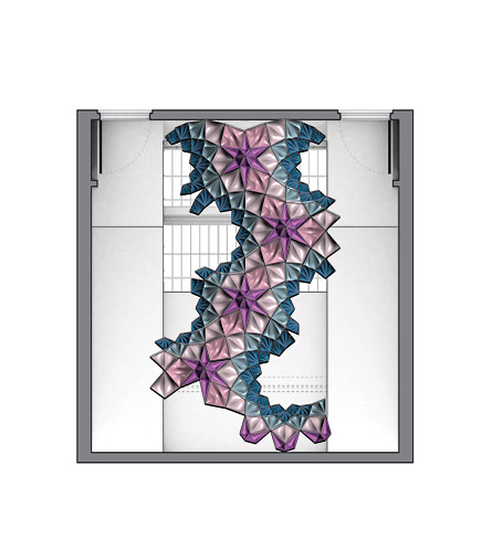
↑ Click image to enlarge
Plan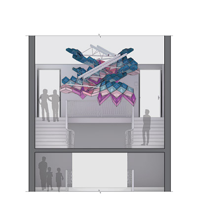
↑ Click image to enlarge
Elevation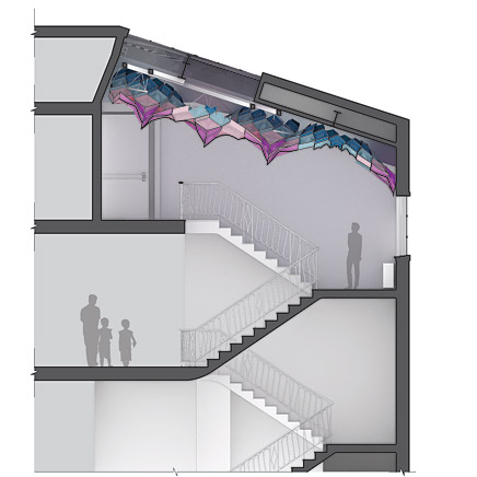
↑ Click image to enlarge
Section
StalacTile's structure consists of a centralized spine suspended from the ceiling with transverse perpendicular appendages supporting the extents of the tiling. This armature, paired with the downslope of the ceiling, allowed the students to calibrate unique moments of differentiation with regard to user proximity and surface sensation.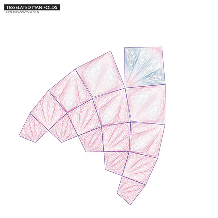
↑ Click image to enlarge
Meta Tiles Contour Field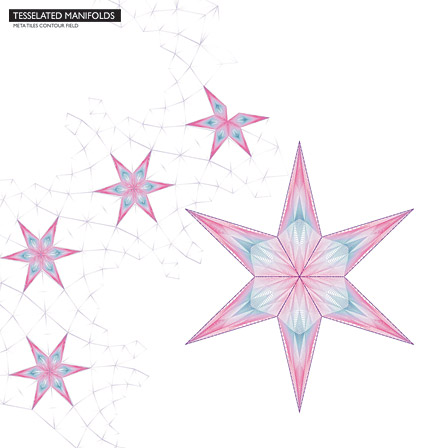
↑ Click image to enlarge
Meta Tiles Contour Field
Presedent Research
Research began with an in-depth investigation of the intricately ornate interior ceiling surfaces of select Islamic architecture called Muqarnas. Muqarnas were developed during the tenth century in parts of Iran and Africa as stalactite ornament applied to the interior of domes, vaults, and arches. Through ornamentation, muqarnas present parameters of scale, texture and depth, coloration, and tone with a slightly more rational take on the distribution of geometry and form. It is not intended that this rationality water-down the opportunities unveiled by the research, but rather, demand that the generation of such ornate parameters be systematized and managed cohesively.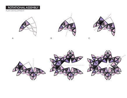
↑ Click image to enlarge
Rotational Assembly: Plan Development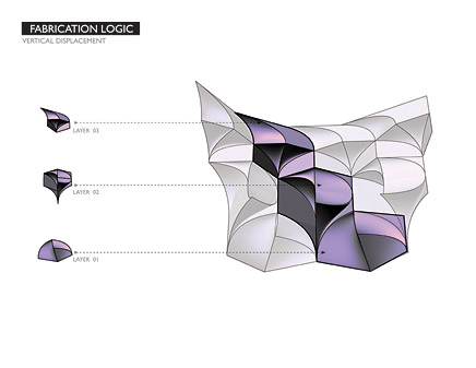
↑ Click image to enlarge
Fabrication Logic: Vertical Displacement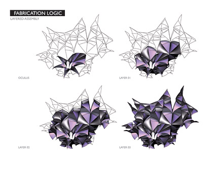
↑ Click image to enlarge
Fabrication Logic: Layered Assembly
Initially, the students were asked to uncover the geometric order of Muqarnas, and identify its primitive tiles (least common denominator). Next, they investigated how these primitive tiles can be classified in terms of construction logic, performance, and assembly. Lastly, students tested these systems against a more complicated set of speculations. How might the parametric logic of Muqarnas adhere to a non-uniform surface? What types of ornamentation might this produce? etc. The goal was for each student to feel equip with a set of techniques and considerations that would inform the studio projects.
On Muqarnas and Stalactites
Upon inspection, the most interesting aspect about muqarnas, is their capacity for producing unique articulations at moments of transition between different systems or compositional elements. Their clear reference to “the cave” lies in the interstitial nature of the Muqarna or stalactite. While its traditional use has been relegated to pure ornament and decoration, Muqarna's figural bottom-up composition and densely patterned structure is more relevant today than ever for those pursuing a more balanced approach between structure and surface, construction and aesthetics.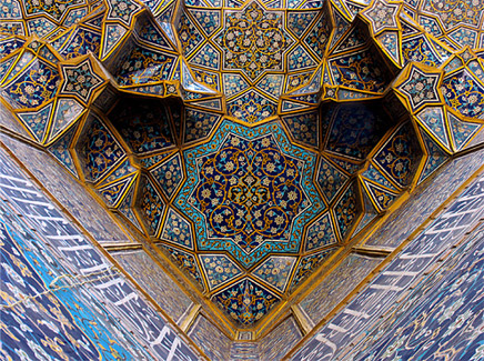
↑ Click image to enlarge
Muqarnas or "Stalactites" in Shia Mosque, Shiraz, Iran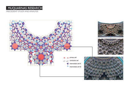
↑ Click image to enlarge
Muqarnas Research: Precedent Study and Analysis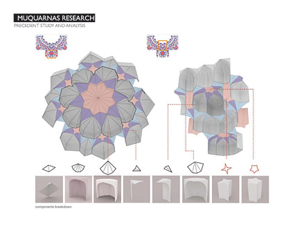
↑ Click image to enlarge
Muqarnas Research: Precedent Study and Analysis
Comparatively, the archetypal vault presents a model wherein the geometry of a finite number of units is intrinsically linked to a cohesive logic of the whole, with the most simple and figural features [pendant stalactites being the most complex] emerging from it. Ultimately, the vault remains bound to a rather simple primitive perimeter, hence, offering an important lesson to those interested in superficial forms of interstitiality.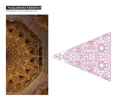
↑ Click image to enlarge
Muqarnas Research: Precedent Study and Analysis
↑ Click image to enlarge
Muqarnas Research: Precedent Study and Analysis
↑ Click image to enlarge
Muqarnas Research: Precedent Study and Analysis
By understanding and locating the research within the development of interstitial tessellated manifolds, the studio moves beyond the prevailing homogeneity of scale present in historic muqarnas in favor of a more deliberate, experimental and rather bold approach to surfacing, subdivision, aggregation, discretization and a fluid, non-hierarchical and contemporary articulation of features such as relief, niche and pocket, pendants, cornices, fenestration, bracket, ceiling, corner, squints and vaults.
Studio Sequence and Operativity
Students developed an arsenal of techniques that were applied in the construction of first, a series of physical models utilizing 3-D printing and laser cutting technology; second, prototypes using CNC milling and plastic forming; and last, a full-scale construction and installation within Givens Hall.
Materials were selected according to the particular needs of the project at every stage of its development. However, it was expected that plastics would be used extensively in the production of surface cells and components for the final installation.
Question 1: Can you describe how you transitioned from digital to manual prototyping? What challenges and opportunities did this process present?
Wai Yu Man: There had certainly been challenges when bringing the digital into something physical, but that is for me where the most interesting part of the studio lies. In the process of testing out our prototypes and making molds, we tried a lot of different methods, materials and connection strategy. Looking at connection methods for instance, we had a lot of discussions on whether to put another piece of black plastic between two tiles to make the seams stands out more and aesthetically more attractive. But in the end, due to difficulty in connection, its effect on the overall geometry and most importantly the time factor, we decided to abandon the idea after all. Something you do not see from a digital model in Rhino, not until something physical is held in front of your own eyes can one see its true visible impact. Therefore just by looking at a perfectly built digital model does not guarantee a beautiful physical piece; it requires a lot of consideration, collaboration and thoughts to make this process and of course the installation itself interesting and memorable.
Brad Lightner: After the initial research phase of the studio, students were divided up into specific focus groups. This allowed the studio to be testing materials and fabrication methods while the design was progressing throughout the semester. Communicating with the other groups in the studio was a challenge, however vital to the success of the project. Along with communication and relaying information to each other, delays with equipment and not having the right equipment until the final installation were major challenges throughout the semester. For a majority of the testing phase, we built makeshift ovens to heat the plastic and we used a small scale/non-reliable CNC router. This made it very difficult to test the full potential of the materials and fabrication methods. We started testing our final design with a new CNC router, thermoforming oven, and silicon membrane press only a couple days before we had to start fabrication for the final installation. At that point, we had to make our best judgments with testing the prototypes because there was no turning back that late in the semester.
Matthew Fromboluti: we did digital and manual prototyping at the same time. once we decided on a design, we began building physical prototypes in order to discover what we were capable of. since we didn't have the equipment that we would eventually build the project with (but we did have the material), we had to improvise on a number of fronts, such as building a makeshift kiln in the woodshop and using a number of different methods to set the molds. some of these didn't end up being useful, such as alternate methods of building the actual molds (we ended up using the CNC router that arrived near the end of the semester), but some turned out to be useful and informed the digital design as to what we could and could not do. two important examples were the tessellated pattern that was eventually imprinted onto the tiles, which we first found by using imperfect molds (our first mills were meant to be a smooth, curved surface, but instead showed the mesh used by the digital model), and also the method of joining the tiles together. this was at first to be joining two curved surfaces to each other, but we soon found that it was too difficult to mold a curved surface to precisely join with another, so we straightened the edges on the digital model to allow a tight fit and then experimented with different joining methods to find a stable solution. eventually we ended up on putting interior angles at each corner, which gave the structure a lot of stiffness and eliminated sag.
Jeffrey Sullivan: My role in the fabrication process involved was both digitally modeling the individual tiles as well as fabricating the molds. The issue that had the biggest effect on my design decisions was the physical limitations of the material and equipment. Because of this we were constantly moving back and forth between digital design and the prototyping. We saw this a lot with molds that were used for thermoforming the PETG tiles. The molds were made out of a standard 3/4" mdf composite that were between 6" and 18" in depth and had undercuts for the back tabs of the tiles. After our first set of prototypes we realized that the back walls of the tile were not thick enough and the interior ridges were too fragile to withstand continual thermoforming. As a result, the digital model was rebuilt to include a 1/4" rolled edge between the seams to handle the 250+ molds at over 275 degrees. As for opportunities afforded, we discovered that the thermoforming process would pick up even the smallest detail in the surface of the mold. We became most excited when we realized that the plastic was registering the slightest tessellated meshes of the mold that were simply a byproduct of the computer converting the NURB surface to a polysurface. From this we modeled another scale of tessellation within the pockets of the individual tiles to give the entire piece a greater sense of depth and articulation.
↑ Click image to enlarge
Phase II (Plastic Formation): CNC Mill, Plastic Milling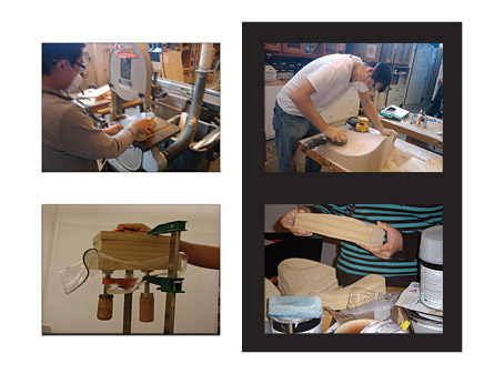
↑ Click image to enlarge
Students at Work
↑ Click image to enlarge
Prototypes
↑ Click image to enlarge
Phase II (Plastic Formation): Forming Process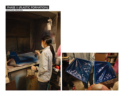
↑ Click image to enlarge
Phase II (Plastic Formation): Painting Process
The operating platform of the class was more akin to that of a small design research unit rather than that of a conventional academic studio. Individual research on Islamic patterning was followed by formal and tectonic experiments. Divided in groups of two, students produced design proposals. One of these proposals was later selected to be further developed through a series of material prototypes and finally, a full-scale installation.
The studio initially operated on two trajectories with research running parallel to individual project development. Both research and project trajectories commenced in groups. Students researched issues of form, texture and coloration, ornament, and economy such that this knowledge gained would enrich the overall design development. Structured as an advanced topics/fabrication studio, the class weighted critical analysis, digital technique, and physical production equally.
Question 2: What did you take away from this studio experience?
Matthew Fromboluti: i took away quite a lot from the studio experience, especially as far as the capacities of digital fabrication. next semester i am doing an independent study with digital fab so that i can explore other capabilities. the experience was also invaluable in the experience it gave me building actual objects. we were pretty much left on our own to schedule and build, since our professors were in another city, and i think that we did a pretty good job as far as speed and construction. i also learned the value of prototyping everything, since at the end the only elements that came out sub-par were those that were not prototyped enough due to time constraints.
Jeffrey Sullivan: Both Marcelo and Daniel helped drive a rigor in the development of the digital models as well as an exploration of material capabilities that displayed how vital craft is to successful digital fabrication. I was also pleased with the extent digital fabrication crossed between artistic design and technical knowledge. Because I was working so heavily with the CNC router, it was crucial that I had Ken Tracy (Associated Fabrication) assisting me with the toolpathing and operations of the CNC router. His expertise in the specific machinery was the perfect counterbalance to Marcelo and Daniel's overall guidance through the research and design.
Wai Yu Man: The time factor has definitely affected a lot of our decisions making and our final installation, which I think is very important to actually incorporate into the design process maybe even earlier which may leaves us more time in the fabrication phase. The importance of collaboration also strikes me as we have altogether 10 people in our group; and everyone has to work perfectly on their own field in order to comply their work with other group members, one single mistake or delays made may affect the whole group. After working and seeing each other for at least 20 hours a day for a month, our group has definitely created much bonding within ourselves….
Brad Lightner: Although the studio had its challenges, I definitely learned about the process of taking a digital design, testing the capabilities and fabricating at full-scale. It was a balance between pushing the limits and being pragmatic at the same time.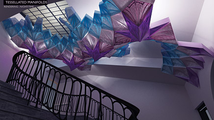
↑ Click image to enlarge
Rendering, Nighttime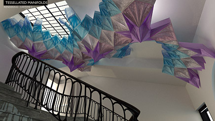
↑ Click image to enlarge
Rendering, Daytime
↑ Click image to enlarge
Rendering, Daytime
Special Thanks to Kathryn Dean, Bruce Lindsey and Carmon Colangelo for their endless support!
Marcelo Spina is an Architect and Educator. He holds a Professional Degree from the National University of Rosario, Argentina and a Master in Architecture from Columbia University in New York where he was the recipient of several honors including the William Kinne Fellowship and the Honor Award for Excellence in Design. He previously worked for Reiser+Umemoto and Keller Easterling in New York before setting his own Practice.
Marcelo Spina is a Design Faculty at The Southern California Institute of Architecture since 2001. Formerly the Coordinator of the Applied Studies Program, Mr. Spina teaches design studios and seminars in technology in the Graduate and Undergraduate Program.
He has been a Visiting Professor at the Graduate School of Design of Harvard University, a Distinguished Visiting Professor at Tulane University, the Friedman Visiting Professor at the University of California Berkeley and a Visiting Professor at the Technical University of Innsbruck, Austria. He has previously held positions at the National University of Rosario and The Di Tella University in Buenos Aires in Argentina.
Mr. Spina is the founder and co-principal of P-A-T-T-E-R-N-S along with Georgina Huljich. P-A-T-T-E-R-N-S is a design research architectural practice based in Los Angeles that has gained worldwide recognition for its inventive approach to design and architecture that fuses advanced computation with an extended understanding of form, tectonics and materials.
Daniel Carper is an architectural designer, educator and curator based in Los Angeles. Carper is currently a member of USC's Design Faculty, having previously taught design studios at WUSTL and UCLA, where he frequently serves as a critic. Born in Ohio, Carper graduated from Ohio State University with a degree in architecture. He obtained a Master of Architecture from UCLA where he graduated with Distinction and was awarded the Harvey S. Perloff scholarship for his design work. His design and research work has been exhibited in Los Angeles, Japan, and the United Arab Emirates. Carper is currently a project designer with DRDS, after previously working in the offices of Greg Lynn Form, Pugh + Scarpa, Gnuform and NBBJ.
Involved Students: Jie-Lu Cheng, Shaun Dodson, Xiao-Meng Fu, Matthew Fromboluti, Brad Lightner, Kun Liu, Wai-Yiu Man, Ryan Spataro, Jeffrey Sullivan, Shengqi Wang
8 Comments
WOW..., thats an incredible work. congrats, all thumbs up
what an excellent exercise,,and such a good explanation
i get it.... lets take this idea and expand it..to create curtain walls..making buildings organic expressive flowing abstractions of muquarnas.... For sure this will end up being the basis for a building off Dubai on some island shaped like Switzerland.
This exercise is admirable as the muquarnas are deserving of serious study. They are beautiful complex forms that beckon from a culture that has been exploited/demonized by self serving interests. That said, I applaud the effort but rendering it in plastic seems compromised and superficial.
What students took from the project was only technical/systemic... not one mentioned anything about the culture from where the forms originated.
Poor students would have learned more if they just reconstructed this Mosque, understanding structure and skin, and researching the meaning encoded as a case study of the city. Then use that knowledge to make Architecture.
Instead they all fabricate a spray painted skin hanging like a flayed snake skin in a grand staircase. Designed by what criteria ? After PoMo DeCon Blobs and now Emergent Geometries do you think students need more formalism?
Remove these engineers teaching group think architecture.
I always find it amusing of how people can comments of what they think of the process of contemporary fabrication but never be critical and insiteful of what students who go thrru these very time-restricted and difficult studios actually achieve which is participation from shop drawings to physical making...reconstruct the mosque really? no one is trying to reinvent the wheel but jsut investigate for the sake of :
1. I am in architecture school
2. Theres new technologies more than ever availble in fabrications.
3. Let's make something to discuss pros and conss- not give stylistic opinons which have no really weight
the arguement of formalism vs anti-formalist is getting really obtuse to the point of draining the life force of developing architectural discource and being naive that 21st century mechanics now involve these type of fabrication processes.
to the students: keep working you are very talented and insiteful of the lesson learned from pre-fabrication....kudos ;)
posters on Archinect always come from a place of hate.
and to monull--- even forms discovered by sustainablity in the 1960s can be thought of as serving self serving interests only thinking that cities wouldn't expnded and that their would only be single family forever....
Corbuuu--- its not about categorizing periods of architcture---im all for contextual arguement--but the exercise here is one of technique not methodlogy....i don't think any part of this project is really projecting itself as superficial or 21st Neuveau..
Dear Or Bang.
You sound like a conflicted and defensive lover but I am not a hater.
Not so long ago students drew and fabricated things big and small by hand and in a shop. 10 years ago I could bring a template drawn on cardboard and the shape was cut via laser. So what? More efficient?
If the shape is ill proportioned or mistaken ....the cut shape is also. Lesson over. Construction is much easier to teach than poetic, visual, and conceptual thinking through making things. And an architects' education need all things including structure and skin. It is difficult.
Students know when professors make them group think.
Hi Glen (Small);
I would like your take on two recent installations.... the first was from materials and applications , the second is this project. ;
eric
EVERY GENERATION HAS THEIR SAY, I SEE IT AT THE ACADEMY, TRYING TO DEAL WITH SOMETHING THAT IS NEW TO THEM WITHOUT UNDERSTANDING THE MATERIAL NOR TECHNOLOGY, AND GOD KNOWS THE PROFESSORS HAVE NO IDEA OF HOW TO CRIT, BECAUSE THEY DO NOT KNOW ANYTHING EITHER. I AM A BIT STERN IN MY TAKE, BUT REALLY IT IS JUST A MATTER OF EDUCATION AND I AM SURE IN TIME THEY WILL PRODUCE GREAT STUFF, BECAUSE THIS GENERATION IS FREEDOM ORIENTED.
GLEN
That was my take too, naiveté of the structural rationale.
But I see it all the time, repeats like a bad sit-com. Today’s episode with space frames, last month it was this; an interior stairwell construction conceived as a hanging sculpture and based on what seems like tessellated patterns of translucent tiles. I applaud the experimentation but I keep thinking it misses the architectural point, it's more like sculpture.
In this example everything is custom fabricated, derived from a spiral (which I like) but only fakes the construction logic and assumed savings from using identical shapes. Nice colorful sculpture but I think they missed the point they were trying to make, if the point was about repeating elements to derive a pleasant . The 3D scheme they say is derived from Islamic ceiling tiles, while I see that the 2D based patterns are closer to a mimic to the fractal drawings of MC Escher or closer yet - to an obscure pentagonal based Penrose tile system.
This project begs the question “But isn't the architectural idea of working with tiling and tessellation to generate a repeatable and economic design pattern. The complex geometric tiling patterns are created from one maybe two shapes and repetition.
All that’s missing is the logic.
Is this all about architecture approaching sculpture and appropriating the innovative structural strategies of mid-century to justify bad art-making?
eric
THE ARTICLE WAS INTERESTING AND VERY PATTERN ORIENTED. FOR ALL THE VERB-AGE AND DIAGRAMS IT CAME OFF AS A DECORATIVE PIECE, WHICH IS FINE, BUT OF NO GREAT CONSEQUENCE.
THE STRUCTURAL VIBRATION WAS LACKING. THE BEST THING WAS THE BLACK AND WHITE PATTERN DIAGRAM. MAYBE THAT IS ALL WE HAVE TO DEAL WITH, SOUPING UP THE EXISTING.
GLEN
Muqarnas have been a decades-long passion with me. The muqarnas tiles I used all have equi-length edges when viewed from the plan view.
If you want to see an exploration into muqarnas forms, please take a look at the muqarnas image gallery at my website:
http://www.ensightful.com/image/tid/2
Dan Owen
dan@ensightful.com
Block this user
Are you sure you want to block this user and hide all related comments throughout the site?
Archinect
This is your first comment on Archinect. Your comment will be visible once approved.