
Sep '08 - Feb '13
Here is the first run through of our boards which we presented at the Foundry midterm review last Tuesday. We received a lot of useful criticism and although the design is basically finalized, we definitely still need to do some work making our idea more clear in the presentation. I think it will read more clearly once some context gets put into the renderings and everything gets tightened up a bit.
Just to clarify: these are boards for the EPA P3 competition. The prize: six - $75,000 dollar grants to continue pursuing project. They are pretty strict on the board requirements (text size, nautilus background, text which must appear on the board, etc) but we are trying to work with it rather than fight it. Most of the entries are hard science based and layed out in PowerPoint, so I think no matter what we do the visual presentation will be no match.
I guess from here the question is how important IS graphic design anyway? I'm a designer - I say VERY. But what will an EPA scientist say? Everything i want to believe about how the world should work tells me good design could move anyone.
Did I mention we have $5,000 to spend purely on presentation / installations? What would you do with $5,000 to present your most recent design project?
We are about to start having lots of fun. Thoughts?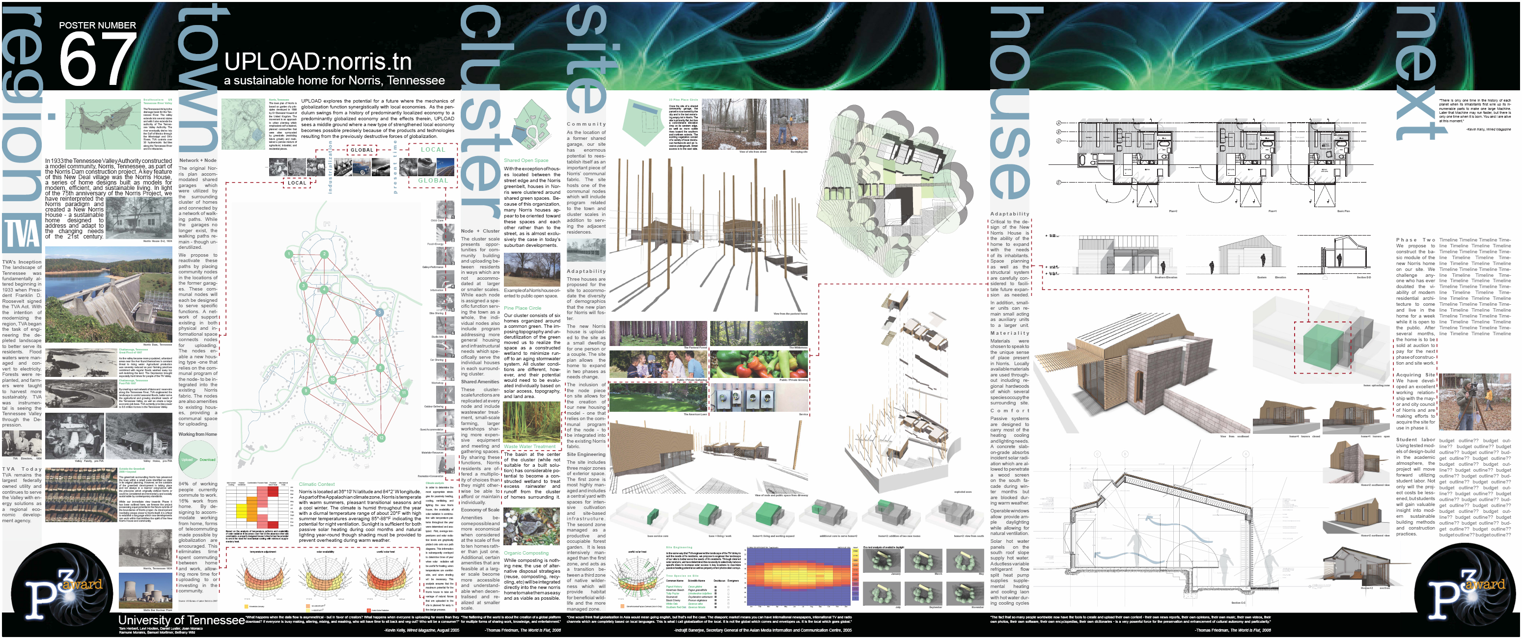
presentation boards: Enlarge in new window
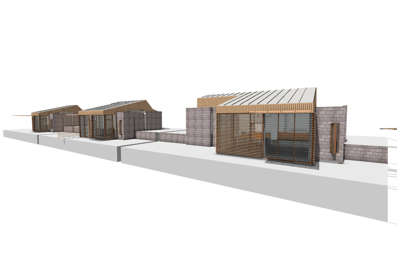
view of all three homes from green
exploded axon of site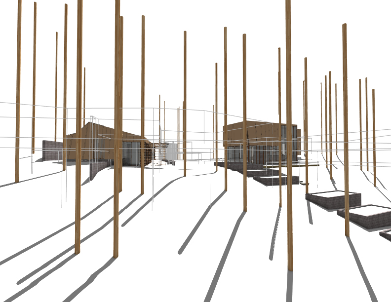
western view from forest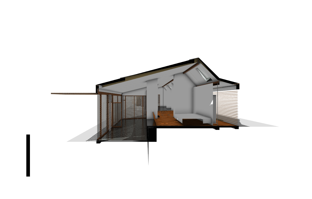
section perspective through "upload" + "download" zones
School blog of BArch student Samuel Mortimer kept from 2008 - 2011. Mostly late-night musings of the studio, but with an emphasis of the events of the College of Architecture and Design and University of Tennessee on the whole. Later blogs discuss participation in the New Norris House project, as both a student and researcher hired after graduation.


8 Comments
Hmm, I actually like your board layout, as seen in the tiny version above. The tiny image actually helps critique the overall layout & space use since we get the perspective of distance.
I'm not a graphic designer so take my comments with a grain of salt...
1. What is the green block after the first title word "REGION"? Is it just an image, like the others buried in blocks of text? If so, consider moving it further down its column of text -- this is the only title word with an image hanging under it and it makes it look at first glance as though it is part of the title, like I read the word "REGION" wrong or something (especially since it's the same color text).
2. Is the 67 your entry number? If so, is it required to be that large and prominent? The way it's situated within your overall board titling makes it seem like the number "67" has to do somehow with the title of the project. Is there a way you could incorporate it into the P3 footer logos, since (if it is your entry number) it has to do with the contest administration itself, rather than the content of your project? I may be reading this wrong entirely.
3. This is just a huge pet peeve left over from my English Lit days, but you've set up a parrallel structure with your titling and then totally departed from it on the last word -- but then graphically made the last word look just like the previous titles, as though it is of a piece with them.
REGION
TOWN
CLUSTER
SITE
HOUSE
NEXT
..."one of these things is not like the otttthhhers". "NEXT" what, exactly? You have noun, noun, noun, ...temporal category. This is fine if you depart slightly from the same graphic language as the previous titles. Can you shade the letter a slightly different saturation of hue, maybe? Or maybe use the blue color to outline the word, instead of as fill color?
This probably doesn't bother anyone but me. I'm a stickler for content consistency, I admit it.
mantaray (and all)-
I added a link below the main boards to the original file to give you a bit more detail. The boards are actually pretty large - 3'x7'.
1. The image directly below the title "region" is the TVA logo. Originally the section was conceived as "background" but this became mostly about TVA, so to fit the structure of the rest of the titles (sans "next" - which I'll get to) we changed it to Region. TVA, as you may know, is the regional power provider and at the time of the Original Norris Houses construction a catalyst for economic growth and modernization of the region. In the smaller version - I agree - it does start to bleed into the title text. In the printed version (full scale) it is not quite as confusing - but I definitely see where you are coming from - it is an odd condition. We were told today to change the color to THE tva blue so the position and location of the logo may be changing. (ps. we received $5000 from TVA in conjunction to our $10k from the EPA for Phase 1)
2. Yes - this is our entry number. There is no specific language in the rules / guidelines about the entry numbers location, size, etc - so potentially this could change. I agree though - it is purely about the administration of the competition and exhibition - so perhaps it could move around / become less noticeable.
3. Completely agree with you on this one. For the time being the word "next" is a place holder until we can think of something better - but I think changing the color or saturation would be a great move as well. From "House" over (36in I believe) is technically supposed to all be "next" (our proposal for Phase II, should we be selected) but the nature of the project makes it kind of hard to draw that line when you are talking about a house you designed for phase I, and are proposing to build for phase II.
As far as the nomenclature goes though - again - I think you are right.
The crux of the project revolves around the changing relationship amongst communal networks with regards to the uploading (versus downloading) of content, ideas, goods, and services. Getting feedback and sharing this with others is only strengthening our concept and I very much appreciate your comments.
ok, here are my thoughts, and I'm trying to focus on the large-scale stuff and not nit-pick, so please bear with me.
1) I honestly can't tell where I am supposed to start. The amount of information in there is truly daunting. I don't think you should take any out, because I'm sure it's all very important. I just want to know where to begin---no part of the boards stands out to me as being more important than any other part. I strongly encourage you to take a moment and ask yourself what THE organizing element of the design is, and then express that in layout form. What drawing do you have that expresses that organizing element? Make it twice as big! Make the text organize around the components of that drawing. Basically everything here is about the same density, about the same size. Lacking in hierarchy.
I think this can start to be solved if you address...
2) You are out of white space. O.U.T. OUT. I suspect that your type size could come down a bit within those columns, which would free up some space for you. Some of your mid-sized contextual stuff could come down and be the size of your smaller sized thumbnails and diagrams. White space is like air, and the elements on your page need to breath.
3) Once I've started somewhere, there's no horizontal relationship between the sections of your boards. You don't need to get all modularly griddy about it, but a couple of hanglines (horizontal gridlines which the tops of things align to) would help you out a lot. for instance, your type all starts at different points, which is hard to follow as a reader. Not absolutely everything has to line up, but a bit more unity would be nice.
4) What's that big swirly thing at the top? Is it relevant? It is getting more real estate on your page than any of your drawings are. Is that right in the hierarchy of this project?
rationalist -
First of all - thanks for the nice long reply.
1. I agree with you here - this was a criticism we received last week at our first formal cirtique of the boards with local professionals, college faculty, alumni, etc. The boards are required to have a lot of information and we definitely have some issues to work out.
2. Again - agree. The pieces definitely needs some room to breath and i think a little hierarchy in separation between the region, site, cluster, etc sections will help the organization read more clearly. The type size presents a bit of an issue as we are already way smaller than the competition "recommended". Right now the majority of the text is a 20pt font, and the smallest size the specified was 24pt for photo captions. Body text (by the competition standards) should occur at 36pt. Ugh - I know. The presentation format viewer is kind of like a big science fair with judges coming around and not really getting very close to the boards. (again - just to be clear this is by no means an architectural based competition. More like collegiate level science fair.)
3. There was some effort to create a band of site based information regarding the specific scale at the top (which falls apart at the house scale - i know) as well as creating a band of quantifiable data / diagrams at the bottom (mostly related to climatic conditions and responses). There could definitely be more organization to this and some grid lines to work off of would probably be prudent. Originally there was an idea to create three zones traversing horizontally to address the competition's themes: people, prosperity, and planet. (people and planet along the top and bottom: prosperity being the design solution which encompasses and is informed by the social and environmental aspects surrounding)
4. The big swirly thing is required by the competition. yes - I know. Silly. In years past it has been less tacky - but we are trying to work with it. (color palette, bleeding text [maybe images too?] into the zone, etc) Any thoughts you have on this would be appreciated. We played with some different transparencies, filters, etc in photoshop to make it a little less noticeable - but in the end just left it as it was originally provided.
I appreciate all your comments and thoughts. The amount of information and requirements are making this particularly challenging to develop. The size is also not my favorite - but we are working with it!
Thanks again!
As usual rationalist nails it.
As for #4 up there samuel, I would caution against bleeding images over other images. The text over the nautilus is already slightly awkward (the way the one letter at the edge hits that black / white background mix is somewhat clunky) but images over images is bad news.
Can you create a little breathing room with some aggressive text editing? I would call in an english major editor friend. Architects are usually nowhere near as concise and clear as they could be. That might be worth $100 for them to spend their time helping you craft the text, especially since it sounds like this might be the main selling point to the scientists.
I want you guys to win!
UGH. Scientific boards, yuck. Sorry, I've worked with Informatics people before, and they really do have atrocious misconceptions about what size things should be. I managed to pacify mine by telling them to make a really big title or topic of some sort, and a mid-sized (24-30pt) "pullquote"ish item, like their first paragraph or a few key sentences somewhere, and then put the rest of the type at a reasonable scale. Because really, very very few people are going to read the entire thing, even if they think they are. You just don't read great quantities of text on a wall like that. So you may as well harness the fact that most of them are going to read about a paragraph, by showing them which paragraph it is super important that they read, and leaving the rest at a scale that only the very interested will bother with.
I had a thought on this looking again this morning---you could almost say that all of these categories (region town, cluster, site) are really the "foundations" for your design, so what if they stretched across in narrow striations like layers of sediment, horizontally, building up to a nice big row of your renderings and plans? An occasional thing could jump up in size and span across two categories, but on the whole this would provide you with an organizing element that controls the scale of things enough to leave you with a reasonable bit of white space around those renderings, which look quite nice when you've posted them individually below your boards (with lots of pretty whiteness and clean small type around them).
Regarding the band at the top, I would agree with manta that it's not quite working. The type you have reversed out in white is, but the medium blue isn't. I would honestly probably do very little to it, that way when you put this in your portfolio, you can just take it out completely. Or, if you switch to the horizontal banding scheme, put the text for the "next" category in there?
I think you are both right in that nailing the text is going to be key. We put this together in about 3 days before a deadline and there are without a doubt at least 6-10 text styles working in there right now. That is not by choice - just the consequence of two people working on one set of boards on deadline. (Everything is just slightly different from one another - but enough to throw you off.) I think you are right in that creating a bit more hierarchy and designating which text is critically important and what is secondary will do a lot for the general reading of the boards as a whole.
We are working through some revisions of these right now, as well as finalizing ideas for an installation we are doing at the expo/competition. I will post updates as they come - thanks again for all the input.
hey where is rationalists comment/ am I missing something :p
Block this user
Are you sure you want to block this user and hide all related comments throughout the site?
Archinect
This is your first comment on Archinect. Your comment will be visible once approved.