
Posting this much about Mies makes me feel like this blog is circling back to where it started two years ago, when I posted about Modernity and Ideology from my studio in Germany. Somehow this recent time in the MidWest, transitioning from Brooklyn to Detroit, does remind me of settling into Stuttgart two falls ago. Stuttgart, like Detroit, has an overly defined downtown, an urban center that makes the language of 'destination' seem justified. Both cities also hold a rightful claim to global automotive history with giant complexes to show for it (The Renaissance Center in Detroit, Porsche and Mercedes museums in Stuttgart).
But it's really Mies that connects both for me. In Stuttgart I returned again and again to the Weißenhofsiedlung, not so much for Mies' building there but for the complex as a whole, the notion of a neighborhood and full-scale built work as exhibition. This, of course, is not only Mies' work, but his collaborative project with Lilly Reich, also design partner for the Barcelona Pavilion and the Barcelona chair. At the Weißenhofsiedlung, I peered repeatedly at a model of the Spiegelglashalle, a prototype for the Barcelona Pavilion.
I am not even a huge fan of Mies. My allegiances are much more to Corbusier, Niemeyer, Cedric Price. The fact that Eisenman tells us to avoid Mies does make me appreciate him a little more passionately. Also, seeing Rem Koolhaas' early collages next to Mies' collage drawings - I am thinking especially of the concert hall collage exhibited in the MoMA postwar show - that provides an entry for me. And, of course, Beatriz Colomina, reading Mies through his collection of x-rays.
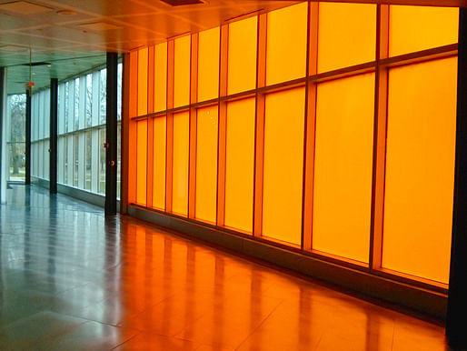
Anyway, a recent trip to Chicago afforded my a visit to Mies' most iconic American work, Crown Hall. Talk about mastery. That entrance. The steps. The trees. The floor. The ceiling. Done. I am usually of the position that symmetry is a terrible place to start anything because it assumes its own righteousness. Or, as Hernan Diaz Alonzo said when he was one of my studio critics at Columbia, "Symmetry means thinking with half your brain." But Crown Hall leverages symmetry toward something undeniably magnanimous. It is so grand and so simple.


Across the IIT campus I visited Rem Koolhaas' contribution... to architecture history? To IIT? To the campus? McCormick Tribune Campus Center feels a bit cynical after Crown Hall. It's a canonical 90s moment, Koolhaas' first building in North America. The project register's OMA's allegiance to Mies as much as the shift to urbanism (the train station), the prominence of surface (interior artifice), and the dominance of the section over the plan (everywhere). Regarding surface, applique and real materials are treated equally, such that real materials become 'real' materials. Intellectually, I am on board. My subjectivity is constituted, nature is man-made, the city is everywhere - I get it, I'm into it. But Crown Hall seems to treat people better. There's something to say for the primacy of being in a space, rather than thinking about it. The orange is the best part.
Am I right? IIT students, please chime in.


Posts are sporadic. Topics span architecture, urban design, planning, and tangents from these. I sometimes include excerpts of academic articles.
7 Comments
There's something to say for the primacy of being in a space, rather than thinking about it.
Love this. It's what Michael Benedikt calls realness.
Donna, thanks for that reference. Interesting how he calls 'emptiness' : "a building's lack of didacticism, a sort of indifference and generosity that we can't or don't want to explain." I do always want to explain, though.
http://www.mbenedikt.com/reality-and-authenticity.pdf
Mitch - I was a student at IIT when that opened in 2003. My first reaction is to agree with you - Crown Hall provides the kind of non-intellectual comfort of simply being a pleasant space which the MTCC doesn't.
At the same time, the campus center does provide a quality of experience that until it opened was completely lacking at IIT - a social space outside of the classrooms - and a place that looks good messy. That Benedikt article was spot-on about what I see as OMA's intent: the campus center was a series of mediated experiences. In a way it comes off as a series of stages for the performance of social activities: lounging, getting coffee, browsing online.
For me personally the building has a lot of value because it was the first time it struck me that architecture actually can have a positive influence on social interaction - and that quality doesn't depend on any kind of broad theoretical understanding of society. Rather, as was the case here, it simply depends on observing the normal behaviours and desires of ordinary people.
Nor does that social influence depend on being quality Architecture. I think the MTCC was a net benefit to the school, but it is kind of an ugly building full of gimicky spaces. There are some clever allusions to Mies (the H-section column grid) and potentially pleasing spaces of repose - but it doesn't come together. That kind of precious wholeness isn't really Rem's thing. The faux-wood fascia is gross and seems like an experiment that didn't work out. I hope OMA leaves some kind of artistic-will to let future designers play with that and improve on it.
I'm intrigued by the statements against symmetry. Laziness can just as easily generate asymmetry. It's more interesting to consider where symmetry is useful or powerful, and why.
First, as an aesthetic principle there's more to it than simply symmetry-asymetry. Symmetry can have layers of complexity that goes beyond mirroring the facade. Crown Hall is a great example of a more thorough symmetry that balances elements in plan as much as in elevation, and manages to do so without being perfectly symetrical (on the east-west axis). Automobile design would be a great place to look too - the form is symmetric, but the mechanical systems are not exactly. And there's a requisite balance due to physical needs which is somewhat reflected in the balance of front and back.
And then as an organizational principle, it can actually be very complex. Most high-rise office towers have a generally symmetric plan layout. Not so much out of aesthetic reasons as that it's a very efficient way to provide flexible units of space to tenants of unknown size and needs. A lot of thought goes into rationalizing the core layouts so that services are evenly distributed, and access is reasonably direct from all sides.
It's also interesting to consider at the level of urban planning. Symmetry has never been very prominent in the European or American city - Washington is the only large-scale example I can think of, but it's still not truly symmetric. Whereas ancient East Asian cities were mostly symmetric about a central palace or government monument. Does this reflect different understandings of urban space - or different approaches to city development?
The main difference between OMAs project and Mies' at IIT is the quality of materiality. OMAs is cheap and poorly detailed. The space has funny and awkward moments like too low of ceilings (4 photos up) and stairs that lead down to glass barriers - step out of room 4 photos up and take 2 rights, parallel to street (visited 3 years ago, may be wrong).......................... ....The Hernan Diaz symmetry comment is a funny one and assuming symmetry is righteous is presumptous, but Mitch is correct: you do not start at symmetry - you arrive at it. Only when you arrive at symmetry and all architectural problems are solved in a simple expression can it become righteous - the poetry of such places are expressed in the sense of Michael Benedikts qoute above. Its much easier to distract with asymmetry and badly placed faux wood.
These comments from on the ground at IIT are so instructive. I am intrigued by midlander's point that the OMA space looks good messy, that it works well socially. And Chris, yes, there's something about the cheapness of the materials that feels, of course, deliberate. When I took that photo with the coffee cup, I wasn't sure what I was getting at. But now that I look at it in the context of this conversation, there's something overwhelmingly consistent about the disposable materiality of that paper cup and the materials of McCormick. Not just in finish, but in logic.
I appreciate this thread picking up my comment about symmetry, too. Indeed, it's not a critique of symmetry, itself, but symmetry as a primary, classical principle. I like the way Chris puts it, that you don't start at symmetry but arrive at it. In that sense I would say symmetry is equivalent to any design algorithm, in that it has to prove itself through the project. It's obviously one that has a lot of great precedents to offer over a very long time span.
L'Enfant's Washington plan never gets old for me, btw. Thanks, again.
I like a good blog on architecture. Been reading lots of new books because of this blog.
Keep up the good work!
Block this user
Are you sure you want to block this user and hide all related comments throughout the site?
Archinect
This is your first comment on Archinect. Your comment will be visible once approved.